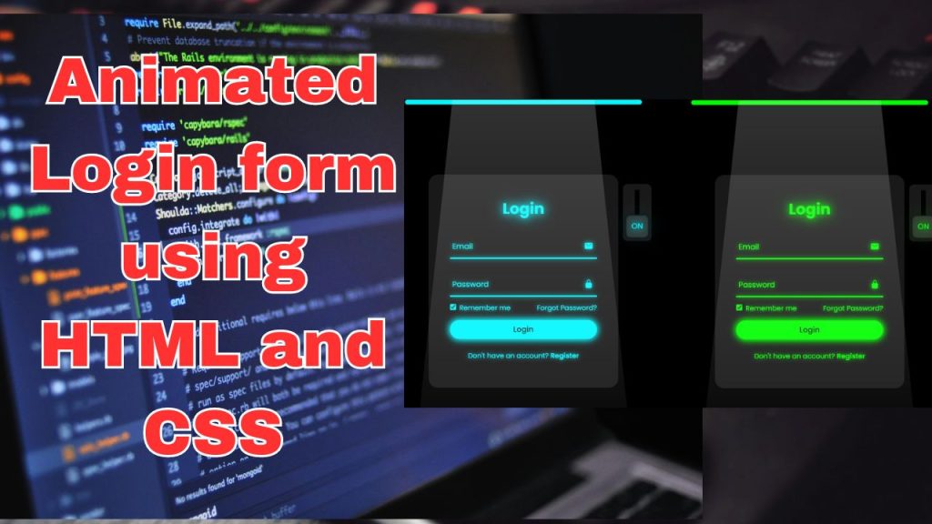
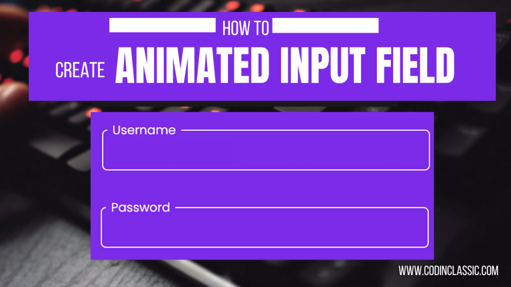
Greetings all! Today, our blog will guide you through creating an animated login form. Within the realm of web design, HTML and CSS serve as the foundation for building attractive and efficient user interfaces. Among the various components enhancing user engagement, animations for login forms play a significant role. These fluid and understated visual enhancements enhance the interaction between users and interfaces, transforming the login procedure into a delightful experience.
The markup language HTML provides the foundation for showcasing these animations, shaping web content into structured elements. HTML’s login form serves as the structure for user input, while CSS, the styling language, imbues vitality into this framework with animations. Through the fusion of these two languages, developers can craft compelling login encounters that leave a lasting impression.
Implemented using HTML and CSS, animations within login forms serve various functions. They offer prompt visual cues to users, indicating successful inputs, errors, or transitions throughout the login procedure. Basic yet impactful animations such as color adjustments, transitions, or gentle shifts can greatly augment the user experience as a whole.
Crafting these animations requires a grasp of CSS animations and transitions. CSS animations facilitate the gradual alteration of an element’s style over a specified duration, enabling fluid transitions and captivating visual enhancements. Meanwhile, transitions govern the speed and timing of the animation, guaranteeing a seamless and refined login interface. Take, for example, the use of a CSS animation to emphasize an input field upon receiving focus, delivering a distinct visual cue to users. Moreover, transitions can be applied to seamlessly adjust the color when a user inputs incorrect information, delivering instant feedback without inundating the user.
Furthermore, HTML and CSS offer the versatility to customize login form animations to match a brand’s visual identity. By harmonizing animations with a brand’s color palette, design elements, and voice, developers can craft a unified and memorable experience that leaves a lasting impression on users well beyond the login process.
Integrating animations into login forms demands a delicate equilibrium between creativity and utility. While animations elevate the visual allure of the interface, an excess of intricate animations can impede the login journey, leading to user frustration. Consequently, developers must find a middle ground, ensuring that animations enhance the login flow seamlessly, without compromising usability.
HTML Code (index.html) . I used comment for better explanation.
<!DOCTYPE html>
<html lang="en">
<head>
<!-- Set character encoding for the document -->
<meta charset="UTF-8">
<!-- Ensure proper rendering and touch zooming on mobile devices -->
<meta http-equiv="X-UA-Compatible" content="IE=edge">
<!-- Define the viewport for responsive web design -->
<meta name="viewport" content="width=device-width, initial-scale=1.0">
<!-- Title of the document -->
<title>Login Form Animation CSS | Codehal</title>
<!-- Link to external CSS file -->
<link rel="stylesheet" href="style.css">
</head>
<body>
<!-- Light background for the login form -->
<div class="login-light"></div>
<!-- Login form container -->
<div class="login-box">
<!-- Form for user login -->
<form action="#">
<!-- Checkbox input for toggling the light -->
<input type="checkbox" class="input-check" id="input-check">
<!-- Label for the checkbox, with text for "off" and "on" states -->
<label for="input-check" class="toggle">
<span class="text off">off</span>
<span class="text on">on</span>
</label>
<!-- Light bulb icon -->
<div class="light"></div>
<!-- Heading for the login section -->
<h2>Login</h2>
<!-- Input box for email -->
<div class="input-box">
<!-- Icon for email -->
<span class="icon">
<ion-icon name="mail"></ion-icon>
</span>
<!-- Input field for email -->
<input type="email" required>
<!-- Label for email -->
<label>Email</label>
<!-- Line below the input field for decoration -->
<div class="input-line"></div>
</div>
<!-- Input box for password -->
<div class="input-box">
<!-- Icon for password -->
<span class="icon">
<ion-icon name="lock-closed"></ion-icon>
</span>
<!-- Input field for password -->
<input type="password" required>
<!-- Label for password -->
<label>Password</label>
<!-- Line below the input field for decoration -->
<div class="input-line"></div>
</div>
<!-- Checkbox for remembering login -->
<div class="remember-forgot">
<label><input type="checkbox"> Remember me</label>
<!-- Link for password recovery -->
<a href="#">Forgot Password?</a>
</div>
<!-- Button for submitting the login form -->
<button type="submit">Login</button>
<!-- Link for registering a new account -->
<div class="register-link">
<p>Don't have an account? <a href="#">Register</a></p>
</div>
</form>
</div>
<!-- Script for using Ionicons -->
<script type="module" src="https://unpkg.com/ionicons@5.5.2/dist/ionicons/ionicons.esm.js"></script>
<!-- Fallback script for older browsers -->
<script nomodule src="https://unpkg.com/ionicons@5.5.2/dist/ionicons/ionicons.js"></script>
</body>
</html>
CSS Code named style.css , explained using comment.
/* Importing the Poppins font from Google Fonts */
@import url('https://fonts.googleapis.com/css2?family=Poppins:wght@300;400;500;600;700;800;900&display=swap');
/* Resetting default margin, padding, and box-sizing */
* {
margin: 0;
padding: 0;
box-sizing: border-box;
/* Setting default font family to Poppins */
font-family: 'Poppins', sans-serif;
}
/* Styling for the body */
body {
/* Centering content vertically and horizontally */
display: flex;
justify-content: center;
align-items: center;
/* Setting minimum height to full viewport height */
min-height: 100vh;
/* Setting background color */
background: #000;
/* Hiding overflow to prevent scrolling */
overflow: hidden;
}
/* Styling for the login box */
.login-box {
/* Positioning relative to its container */
position: relative;
/* Setting width and height */
width: 400px;
height: 450px;
/* Setting background color */
background: #191919;
/* Adding border radius for rounded corners */
border-radius: 20px;
/* Centering content vertically and horizontally */
display: flex;
justify-content: center;
align-items: center;
}
/* Styling for the heading */
h2 {
/* Setting font size */
font-size: 2em;
/* Setting text color */
color: #fff;
/* Centering text */
text-align: center;
/* Adding transition effect */
transition: .5s ease;
}
/* Styling for the heading when the input is checked */
.input-check:checked~h2 {
/* Changing text color */
color: #00f7ff;
/* Adding text shadow for effect */
text-shadow:
0 0 15px #00f7ff,
0 0 30px #00f7ff;
}
/* Styling for the input box */
.input-box {
/* Positioning relative to its container */
position: relative;
/* Setting width */
width: 310px;
/* Adding margin */
margin: 30px 0;
}
/* Styling for the line beneath the input */
.input-box .input-line {
/* Positioning absolute at the bottom */
position: absolute;
bottom: -2px;
left: 0;
/* Setting width and height */
width: 100%;
height: 2.5px;
/* Setting background color */
background: #fff;
/* Adding transition effect */
transition: .5s ease;
}
/* Styling for the line beneath the input when the input is checked */
.input-check:checked~.input-box .input-line {
/* Changing background color */
background: #00f7ff;
/* Adding box shadow for effect */
box-shadow: 0 0 10px #00f7ff;
}
/* Styling for the label above the input */
.input-box label {
/* Positioning absolute at the top left */
position: absolute;
top: 50%;
left: 5px;
/* Translating label upwards by 50% of its own height */
transform: translateY(-50%);
/* Setting font size */
font-size: 1em;
/* Setting text color */
color: #fff;
/* Disabling pointer events */
pointer-events: none;
/* Adding transition effect */
transition: .5s ease;
}
/* Styling for the label above the input when the input is focused or has content */
.input-box input:focus~label,
.input-box input:valid~label {
/* Moving label upwards */
top: -5px;
}
/* Styling for the label above the input when the input is checked */
.input-check:checked~.input-box label {
/* Changing text color */
color: #00f7ff;
/* Adding text shadow for effect */
text-shadow: 0 0 10px #00f7ff;
}
/* Styling for input fields within the input-box */
.input-box input {
/* Setting width and height */
width: 100%;
height: 50px;
/* Making background transparent */
background: transparent;
/* Removing borders and outlines */
border: none;
outline: none;
/* Setting font size and text color */
font-size: 1em;
color: #fff;
/* Adding padding */
padding: 0 35px 0 5px;
/* Adding transition effect */
transition: .5s ease;
}
/* Styling for input fields when the input-check is checked */
.input-check:checked~.input-box input {
/* Changing text color */
color: #00f7ff;
/* Adding text shadow for effect */
text-shadow: 0 0 5px #00f7ff;
}
/* Styling for icons within the input-box */
.input-box .icon {
/* Positioning absolute to the right */
position: absolute;
right: 8px;
/* Setting text color and size */
color: #fff;
font-size: 1.2em;
/* Setting line height */
line-height: 57px;
/* Adding transition effect */
transition: .5s ease;
}
/* Styling for icons within the input-box when the input-check is checked */
.input-check:checked~.input-box .icon {
/* Changing text color */
color: #00f7ff;
/* Adding drop shadow for effect */
filter: drop-shadow(0 0 5px #00f7ff);
}
/* Styling for the "remember" and "forgot" section */
.remember-forgot {
/* Setting text color, font size, and margin */
color: #fff;
font-size: .9em;
margin: -15px 0 15px;
/* Arranging items in a row with space between */
display: flex;
justify-content: space-between;
/* Adding transition effect */
transition: .5s ease;
}
/* Styling for the "remember" and "forgot" section when the input-check is checked */
.input-check:checked~.remember-forgot {
/* Changing text color */
color: #00f7ff;
/* Adding text shadow for effect */
text-shadow: 0 0 10px #00f7ff;
}
/* Styling for the checkbox within the "remember" and "forgot" section */
.remember-forgot label input {
/* Setting accent color and margin */
accent-color: #fff;
margin-right: 3px;
/* Adding transition effect */
transition: .5s ease;
}
/* Styling for the checkbox within the "remember" and "forgot" section when the input-check is checked */
.input-check:checked~.remember-forgot label input {
/* Changing accent color */
accent-color: #00f7ff;
}
/* Styling for the link within the "remember" and "forgot" section */
.remember-forgot a {
/* Setting text color and removing underline */
color: #fff;
text-decoration: none;
/* Adding transition effect */
transition: color .5s ease;
}
/* Styling for the link within the "remember" and "forgot" section on hover */
.remember-forgot a:hover {
/* Adding underline on hover */
text-decoration: underline;
}
/* Styling for the link within the "remember" and "forgot" section when the input-check is checked */
.input-check:checked~.remember-forgot a {
/* Changing text color */
color: #00f7ff;
}
/* Styling for the button */
button {
/* Setting width, height, background color, and border */
width: 100%;
height: 40px;
background: #fff;
border: none;
outline: none;
/* Adding border radius for rounded corners */
border-radius: 40px;
/* Changing cursor to pointer */
cursor: pointer;
/* Setting font size, text color, and font weight */
font-size: 1em;
color: #191919;
font-weight: 500;
/* Adding transition effect */
transition: .5s ease;
}
/* Styling for the button when the input-check is checked */
.input-check:checked~button {
/* Changing background color */
background: #00f7ff;
/* Adding box shadow for effect */
box-shadow: 0 0 15px #00f7ff, 0 0 15px #00f7ff;
}
/* Styling for the register link */
.register-link {
/* Setting text color, font size, text alignment, and margin */
color: #fff;
font-size: .9em;
text-align: center;
margin: 25px 0 10px;
/* Adding transition effect */
transition: .5s ease;
}
/* Styling for the register link when the input-check is checked */
.input-check:checked~.register-link {
/* Changing text color */
color: #00f7ff;
/* Adding text shadow for effect */
text-shadow: 0 0 10px #00f7ff;
}
/* Styling for the link within the register link */
.register-link p a {
/* Setting text color, text decoration, and font weight */
color: #fff;
text-decoration: none;
font-weight: 600;
/* Adding transition effect */
transition: color .5s ease;
}
/* Styling for the link within the register link on hover */
.register-link p a:hover {
/* Adding underline on hover */
text-decoration: underline;
}
/* Styling for the link within the register link when the input-check is checked */
.input-check:checked~.register-link p a {
/* Changing text color */
color: #00f7ff;
}
/* Styling for the light background behind the login form */
.login-light {
/* Positioning absolute at the top, centered horizontally */
position: absolute;
top: 0;
left: 50%;
transform: translateX(-50%);
/* Setting width, height, background color, and border radius */
width: 500px;
height: 10px;
background: #00f7ff;
border-radius: 20px;
}
/* Styling for the light effect on the login form */
.light {
/* Positioning absolute above the login form */
position: absolute;
top: -200%;
left: 0;
/* Setting width, height, background gradient, and clip path */
width: 100%;
height: 950px;
background: linear-gradient(to bottom, rgba(255, 255, 255, .3) -50%, rgba(255, 255, 255, 0) 90%);
clip-path: polygon(20% 0, 80% 0, 100% 100%, 0 100%);
/* Disabling pointer events */
pointer-events: none;
/* Adding transition effect */
transition: .5s ease;
}
/* Styling for the light effect on the login form when the input-check is checked */
.input-check:checked~.light {
/* Moving light effect upwards */
top: -90%;
}
/* Styling for the toggle switch */
.toggle {
/* Positioning absolute at the top right */
position: absolute;
top: 20px;
right: -70px;
/* Setting width, height, background color, and border radius */
width: 60px;
height: 120px;
background: #191919;
border-radius: 10px;
}
/* Styling for the toggle switch indicator */
.toggle::before {
/* Positioning absolute at the center */
content: '';
position: absolute;
top: 50%;
left: 50%;
transform: translate(-50%, -50%);
/* Setting width, height, and background color */
width: 10px;
height: 80%;
background: #000;
}
/* Styling for the toggle switch handle */
.toggle::after {
/* Positioning absolute at the center top */
content: '';
position: absolute;
top: 5px;
left: 50%;
transform: translateX(-50%);
/* Setting width, height, background color, border, border radius, cursor, and box shadow */
width: 45px;
height: 45px;
background: #333;
border: 2px solid #191919;
border-radius: 10px;
cursor: pointer;
box-shadow: 0 0 10px rgba(0, 0, 0, .5);
/* Adding transition effect */
transition: .5s ease;
}
/* Styling for the toggle switch handle when the input-check is checked */
.input-check:checked~.toggle::after {
/* Moving the handle downwards */
top: 65px;
}
/* Styling for the input checkbox */
.input-check {
/* Positioning absolute at the top right */
position: absolute;
right: -70px;
/* Setting z-index to appear above other elements */
z-index: 1;
/* Making the checkbox invisible */
opacity: 0;
}
/* Styling for the text within the toggle switch */
.toggle .text {
/* Positioning absolute at the center top */
position: absolute;
top: 17px;
left: 50%;
transform: translateX(-50%);
/* Setting text color, font size, and z-index */
color: #fff;
font-size: 1em;
z-index: 1;
/* Transforming text to uppercase */
text-transform: uppercase;
/* Disabling pointer events */
pointer-events: none;
/* Adding transition effect */
transition: .5s ease;
}
/* Styling for the text within the toggle switch when it's off */
.toggle .text.off {
/* Making the text visible */
opacity: 1;
}
/* Styling for the text within the toggle switch when the input-check is checked and it's off */
.input-check:checked~.toggle .text.off {
/* Moving the text downwards */
top: 76px;
/* Making the text invisible */
opacity: 0;
}
/* Styling for the text within the toggle switch when it's on */
.toggle .text.on {
/* Making the text invisible */
opacity: 0;
}
/* Styling for the text within the toggle switch when the input-check is checked and it's on */
.input-check:checked~.toggle .text.on {
/* Moving the text downwards */
top: 76px;
/* Making the text visible */
opacity: 1;
/* Changing text color */
color: #00f7ff;
/* Adding text shadow for effect */
text-shadow:
0 0 15px #00f7ff,
0 0 30px #00f7ff,
0 0 45px #00f7ff,
0 0 60px #00f7ff;
}
To sum up, login form animations created with HTML and CSS serve as valuable assets in web development. They enrich user interactions, provide visual prompts for feedback, and bolster brand recognition. Utilizing the features of HTML and CSS, developers can design captivating and intuitive login interfaces, leaving a memorable impact on users.