Coding classic

html, css, javascript, react, python

How to Create A Navigation menu Bar using HTML ,CSS and Javascript

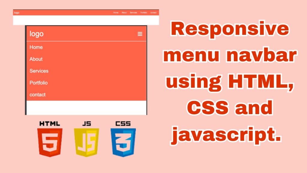
Creating a navigation menu bar is an essential aspect of web development, allowing users to navigate through various sections of a website seamlessly. By combining HTML, CSS, and JavaScript, developers can craft dynamic and visually appealing menu bars that enhance user experience and streamline navigation.

In this guide, we will explore step-by-step how to create a navigation menu bar from scratch using these three fundamental web development technologies. We’ll start by structuring the menu using HTML to define its components and layout. Then, we’ll style the menu with CSS to achieve the desired visual appearance, including colors, fonts, and animations. Finally, we’ll add interactivity and functionality using JavaScript to handle user interactions such as dropdown menus.

Whether you’re a beginner looking to learn the basics of web development or a seasoned developer aiming to enhance your skills, this tutorial will provide you with a comprehensive understanding of how to create a navigation menu bar that is both elegant and functional. Let’s dive in and start building!

create html file named index.html , we used html comment for better explanation.

<!DOCTYPE html> <!-- Specifies the document type and version of HTML -->
<html lang="en"> <!-- Specifies the language of the document (English) -->

<head>
    <meta charset="UTF-8"> <!-- Sets the character encoding to UTF-8 for universal character support -->
    <meta name="viewport" content="width=device-width, initial-scale=1.0"> <!-- Sets the viewport for responsive design -->
    <title>NavBar</title> <!-- Sets the title of the webpage -->
    <link rel="stylesheet" href="styles.css"> <!-- Links an external CSS stylesheet -->
</head>

<body>

   <header> <!-- Defines the header section of the webpage -->
    <div class="logo">logo</div> <!-- Creates a div for the logo with the text "logo" -->
    <nav> <!-- Defines the navigation section of the webpage -->
        <div class="hamburger">☰</div> <!-- Creates a div for the hamburger icon -->
        <ul class="menu"> <!-- Creates an unordered list for the menu items with the class "menu" -->
            <li><a href="#">Home</a></li> <!-- Creates a list item with a link to the "Home" page -->
            <li><a href="#">About</a></li> <!-- Creates a list item with a link to the "About" page -->
            <li><a href="#">Services</a></li> <!-- Creates a list item with a link to the "Services" page -->
            <li><a href="#">Portfolio</a></li> <!-- Creates a list item with a link to the "Portfolio" page -->
            <li><a href="#">contact</a></li> <!-- Creates a list item with a link to the "Contact" page -->
        </ul>
    </nav>
   </header>

    <script src="script.js"></script> <!-- Links an external JavaScript file -->
</body>
</html>

This HTML code defines a basic webpage structure with a header containing a logo and a navigation menu. The navigation menu includes a hamburger icon for mobile responsiveness and a list of menu items. Each menu item is a link to a specific page (though in this example, they are all placeholders with “#” as the href). Additionally, external CSS and JavaScript files are linked for styling and interactivity, respectively.

create html file named styles.css , we used CSS comment for better explanation.

/* Applies box-sizing border-box model to all elements */
* {
    box-sizing: border-box;
    padding: 0; /* Removes default padding */
    margin: 0; /* Removes default margin */
}

/* Applies Arial or sans-serif font family to the entire body */
body {
    font-family: Arial, sans-serif;
}

/* Styles the header element */
header {
    background-color: tomato; /* Sets the background color to tomato */
    display: flex; /* Enables flexbox layout */
    justify-content: space-between; /* Aligns items with space between */
    align-items: center; /* Aligns items vertically */
    padding: 10px; /* Adds padding */
}

/* Styles the logo class */
.logo {
    color: #fff; /* Sets text color to white */
    font-size: 24px; /* Sets font size to 24 pixels */
}

/* Styles the navigation element */
nav {
    display: flex; /* Enables flexbox layout */
    align-items: center; /* Aligns items vertically */
}

/* Styles the menu class */
.menu {
    display: flex; /* Enables flexbox layout */
    list-style: none; /* Removes default list styles */
}

/* Styles the list items within the menu */
.menu li {
    margin: 0 15px; /* Adds margin around list items */
}

/* Styles the anchor tags within the menu */
.menu li a {
    text-decoration: none; /* Removes underline from links */
    color: #fff; /* Sets text color to white */
}

/* Styles anchor tags within menu on hover */
.menu li a:hover {
    color: azure; /* Changes text color on hover */
}

/* Styles the hamburger icon */
.hamburger {
    display: none; /* Initially hides the hamburger icon */
    color: #fff; /* Sets text color to white */
    font-size: 24px; /* Sets font size to 24 pixels */
    cursor: pointer; /* Changes cursor to pointer */
}

/* Media query for screens with a maximum width of 768px */
@media (max-width: 768px) {
    /* Styles the menu for smaller screens */
    .menu {
        display: none; /* Initially hides the menu */
        flex-direction: column; /* Arranges items in a column */
        background-color: tomato; /* Sets background color to tomato */
        position: absolute; /* Positions menu absolutely */
        top: 50px; /* Sets distance from the top */
        right: 0; /* Aligns with the right edge */
        left: 0; /* Aligns with the left edge */
        z-index: 1; /* Sets stacking order */
        padding-left: 10px; /* Adds padding */
    }

    /* Styles list items within the menu for smaller screens */
    .menu li {
        margin: 10px 0; /* Adds margin */
    }

    /* Styles anchor tags within menu on hover for smaller screens */
    .menu li a:hover {
        color: rgb(127, 127, 121); /* Changes text color on hover */
    }

    /* Displays the hamburger icon for smaller screens */
    .hamburger {
        display: block; /* Shows the hamburger icon */
    }

    /* Styles the active state of the menu for smaller screens */
    .menu.active {
        display: flex; /* Shows the menu */
    }
}

create html file named script.js , we used javascript comment for better explanation.

// Selects the element with the class 'hamburger' and assigns it to the variable 'hamburger'
const hamburger = document.querySelector('.hamburger');

// Selects the element with the class 'menu' and assigns it to the variable 'menu'
const menu = document.querySelector('.menu');

// Adds a click event listener to the 'hamburger' element
hamburger.addEventListener('click', () => {
    // Toggles the 'active' class on the 'menu' element
    menu.classList.toggle('active');
});

Explanation:

  1. The querySelector() method is used to select HTML elements based on CSS selectors.
  2. The .hamburger class is typically assigned to the hamburger icon in a navigation menu, and the .menu class is assigned to the menu itself.
  3. The addEventListener() method is used to listen for a click event on the hamburger icon.
  4. When the hamburger icon is clicked, the provided arrow function is executed.
  5. Within the arrow function, the classList.toggle() method is used to toggle the presence of the active class on the menu element. If the class is not present, it adds it; if it’s present, it removes it.

This JavaScript code enables a simple toggle functionality for the menu when the hamburger icon is clicked. It adds or removes the active class on the menu element, allowing for the menu to appear or disappear based on its current state.

In conclusion, creating a navigation menu bar using HTML, CSS, and JavaScript is a fundamental aspect of web development that significantly enhances user experience and improves website navigation. Throughout this guide, we’ve covered the step-by-step process of building a navigation menu bar from scratch, starting with structuring the menu using HTML, styling it using CSS to achieve the desired visual appearance, and adding interactivity and functionality using JavaScript to handle user interactions.

By combining these three technologies, developers can create navigation menu bars that are not only visually appealing but also dynamic and user-friendly. From basic menu layouts to more advanced features such as dropdown menus, mobile responsiveness, and animations, the possibilities are endless.

Whether you’re a beginner or an experienced developer, mastering the creation of navigation menu bars using HTML, CSS, and JavaScript is essential for building modern and intuitive websites. With the knowledge gained from this guide, you’ll be well-equipped to design and implement navigation menu bars that cater to the needs of your users, ultimately contributing to the overall success of your web projects. Happy coding!

How to Create A Navigation menu Bar using HTML ,CSS and Javascript

Leave a Reply

Your email address will not be published. Required fields are marked *

Scroll to top