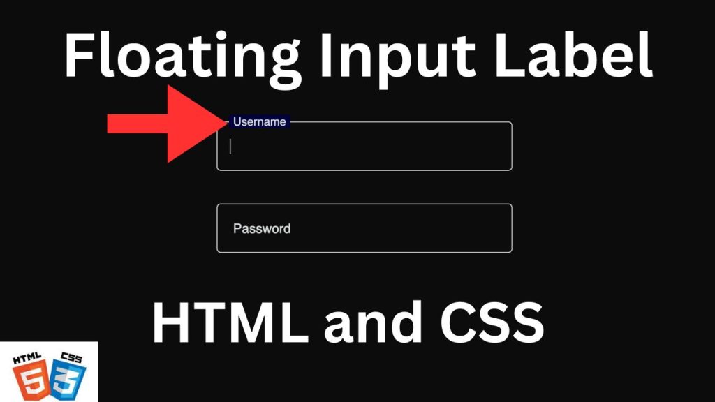
Floating labels are clean, fancy and modern way of showing input label getting rid of old boring label style resulting in user experience. FLoating labels help users understand what they should specigy, because the label never disappears if field is focused or filled. This tutorial will show you how to create Floating Labels Using HTML and CSS. No worries this tutorial will help you to add that fancy feature in your web forms even if it goes beyond javascript.now whether angular,react or native Android, etc.
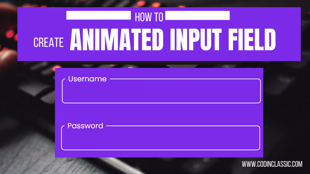
Step-by-Step Guide to Creating Floating Labels
Step 1: Basic HTML Structure
Start by setting up a simple HTML form with input fields and labels. Here’s the basic structure:
Step 2: Styling with CSS
Next, we’ll add CSS to style the form and create the floating label effect. Here’s the CSS code:
<!DOCTYPE html>
<html lang="en">
<head>
<!-- Specifies the character encoding for the HTML document -->
<meta charset="UTF-8">
<!-- Sets the viewport to ensure the website is responsive -->
<meta name="viewport" content="width=device-width, initial-scale=1.0">
<!-- Defines the title of the HTML document, which appears in the browser's title bar or tab -->
<title>Floating Label</title>
<!-- Links to an external CSS file named "style.css" to apply styles to the HTML document -->
<link rel="stylesheet" href="style.css">
</head>
<body>
<!-- A div container for the first input field and its label -->
<div class="input-group">
<!-- Input field for the user's surname; the "required" attribute means the form cannot be submitted without filling this field -->
<input type="text" required>
<!-- Label for the input field, positioned to float over the input when the user starts typing -->
<label>Surname</label>
</div>
<!-- A div container for the second input field and its label -->
<div class="input-group">
<!-- Input field for the user's password; the "password" type hides the entered text, and the "required" attribute ensures it must be filled -->
<input type="password" required>
<!-- Label for the input field, positioned to float over the input when the user starts typing -->
<label>Password</label>
</div>
</body>
</html>
<!DOCTYPE html>
: This declaration defines the document type and version of HTML. It ensures the browser interprets the document as HTML5.
<html lang="en">
: The root element of the HTML document. The lang
attribute specifies the language of the document’s content (English in this case).
<head>
: Contains meta-information about the HTML document, such as the character encoding, viewport settings, and links to external resources like CSS files.
<meta charset="UTF-8">
: Defines the character encoding for the document as UTF-8, which supports a wide range of characters from different languages.
<meta name="viewport" content="width=device-width, initial-scale=1.0">
: Ensures the webpage is responsive by setting the width of the viewport to the device’s width and scaling the initial size appropriately.
<title>Floating Label</title>
: Sets the title of the document, which is displayed in the browser’s title bar or tab.
<link rel="stylesheet" href="style.css">
: Links an external CSS file (style.css
) to style the HTML document.
<body>
: Contains the main content of the HTML document that is visible to the user.
<div class="input-group">
: A container for grouping an input field and its associated label together. The class
attribute is used to apply CSS styles to the group.
<input type="text" required>
: An input field where users can enter text. The required
attribute makes it mandatory to fill this field before submitting a form.
<label>Surname</label>
: A label for the input field. When styled with CSS, it will float over the input field when the user starts typing.
<input type="password" required>
: An input field for entering a password. The password
type hides the text entered for security. The required
attribute ensures the field must be filled out.
<label>Password</label>
: A label for the password input field, which will float over the input field when styled appropriately with CSS.
css structure:
/* Universal selector to apply common styles to all elements */
/* Remove default margin and padding from all elements */
/* Use border-box sizing so padding and border are included in the element's total width and height */
* {
margin: 0;
padding: 0;
box-sizing: border-box;
}
/* Style the body element to center content and set the background color */
/* Use flexbox to center content both horizontally and vertically */
/* Set the height to at least the full viewport height */
body {
display: flex; /* Enable flexbox layout */
min-height: 100vh; /* Ensure the body is at least 100% of the viewport height */
justify-content: center; /* Center flex items horizontally */
align-items: center; /* Center flex items vertically */
flex-direction: column; /* Stack flex items vertically */
background: #0d0d0d; /* Set a dark background color */
}
/* Container for each input field and its label */
/* Use margin to create vertical spacing between input groups */
.input-group {
margin: 20px 0; /* Add 20px of vertical margin */
position: relative; /* Set positioning context for the label */
}
/* Style the label inside the input group */
/* Position the label absolutely within the input group container */
/* Use transform to center the label vertically */
.input-group label {
position: absolute; /* Position absolutely within the input group */
transform: translateY(-50%); /* Center the label vertically using translate */
top: 50%; /* Position the label at the vertical center of the input group */
left: 15px; /* Add padding to the left of the label */
font-size: 16px; /* Set the font size */
pointer-events: none; /* Prevent the label from being clickable */
color: rgb(218, 223, 223); /* Set the label color */
padding: 0 5px; /* Add horizontal padding to the label */
transition: .5s; /* Smooth transition for label movements */
}
/* Style the input field */
/* Set dimensions, colors, and other styling properties */
.input-group input {
width: 360px; /* Set the width of the input field */
height: 60px; /* Set the height of the input field */
color: #fff; /* Set the text color inside the input */
font-size: 16px; /* Set the font size of the input text */
padding: 0 15px; /* Add horizontal padding inside the input */
border: 1.2px solid rgb(220, 223, 223); /* Set the border color and width */
background: transparent; /* Make the background transparent */
outline: none; /* Remove the default outline when the input is focused */
border-radius: 5px; /* Round the corners of the input */
}
/* Style the label when the input is focused or contains text */
/* Move the label above the input field */
/* Change the background color behind the label text */
/* Reduce the font size of the label */
.input-group input:focus~label,
.input-group input:valid~label {
top: 0; /* Move the label to the top of the input group */
background: #010031; /* Set the background color behind the label text */
font-size: 14px; /* Reduce the font size of the label */
}
Conclusion:
In summary, floating labels are an effective method for enhancing the usability and appearance of forms in web development. By using HTML and CSS, developers can design input fields that are both attractive and functional, thereby improving the user experience. When used thoughtfully and appropriately, floating labels can significantly improve form design, making it more intuitive, efficient, and visually appealing.