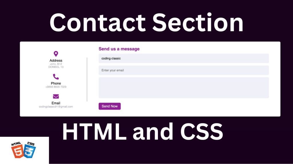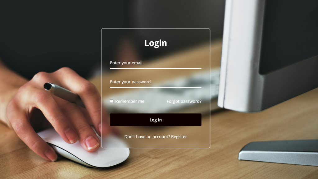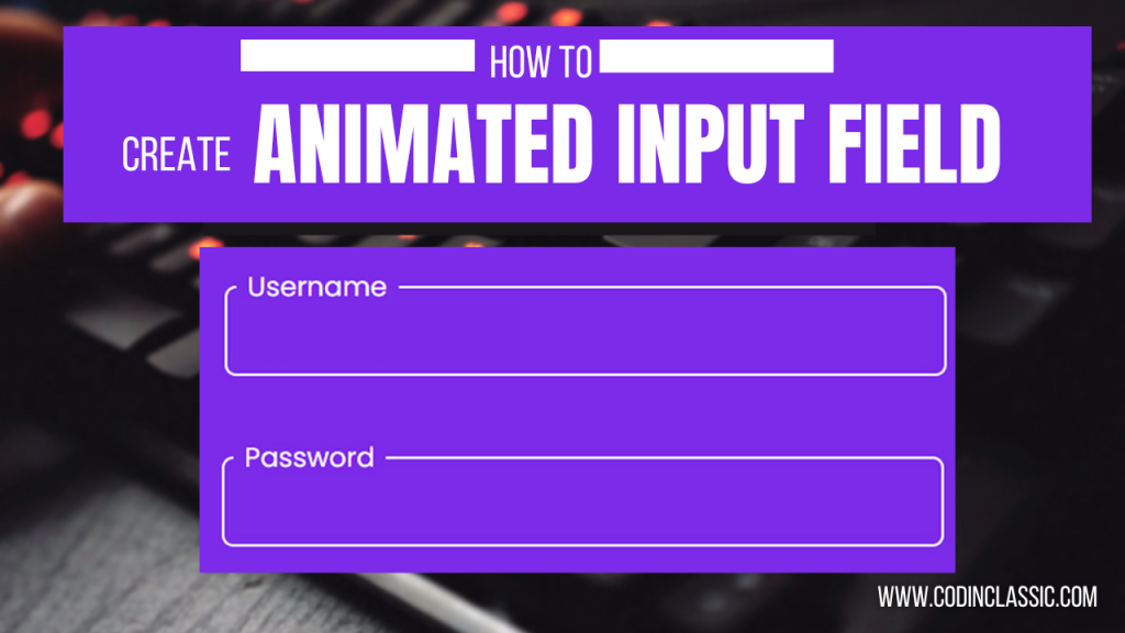
Have you ever visited a website on your phone, tried to fill out a contact form, and found yourself pinching and zooming just to hit the right fields? Frustrating, right? Well, today we’re going to put an end to that! Let’s dive into creating a responsive contact form that looks great on any device, using just HTML and CSS. No JavaScript required!
This contact form is fully responsive. To see a live demo of this contact page and view all the code used to create it, you can watch the complete video tutorial provided below.
WATCH VIDEO TUTORIA:
Setting Up the HTML Structure
First things first, let’s create the backbone of our form with HTML. We’ll keep it simple with fields for name, email and message.
Styling with CSS
Now, let’s make our form look good! We’ll use CSS to give it a clean, modern look that adapts to different screen sizes.
Summary of Key Points:
- Global Reset: The
*selector resets margin and padding for all elements and setsbox-sizingtoborder-boxto include padding and border in the element’s total width and height. - Body Styling: Centers the content both vertically and horizontally with a dark background and full viewport height.
- Container: The main wrapper with padding, shadow, white background, and rounded corners.
- Content Layout: Uses flexbox to arrange the left and right sections side by side.
- Left Side: Contains contact details with icons and text, and a pseudo-element for a vertical line.
- Right Side: Contains the form fields with styled inputs, a message box, and a submit button.
- Responsive Design: Media queries adjust the layout and sizes for smaller screens, including stacking the sections vertically on very small screens.
CONCLUSION
Creating a responsive “Contact Us” form using HTML and CSS is a fundamental skill for web developers, ensuring seamless communication between users and website owners. By following the steps outlined in this guide, you can design a visually appealing and functional contact form that works well on all devices.
Key Takeaways:
- Responsive Design: Utilize CSS media queries to adapt the form layout to different screen sizes, ensuring a user-friendly experience on both desktops and mobile devices.
- HTML Structure: Organize the form elements logically using semantic HTML to enhance accessibility and improve search engine optimization (SEO).
- Styling with CSS: Apply CSS styles to enhance the appearance and usability of the form, including hover effects, padding, and font choices.
- Flexbox Layout: Use flexbox for a modern and flexible layout, making it easier to align and distribute form elements.
- User Experience: Incorporate intuitive input fields and clear labels to guide users, making it easy for them to submit their information.
By mastering these techniques, you can create a responsive “Contact Us” form that not only looks great but also provides a smooth and engaging user experience. Keep experimenting with different styles and layouts to find the best fit for your website, and remember that a well-designed contact form is a key component in building strong, trustful relationships with your users.

