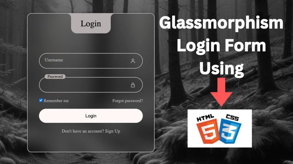
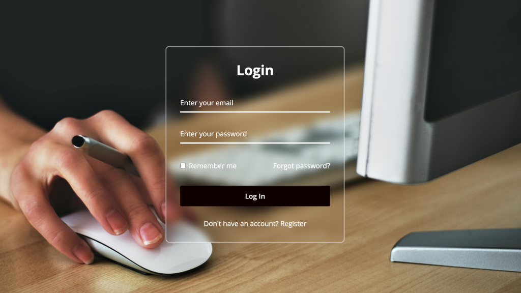
Creating a visually appealing and functional login form is a key element in web design. With the rise of glassmorphism, a design trend that uses frosted glass effects to create a modern and sleek appearance, you can elevate the look of your forms. This tutorial will guide you through the process of building a modern login form using HTML and CSS, incorporating the glassmorphism effect to give your form a polished and contemporary look. Whether you are a beginner or an experienced developer, this step-by-step guide will help you create a stunning login form for your website.
WATCH VIDEO:
1. Setting Up the HTML Structure
First, we need to set up the basic HTML structure for our login form. This includes creating a form element, input fields for the username and password, and a submit button.
<!DOCTYPE html>
<!-- Declares the document type and version, which is HTML5 -->
<html lang="en">
<!-- Opens the HTML document and sets the language to English -->
<head>
<meta charset="UTF-8">
<!-- Sets the character encoding for the document to UTF-8 -->
<meta name="viewport" content="width=device-width, initial-scale=1.0">
<!-- Ensures proper rendering and touch zooming on mobile devices -->
<title>Login Form by coding classic</title>
<!-- Sets the title of the web page to "Login Form by coding classic" -->
<link rel="stylesheet" href="style.css">
<!-- Links to an external CSS file named "style.css" for styling -->
<link rel="stylesheet" href="https://cdnjs.cloudflare.com/ajax/libs/font-awesome/6.6.0/css/all.min.css">
<!-- Links to the Font Awesome library for using icons -->
</head>
<body>
<!-- Opens the body of the HTML document where the content is placed -->
<div class="container">
<!-- A container div that wraps the entire login form -->
<div class="login_container">
<!-- A div specifically for the login form content -->
<div class="login_title">
<span>Login</span>
<!-- A div for the login title with a span element containing the text "Login" -->
</div>
<div class="input_wrapper">
<!-- A wrapper div for the username input field and its related elements -->
<input type="text" id="user" class="input_field" required>
<!-- An input field for the username, with an id of "user" and a class of "input_field", marked as required -->
<label for="user" class="label">Username</label>
<!-- A label for the username input field, associated with the input by the "for" attribute -->
<i class="fa-regular fa-user icon"></i>
<!-- A Font Awesome icon representing a user -->
</div>
<div class="input_wrapper">
<!-- A wrapper div for the password input field and its related elements -->
<input type="password" id="pass" class="input_field" required>
<!-- An input field for the password, with an id of "pass" and a class of "input_field", marked as required -->
<label for="pass" class="label">Password</label>
<!-- A label for the password input field, associated with the input by the "for" attribute -->
<i class="fa-solid fa-lock icon"></i>
<!-- A Font Awesome icon representing a lock (for password) -->
</div>
<div class="remember-forgot">
<!-- A div that contains the "Remember Me" checkbox and "Forgot Password" link -->
<div class="remember-me">
<input type="checkbox" id="remember">
<!-- A checkbox input for "Remember Me", with an id of "remember" -->
<label for="remember">Remember Me</label>
<!-- A label for the "Remember Me" checkbox, associated with the input by the "for" attribute -->
</div>
<div class="forgot">
<a href="#">Forgot Password</a>
<!-- A link for "Forgot Password" -->
</div>
</div>
<div class="input_wrapper">
<!-- A wrapper div for the submit button -->
<input type="submit" class="input-submit" value="Login">
<!-- A submit button with a class of "input-submit" and a value of "Login" -->
</div>
<div class="signup">
<span>Don't have an account <a href="#">Sign Up</a></span>
<!-- A div for the signup link, with a span element containing the text and link for "Sign Up" -->
</div>
</div>
</div>
</body>
<!-- Closes the body of the HTML document -->
</html>
<!-- Closes the HTML document -->
2. Styling the Login Form with CSS
Next, we will use CSS to style our login form and apply the glassmorphism effect. We’ll start by defining the basic styles for the body and the login container.
```css
* {
padding: 0; /* Reset padding for all elements */
margin: 0; /* Reset margin for all elements */
box-sizing: border-box; /* Include padding and border in the element's total width and height */
}
:root {
--second-color: #b9b9b9; /* Define a secondary color variable */
--primary-color: #b5afaf; /* Define a primary color variable */
--black-color: #020101; /* Define a black color variable */
}
body {
background-position: center; /* Center the background image */
background-image: url("bg.jpeg"); /* Set the background image */
background-repeat: no-repeat; /* Prevent the background image from repeating */
background-size: cover; /* Ensure the background image covers the entire body */
background-attachment: fixed; /* Keep the background image fixed in place while scrolling */
}
a {
color: var(--second-color); /* Set the link color to the secondary color */
text-decoration: none; /* Remove the default underline from links */
}
a:hover {
text-decoration: underline; /* Add underline to links when hovered */
}
.container {
display: flex; /* Use flexbox layout for the container */
width: 100%; /* Make the container span the full width of the viewport */
min-height: 100vh; /* Ensure the container takes at least the full height of the viewport */
justify-content: center; /* Center the content horizontally */
align-items: center; /* Center the content vertically */
background-color: rgba(0, 0, 0, 0.2); /* Apply a semi-transparent black background */
}
.login_container {
position: relative; /* Allow for absolute positioning of child elements */
backdrop-filter: blur(25px); /* Apply a blur effect for a glassmorphism look */
width: 450px; /* Set a fixed width for the login container */
border: 2px solid var(--primary-color); /* Add a border with the primary color */
padding: 7.5em 2.5em 4em 2.5em; /* Add padding inside the container */
border-radius: 15px; /* Round the corners of the container */
box-shadow: 0px 0px 10px 2px rgba(0, 0, 0, 0.2); /* Add a shadow for depth */
color: var(--second-color); /* Set the text color to the secondary color */
}
.login_title {
position: absolute; /* Position absolutely within the login container */
left: 50%; /* Center the title horizontally */
top: 0; /* Align the title to the top of the container */
display: flex; /* Use flexbox layout for the title */
transform: translateX(-50%); /* Offset by 50% of its own width to center */
justify-content: center; /* Center the content horizontally within the title */
align-items: center; /* Center the content vertically within the title */
width: 140px; /* Set a fixed width for the title */
background-color: var(--primary-color); /* Set the background color to the primary color */
border-radius: 0 0 20px 20px; /* Round the bottom corners of the title */
height: 70px; /* Set a fixed height for the title */
}
.login_title span {
color: var(--black-color); /* Set the text color to black */
font-size: 30px; /* Set the font size for the title text */
}
.login_title::before {
content: ""; /* Creates an empty content before the element */
top: 0; /* Position at the top */
left: -30px; /* Position 30px to the left of the parent element */
position: absolute; /* Position relative to the parent element */
border-top-right-radius: 50%; /* Creates a rounded corner on the top right */
width: 30px; /* Set the width to 30px */
height: 30px; /* Set the height to 30px */
box-shadow: 15px 0 0 0 var(--primary-color); /* Creates a shadow to simulate a rounded edge */
background: transparent; /* Make the background transparent */
}
.login_title::after {
content: ""; /* Creates an empty content after the element */
top: 0; /* Position at the top */
position: absolute; /* Position relative to the parent element */
height: 30px; /* Set the height to 30px */
right: -30px; /* Position 30px to the right of the parent element */
width: 30px; /* Set the width to 30px */
background: transparent; /* Make the background transparent */
border-top-left-radius: 50%; /* Creates a rounded corner on the top left */
box-shadow: -15px 0 0 0 var(--primary-color); /* Creates a shadow to simulate a rounded edge */
}
.input_wrapper {
position: relative; /* Position relative to its parent element */
flex-direction: column; /* Arrange children in a column */
display: flex; /* Use flexbox layout for the container */
margin: 20px 0; /* Add vertical margins of 20px */
}
.input_field {
width: 100%; /* Set the width to 100% of the parent */
font-size: 16px; /* Set the font size to 16px */
height: 55px; /* Set the height to 55px */
color: var(--second-color); /* Set the text color to the secondary color */
background: transparent; /* Make the background transparent */
padding-inline: 20px 54px; /* Add horizontal padding of 20px on the left and 54px on the right */
border-radius: 30px; /* Round the corners of the input field */
border: 2px solid var(--primary-color); /* Add a 2px solid border with the primary color */
outline: none; /* Remove the default outline */
}
#user {
margin-bottom: 10px; /* Add a bottom margin of 10px to the user input */
}
.label {
position: absolute; /* Position absolutely within the parent element */
transition: 0.2s; /* Add a transition effect of 0.2 seconds */
top: 15px; /* Position 15px from the top */
left: 20px; /* Position 20px from the left */
}
.input_field:focus ~ .label,
.input_field:valid .label {
position: absolute; /* Position absolutely within the parent element */
font-size: 14px; /* Set the font size to 14px */
top: -10px; /* Position 10px above the top */
left: 20px; /* Position 20px from the left */
background-color: var(--primary-color); /* Set the background color to the primary color */
color: var(--black-color); /* Set the text color to black */
border-radius: 30px; /* Round the corners of the label */
padding: 0 10px; /* Add horizontal padding of 10px */
}
.icon {
position: absolute; /* Position absolutely within the parent element */
font-size: 20px; /* Set the font size to 20px */
top: 18px; /* Position 18px from the top */
right: 25px; /* Position 25px from the right */
}
.remember-forgot {
justify-content: space-between; /* Distribute space between children elements */
display: flex; /* Use flexbox layout for the container */
font-size: 15px; /* Set the font size to 15px */
}
.input-submit {
background: #fff6f6; /* Set the background color to a light shade */
width: 100%; /* Set the width to 100% of the parent */
height: 50px; /* Set the height to 50px */
font-size: 16px; /* Set the font size to 16px */
border-radius: 30px; /* Round the corners of the button */
cursor: pointer; /* Change the cursor to a pointer on hover */
font-weight: 500; /* Set the font weight to 500 */
border: none; /* Remove the default border */
transition: 0.3s; /* Add a transition effect of 0.3 seconds */
}
.input-submit:hover {
background: var(--second-color); /* Change the background color to the secondary color on hover */
}
.signup {
text-align: center; /* Center align the text */
}
.signup a {
font-weight: 500; /* Set the font weight to 500 for the link */
}
@media only screen and (max-width: 564px) {
.container {
padding: 20px; /* Add padding of 20px */
}
.login_container {
padding: 7.5em 1.5em 4em 1.5em; /* Adjust padding for smaller screens */
}
}
```
Conclusion
By following this tutorial, you’ve successfully created a modern login form using HTML and CSS, featuring the glassmorphism effect. This sleek, frosted glass design not only enhances the visual appeal of your form but also provides a smooth and engaging user experience. Feel free to customize further and integrate this form into your projects, enhancing your web design with a touch of modern elegance.
Thank you for following along! If you have any questions or feedback, feel free to leave a comment below. Happy coding!