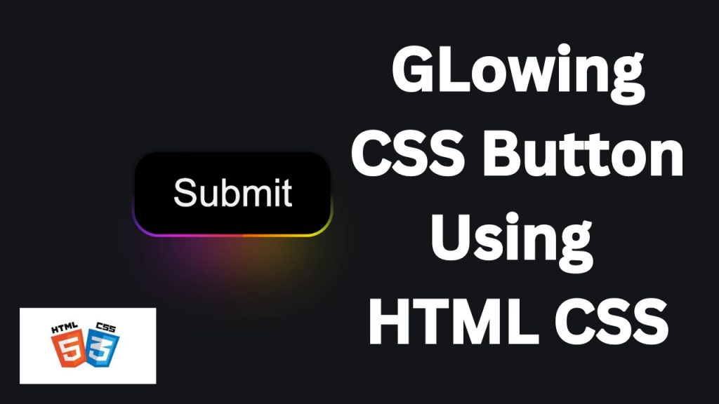
Buttons are fundamental elements in web design, serving as key interactive components that guide users through a website. While a simple button can suffice, adding a glowing effect can make it stand out, giving your site a modern and dynamic feel. In this tutorial, we’ll walk you through the steps to create a glowing button using HTML and CSS. This effect is not only visually appealing but also easy to implement, making it a great addition to any web project.
Step 1: Setting Up the HTML
First, let’s create a basic HTML structure for our button. We’ll wrap the button in a div
for better styling control.
<!DOCTYPE html>
<!--
This declaration defines the document type and version of HTML.
It tells the browser that this document is using HTML5, the latest version of HTML.
-->
<html lang="en">
<!--
The <html> tag is the root element of the HTML document.
The 'lang' attribute specifies the language of the content inside the document, which in this case is English ("en").
-->
<head>
<!--
The <head> section contains meta-information about the document,
such as character encoding, the viewport settings for responsive design, stylesheets, and the title.
-->
<meta charset="UTF-8">
<!--
The <meta> tag with 'charset="UTF-8"' specifies the character encoding for the document.
UTF-8 is a standard character encoding that covers almost all characters and symbols in the world,
ensuring that your content is displayed correctly.
-->
<meta name="viewport" content="width=device-width, initial-scale=1.0">
<!--
This <meta> tag ensures that the page is responsive by controlling the viewport's size and scale.
'width=device-width' sets the width of the viewport to match the width of the device.
'initial-scale=1.0' sets the initial zoom level when the page is first loaded by the browser.
-->
<link rel="stylesheet" href="./style.css">
<!--
The <link> tag links external resources to the document.
Here, it links an external CSS file (style.css) that contains the styles for the webpage.
The './' before 'style.css' indicates that the file is located in the same directory as the HTML file.
-->
<title>Glowing Button by coding classic</title>
<!--
The <title> tag sets the title of the webpage, which appears in the browser tab or window title.
In this case, it is set to "Glowing Button".
-->
</head>
<body>
<!--
The <body> tag contains all the content of the HTML document, including text, images, links, buttons, etc.,
that will be displayed on the web page.
-->
<button>Get Started</button>
<!--
This <button> tag creates a clickable button with the label "Get Started".
This button can be styled using CSS, which is linked in the <head> section via the style.css file.
-->
</body>
</html>
<!--
The closing </html> tag ends the HTML document.
-->
Step 2: Adding the CSS
Now that we have our HTML set up, it’s time to style the button using CSS to create the glowing effect.
@import url('https://fonts.googleapis.com/css?family=Space%20Grotesk:700|Space%20Grotesk:400');
/*
The @import rule is used to include external CSS files or resources.
Here, a Google Font called "Space Grotesk" is imported with two weights: 700 (bold) and 400 (regular).
This font will be used in the button text.
*/
:root {
/*
The :root pseudo-class represents the highest-level parent in the document,
which is the <html> element. It is often used to define CSS variables (custom properties)
that can be reused throughout the CSS file.
*/
/* This variable controls the scaling factor for various dimensions in the design.
Changing this value will proportionally scale the button's size, padding, and other properties. */
--m: 4rem;
/* Color variables for a vibrant gradient spectrum */
--red: #FF6565;
--pink: #FF64F9;
--purple: #6B5FFF;
--blue: #4D8AFF;
--green: #5BFF89;
--yellow: #FFEE55;
--orange: #FF6D1B;
}
body {
/*
The body element is styled to create a centered layout on the page,
both horizontally and vertically.
*/
background-color: #141516; /* A dark background color for the page */
display: flex; /* Using flexbox for layout */
flex-direction: column; /* Arrange content in a column (though there’s only one button) */
justify-content: center; /* Center content vertically */
align-items: center; /* Center content horizontally */
height: 100vh; /* Full viewport height */
margin: 0; /* Remove any default margin around the body */
}
button {
/*
The button element is styled with various properties to create a glowing effect.
*/
border: calc(0.08 * var(--m)) solid transparent; /* Transparent border scaled with --m */
position: relative; /* Relative positioning for layering effects */
color: #F3F3F3; /* Light gray color for the button text */
font-family: 'Space Grotesk'; /* Apply the imported font to the button text */
font-size: var(--m); /* Font size scaled with --m */
border-radius: calc(0.7 * var(--m)); /* Rounded corners for the button, scaled with --m */
padding: calc(0.5 * var(--m)) calc(1 * var(--m)); /* Padding inside the button, scaled with --m */
display: flex; /* Flexbox for centering text inside the button */
justify-content: center; /* Center the button text horizontally */
cursor: pointer; /* Change cursor to a pointer on hover, indicating interactivity */
/*
Three background layers are defined:
1. The first linear gradient (dark) fills the button's padding-box area.
2. The second gradient creates a subtle shadow effect within the button.
3. The third gradient creates a multicolored border-like effect,
using the color variables defined earlier.
*/
background:linear-gradient(#121213, #121213),
linear-gradient(#121213 50%, rgba(18, 18, 19, 0.6) 80%, rgba(18, 18, 19, 0)),
linear-gradient(90deg, var(--orange), var(--yellow), var(--green), var(--blue), var(--purple), var(--pink), var(--red));
background-origin: border-box; /* The third gradient stays within the border area */
background-clip: padding-box, border-box, border-box; /* Clipping to control where the background shows */
background-size: 200%; /* The background gradient is twice the size of the button to allow for animation */
animation: animate 2s infinite linear; /* Apply a smooth, infinite animation to the background */
}
button::before {
/*
The ::before pseudo-element creates an additional layer behind the button,
contributing to the glowing effect.
*/
content: ''; /* Required for pseudo-elements; it adds an empty content string */
background: linear-gradient(90deg, var(--orange), var(--yellow), var(--green), var(--blue), var(--purple), var(--pink), var(--red));
/* The same multicolored gradient used in the button's border */
height: 30%; /* Height of the glowing effect area */
width: 60%; /* Width of the glowing effect area */
position: absolute; /* Absolute positioning relative to the button */
bottom: -20%; /* Position the glow slightly below the button */
z-index: -5; /* Place the glow behind the button */
background-size: 200%; /* Double the size of the gradient for animation purposes */
animation: animate 2s infinite linear; /* Apply the same animation as the button's background */
filter: blur(calc(0.8 * var(--m))); /* Blur the glowing effect for a softer appearance */
}
button:hover, button:hover::before {
/*
Change the animation speed when the button is hovered over.
Both the button and its ::before pseudo-element will animate faster on hover.
*/
animation: animate 0.5s infinite linear;
}
@keyframes animate {
/*
The @keyframes rule defines the animation for the gradient background.
It shifts the gradient from the starting position to the end, creating a flowing effect.
*/
0% {background-position: 0}
100% {background-position: 200%}
}
@media screen and (max-width: 1000px) {
/*
Media query to adjust styles on screens narrower than 1000px.
This makes the design more responsive.
*/
:root {
--m: 2rem; /* Reduce the scaling factor on smaller screens for better layout adaptation */
}
}
Step 3: Testing and Refining
After applying the CSS, save your files and open the HTML document in a web browser. You should see a button with a glowing effect that activates when hovered over and slightly changes when clicked. You can adjust the colors, shadow sizes, and other parameters to match your website’s design.
Conclusion
Adding a glowing button to your website is a simple yet effective way to enhance its interactivity and visual appeal. With just a few lines of HTML and CSS, you can create a button that not only looks great but also grabs the user’s attention. Experiment with different colors and shadow effects to create a unique design that complements your site’s overall aesthetic. Whether you’re designing a landing page, a call-to-action button, or just want to add some flair to your web project, a glowing button is a great tool to have in your web design.