Coding classic

html, css, javascript, react, python

How to Create Password Generator in HTML CSS & JavaScript

Building a Secure Password Generator with HTML CSS and JavaScript

In today’s digital world, strong passwords are essential for protecting our online accounts. A password generator can help us create complex and unique passwords that are difficult to guess. In this article, we’ll learn how to build a simple yet effective password generator using HTML, CSS, and JavaScript.

1. HTML Structure

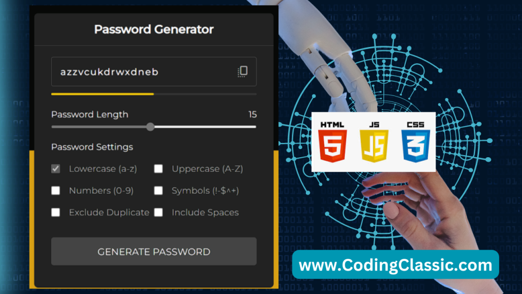
This HTML document creates a user interface for a password generator tool. The layout consists of a main container featuring a title, various input fields, a password strength display, length selection options, and checkboxes to customize password settings. It also includes a button to trigger password generation. The document references separate CSS and JavaScript files for styling and functionality, respectively. It includes two Google Fonts: “Material Symbols Rounded” for icons and “Montserrat” for text.

<!DOCTYPE html>
<html lang="en">
<head>
  <meta charset="UTF-8">
  <title>Password Generator</title>

  <!-- Import Google Fonts for styling -->
  <link rel='stylesheet' href='https://fonts.googleapis.com/css2?family=Material+Symbols+Rounded:opsz,wght,FILL,GRAD@20..48,100..700,0..1,-50..200'>
  <link rel='stylesheet' href='https://fonts.googleapis.com/css2?family=Montserrat:wght@400;500&display=swap'>

  <!-- Link to external CSS file for custom styles -->
  <link rel="stylesheet" href="./style.css">
</head>
<body>
<!-- Main container for the password generator interface -->
<div class="container">
  <h2>Password Generator</h2> <!-- Header for the password generator -->

  <!-- Wrapper containing input box, indicator, length slider, and settings -->
  <div class="wrapper">
    
    <!-- Input box for displaying the generated password (disabled for user input) -->
    <div class="input-box">
      <input type="text" disabled>
      <span class="material-symbols-rounded">copy_all</span> <!-- Icon for copy functionality -->
    </div>

    <!-- Password strength indicator (visual representation of strength) -->
    <div class="pass-indicator"></div>

    <!-- Slider to adjust password length -->
    <div class="pass-length">
      <div class="details">
        <label class="title">Password Length</label> <!-- Label for the slider -->
        <span></span> <!-- Placeholder for displaying the chosen length -->
      </div>
      <input type="range" min="1" max="30" value="15" step="1"> <!-- Range slider to select length -->
    </div>

    <!-- Password settings with various options -->
    <div class="pass-settings">
      <label class="title">Password Settings</label> <!-- Label for settings section -->
      
      <!-- List of options for generating the password -->
      <ul class="options">
        
        <!-- Option to include lowercase letters -->
        <li class="option">
          <input type="checkbox" id="lowercase" checked>
          <label for="lowercase">Lowercase (a-z)</label>
        </li>

        <!-- Option to include uppercase letters -->
        <li class="option">
          <input type="checkbox" id="uppercase">
          <label for="uppercase">Uppercase (A-Z)</label>
        </li>

        <!-- Option to include numbers -->
        <li class="option">
          <input type="checkbox" id="numbers">
          <label for="numbers">Numbers (0-9)</label>
        </li>

        <!-- Option to include symbols -->
        <li class="option">
          <input type="checkbox" id="symbols">
          <label for="symbols">Symbols (!-$^+)</label>
        </li>

        <!-- Option to exclude duplicate characters -->
        <li class="option">
          <input type="checkbox" id="exc-duplicate">
          <label for="exc-duplicate">Exclude Duplicate</label>
        </li>

        <!-- Option to include spaces -->
        <li class="option">
          <input type="checkbox" id="spaces">
          <label for="spaces">Include Spaces</label>
        </li>
      </ul>
    </div>

    <!-- Button to generate the password -->
    <button class="generate-btn">Generate Password</button>
  </div>
</div>

<!-- Link to external JavaScript file for interactivity -->
<script src="./script.js"></script>

</body>
</html>

2. CSS Styling

This CSS defines the visual design for a password generator interface, giving it a contemporary appearance. It employs the “Montserrat” typeface and a gradient background. The stylesheet formats various elements including input boxes, a password strength meter, length selection options, and setting checkboxes. The password generation button features interactive effects for hover and click states. The layout adapts to accommodate smaller screen sizes, ensuring responsiveness.

/* Universal selector to remove default margin and padding from all elements.
   Sets box-sizing to border-box, ensuring padding and borders are included in element's width/height.
   Sets a default font and text color for all elements. */
* {
  margin: 0;
  padding: 0;
  box-sizing: border-box;
  font-family: "Montserrat", sans-serif;
  color: #fff; /* White text color for all elements */
}

/* Body styling for centering content both vertically and horizontally.
   Sets a background with a linear gradient split 50/50 vertically. */
body {
  display: flex;
  align-items: center;
  justify-content: center;
  min-height: 100vh; /* Full viewport height */
  background: linear-gradient(180deg, #070807 50%, #dca314 50%);
}

/* Container for the password generator box.
   Sets the width, background color, rounded corners, and box shadow for a card-like appearance. */
.container {
  width: 430px;
  background: #222; /* Dark background for contrast */
  border-radius: 7px;
  box-shadow: 0 10px 20px rgba(0, 0, 0, 0.05); /* Subtle shadow for depth */
}

/* Styles for the header inside the container.
   Sets font properties, padding, and a border-bottom for separation. */
.container h2 {
  font-weight: 600;
  font-size: 21px;
  padding: 16px 30px;
  border-bottom: 1px solid #444;
  text-align: center; /* Centers the text */
}

/* Wrapper for content inside the container, adds margin for spacing. */
.wrapper {
  margin: 20px 30px;
}

/* Input box styling, relative positioning for icons inside the box. */
.input-box {
  position: relative;
}

/* Styling for the input field where the password is displayed.
   Sets width, height, text color, background, font size, border, padding, and letter spacing. */
.input-box input {
  width: 100%;
  height: 53px;
  color: #fff;
  background: none; /* Transparent background */
  font-size: 17px;
  font-weight: 500;
  border-radius: 4px;
  letter-spacing: 1.4px; /* Adds spacing between letters */
  border: 1px solid #555; /* Border color */
  padding: 0 48px 0 16px; /* Padding for text and space for icon */
}

/* Styling for the icon inside the input box.
   Positions it to the right and vertically centers it.
   Changes color on hover. */
.input-box span {
  position: absolute;
  right: 13px;
  cursor: pointer; /* Cursor changes to pointer when hovering */
  line-height: 53px; /* Centers icon vertically */
  color: #aaa; /* Light gray color */
}

.input-box span:hover {
  color: #4285f4 !important; /* Changes icon color to blue on hover */
}

/* Password strength indicator bar.
   Initial state has a dark background and rounded edges. */
.pass-indicator {
  width: 100%;
  height: 4px;
  position: relative;
  background: #333;
  margin-top: 12px;
  border-radius: 25px;
}

/* Indicator bar that grows in width based on password strength.
   Width and color change based on strength (weak, medium, strong). */
.pass-indicator::before {
  position: absolute;
  content: "";
  height: 100%;
  width: 0; /* Initial width */
  border-radius: inherit; /* Inherits border radius from parent */
  transition: width 0.3s ease; /* Smooth transition effect */
}

.pass-indicator#weak::before {
  width: 20%;
  background: #e64a4a; /* Red color for weak password */
}

.pass-indicator#medium::before {
  width: 50%;
  background: #f1c80b; /* Yellow color for medium password */
}

.pass-indicator#strong::before {
  width: 100%;
  background: #27c468; /* Green color for strong password */
}

/* Styling for the password length section.
   Sets margins and displays the details flexibly with space between. */
.pass-length {
  margin: 25px 0 20px;
}

.pass-length .details {
  display: flex;
  justify-content: space-between;
}

/* Slider for selecting password length.
   Width is set to 100% and height to 5px. */
.pass-length input {
  width: 100%;
  height: 5px;
}

/* Styling for password settings options.
   Displayed as a flexbox with wrapping and margins. */
.pass-settings .options {
  display: flex;
  list-style: none; /* Removes default bullet points from list */
  flex-wrap: wrap; /* Allows items to wrap onto the next line */
  margin-top: 20px;
}

/* Styling for individual options in the settings section.
   Aligns items (checkboxes and labels) in a row. */
.pass-settings .options .option {
  display: flex;
  align-items: center;
  margin-bottom: 20px;
  width: 50%; /* Each option takes up half the width */
}

/* Disables interaction for the first option (lowercase letters),
   and reduces the opacity of its checkbox. */
.options .option:first-child {
  pointer-events: none;
}

.options .option:first-child input {
  opacity: 0.7;
}

/* General styling for checkboxes.
   Sets size and makes them clickable. */
.options .option input {
  height: 16px;
  width: 16px;
  cursor: pointer; /* Changes cursor to pointer */
}

/* Styling for labels next to checkboxes.
   Sets color and padding to the left. */
.options .option label {
  cursor: pointer;
  color: #aaa;
  padding-left: 16px;
}

/* Styling for the password generation button.
   Full width, uppercase text, and a dark background with rounded corners. */
.generate-btn {
  width: 100%;
  color: #fff;
  border: none;
  outline: none;
  cursor: pointer; /* Button is clickable */
  background: #444; /* Dark gray background */
  font-size: 17px;
  padding: 15px 0;
  border-radius: 5px; /* Rounded corners */
  text-transform: uppercase; /* Uppercase text */
  margin: 15px 0 20px;
  transition: background 0.3s ease, transform 0.2s ease; /* Smooth transition on hover and click */
}

/* Changes background color on hover. */
.generate-btn:hover {
  background: #333; /* Darker gray on hover */
}

/* Slightly reduces button size when clicked. */
.generate-btn:active {
  transform: scale(0.95); /* Shrinks the button */
}

/* Responsive design adjustments.
   Reduces container width to 90% on smaller screens (max-width: 768px). */
@media (max-width: 768px) {
  .container {
    width: 90%;
  }
}

3. JavaScript Functionality

This JavaScript code implements the core functionality of a password generator. It sets up event handlers, defines functions, and declares variables to produce randomized passwords according to user-specified criteria.

The code establishes event listeners that activate specific functions in response to user actions, such as selecting the copy icon, adjusting the password length slider, or pressing the generate button.

In essence, this script creates an interactive password generator interface, allowing users to tailor the password length and character composition to their preferences.

// Select the password length slider element from the DOM
const lengthSlider = document.querySelector(".pass-length input"),
  // Select all the checkbox inputs (options) from the DOM
  options = document.querySelectorAll(".option input"),
  // Select the copy icon inside the input box from the DOM
  copyIcon = document.querySelector(".input-box span"),
  // Select the password input field from the DOM
  passwordInput = document.querySelector(".input-box input"),
  // Select the password strength indicator from the DOM
  passIndicator = document.querySelector(".pass-indicator"),
  // Select the "Generate Password" button from the DOM
  generateBtn = document.querySelector(".generate-btn");

// An object containing all possible characters for password generation
const characters = {
  lowercase: "abcdefghijklmnopqrstuvwxyz",
  uppercase: "ABCDEFGHIJKLMNOPQRSTUVWXYZ",
  numbers: "0123456789",
  symbols: "^!$%&|[](){}:;.,*+-#@<>~"
};

// Function to generate a random password based on selected options
const generatePassword = () => {
  // Initialize variables for storing static characters, the final password, 
  // whether to exclude duplicates, and the password length
  let staticPassword = "",
    randomPassword = "",
    excludeDuplicate = false,
    passLength = lengthSlider.value;

  // Loop through each option (checkbox) and update staticPassword based on selected options
  options.forEach((option) => {
    if (option.checked) {
      // If the option is not "Exclude Duplicates" or "Include Spaces", add characters to staticPassword
      if (option.id !== "exc-duplicate" && option.id !== "spaces") {
        staticPassword += characters[option.id];
      } else if (option.id === "spaces") {
        // If "Include Spaces" is selected, add spaces around staticPassword
        staticPassword += `  ${staticPassword}  `;
      } else {
        // If "Exclude Duplicates" is selected, set excludeDuplicate to true
        excludeDuplicate = true;
      }
    }
  });

  // Generate the random password based on selected length and options
  for (let i = 0; i < passLength; i++) {
    // Select a random character from staticPassword
    let randomChar =
      staticPassword[Math.floor(Math.random() * staticPassword.length)];
    
    // If duplicates are to be excluded, ensure each character is unique in randomPassword
    if (excludeDuplicate) {
      !randomPassword.includes(randomChar) || randomChar == " "
        ? (randomPassword += randomChar)
        : i--; // If duplicate is found, decrement i to ensure correct length
    } else {
      // If duplicates are allowed, simply add the character to randomPassword
      randomPassword += randomChar;
    }
  }
  // Set the generated password as the value of the password input field
  passwordInput.value = randomPassword;
};

// Function to update the password strength indicator based on the length of the password
const updatePassIndicator = () => {
  passIndicator.id =
    lengthSlider.value <= 8
      ? "weak"    // Weak if password length is 8 or less
      : lengthSlider.value <= 16
      ? "medium"  // Medium if password length is between 9 and 16
      : "strong"; // Strong if password length is more than 16
};

// Function to update the slider value and regenerate the password
const updateSlider = () => {
  // Display the current value of the slider (password length)
  document.querySelector(".pass-length span").innerText = lengthSlider.value;
  generatePassword();      // Generate a new password based on the updated slider value
  updatePassIndicator();   // Update the password strength indicator accordingly
};
updateSlider(); // Initialize the slider and generate a password on page load

// Function to copy the generated password to the clipboard and provide visual feedback
const copyPassword = () => {
  navigator.clipboard.writeText(passwordInput.value); // Copy the password to the clipboard
  copyIcon.innerText = "check";  // Change the icon to a checkmark to indicate success
  copyIcon.style.color = "#4285F4"; // Change the icon color to blue
  setTimeout(() => {
    // Revert the icon back to its original state after 1.5 seconds
    copyIcon.innerText = "copy_all";
    copyIcon.style.color = "#707070";
  }, 1500);
};

// Event listener for the copy icon; triggers the copyPassword function on click
copyIcon.addEventListener("click", copyPassword);

// Event listener for the length slider; updates the slider value and regenerates the password
lengthSlider.addEventListener("input", updateSlider);

// Event listener for the "Generate Password" button; triggers the generatePassword function on click
generateBtn.addEventListener("click", generatePassword);

Conclusion

By combining HTML, CSS, and JavaScript, we have successfully created a functional password generator. This generator allows users to customize their password length and character types, generating strong and unique passwords that enhance their online security. Remember, this is a basic example, and you can further enhance it by adding features like password strength indicators, copy-to-clipboard functionality, and more.

How to Create Password Generator in HTML CSS & JavaScript

Leave a Reply

Your email address will not be published. Required fields are marked *

Scroll to top