Coding classic

html, css, javascript, react, python

How to Create a Fixed Navigation Bar using HTML, CSS, And JavaScript

Introduction

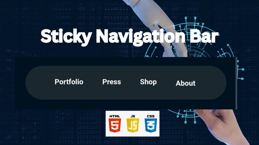
A Fixed navigation bar, also known as a sticky or floating navbar, remains visible at the top of the webpage as users scroll down. This functionality enhances user experience by providing constant access to navigation links, which is particularly useful for long pages or content-heavy websites. In this tutorial, we’ll guide you through the steps to create a sticky navigation bar using HTML, CSS, and JavaScript. By the end, you’ll have a sleek and responsive navbar that sticks to the top of the viewport as users scroll.

1. HTML Structure: The Foundation

This HTML code creates a sticky navigation bar that allows users to navigate to different sections of the page. The navigation menu is contained within a header element and features links to various sections, each represented by a unique section element with an ID. The links use anchor tags with corresponding IDs as href attributes, enabling smooth scrolling to the respective sections. Additionally, the code incorporates a custom cursor effect that is achieved through a combination of JavaScript and CSS.

Here’s an explanation of the HTML code with comments:

<!DOCTYPE html>
<html lang="en">
<head>
  <!-- Specifies the character encoding for the HTML document -->
  <meta charset="UTF-8">
  <!-- The title that appears in the browser tab -->
  <title>Sticky Navigation Bar</title>
  <!-- Links to an external CSS file for styling the page -->
  <link rel="stylesheet" href="./style.css">
</head>

<body>
<!-- Main content of the page starts here -->
<!-- partial:index.partial.html -->
<header>
  <!-- Defines the navigation bar inside the header -->
  <nav>
    <ul>
      <!-- Navigation links that anchor to different sections on the same page -->
      <li><a href="#portfolio">Portfolio</a></li>
      <li><a href="#press">Press</a></li>
      <li><a href="#shop">Shop</a></li>
      <li><a href="#about">Aboutㅤㅤㅤ</a></li> <!-- Extra spaces in the About link -->
    </ul>
  </nav>
</header>

<!-- Section for Portfolio content -->
<section id="portfolio">
  <!-- Heading with a custom data attribute for potential animations -->
  <h2 data-animate="true">Portfolio</h2>
</section>

<!-- Section for Press content -->
<section id="press">
  <h2 data-animate="true">Press</h2>
</section>

<!-- Section for Shop content -->
<section id="shop">
  <h2 data-animate="true">Shop</h2>
</section>

<!-- Section for About content -->
<section id="about">
  <h2 data-animate="true">About</h2>
</section>

<!-- Custom cursor element defined here -->
<div id="cursor" class="cursor">
  <!-- Two rings for the custom cursor design -->
  <div class="ring">
    <div>
      <!-- Border of the cursor -->
    </div>
  </div>
  <div class="ring">
    <div>
      <!-- Inner pointer of the cursor -->
    </div>
  </div>
</div>

<!-- jQuery library loaded from a CDN for easier DOM manipulation and event handling -->
<script src='https://cdnjs.cloudflare.com/ajax/libs/jquery/3.7.1/jquery.min.js'></script>
<!-- Links to an external JavaScript file for adding interactivity to the page -->
<script src="./script.js"></script>

</body>
</html>

2. Style the Navbar with CSS

This CSS code is responsible for styling the layout of a website, covering various elements such as the body, header, navigation, and sections. It also includes responsive design features through media queries, which adapt the layout to different screen sizes. Furthermore, the code defines background settings, a custom cursor animation, and animation effects classes, all of which contribute to a visually appealing and interactive user experience.

Here’s a breakdown of the CSS code with comments explaining each section:

html {
  cursor: none; /* Hides the cursor when hovering over the page */
  --text: #fff; /* Defines a CSS variable for text color, set to white */
  background: #001220; /* Sets the background color of the page to a dark navy blue */
  scroll-behavior: smooth; /* Enables smooth scrolling when navigating to anchors */
}

body {
  margin: 0; /* Removes default margin around the body */
  padding: 0; /* Removes default padding around the body */
  font-family: sans-serif; /* Sets the font family for the text to sans-serif */
}

header {
  position: sticky; /* Makes the header stick to the top of the viewport when scrolling */
  top: 0; /* Positions the sticky header at the top of the page */
  left: 0; /* Aligns the header to the left edge of the page */
  z-index: 1; /* Ensures the header appears above other content */
  padding: 1.5rem; /* Adds padding inside the header for spacing */
}

nav {
  width: 100%; /* Makes the navigation bar take up the full width of its container */
  background-color: rgba(76, 76, 76, 0.36); /* Sets a semi-transparent background color */
  color: black; /* Sets the text color to black */
  padding: 10px 0; /* Adds padding above and below the navigation bar */
  text-align: center; /* Centers the text inside the navigation bar */
  display: flex; /* Enables flexbox layout for the navigation bar */
  justify-content: space-around; /* Distributes the navigation items evenly */
  border-radius: 5rem; /* Rounds the corners of the navigation bar */
  backdrop-filter: blur(4px); /* Applies a blur effect to the background behind the nav */
}

nav ul {
  list-style: none; /* Removes default bullet points from list items */
  display: flex; /* Enables flexbox layout for the list */
  justify-content: space-between; /* Distributes the list items evenly */
  width: 80%; /* Sets the width of the list to 80% of its container */
}

li {
  font-weight: bold; /* Makes the list items bold */
}

a {
  text-decoration: none; /* Removes underlines from links */
  color: var(--text); /* Sets the text color using the variable defined in the html */
}

section {
  height: 100vh; /* Makes each section take up the full height of the viewport */
  display: flex; /* Enables flexbox layout for the section */
  justify-content: center; /* Centers the content horizontally */
  align-items: center; /* Centers the content vertically */
}

h2 {
  transition: font-size 300ms ease-out; /* Smoothly changes the font size over 300ms */
  font-size: 20vw; /* Sets the font size to 20% of the viewport width */
  color: #fff; /* Sets the text color to white */
  background: -webkit-linear-gradient(45deg, #09009f, #00ff95 80%); /* Creates a gradient background for the text */
  -webkit-background-clip: text; /* Clips the background to the text, making it appear as the text color */
  -webkit-text-fill-color: transparent; /* Makes the text color transparent so the gradient shows */
  -webkit-box-reflect: below 10px linear-gradient(to bottom, rgba(0, 0, 0, 0), rgba(0, 0, 0, 0.4)); /* Reflects the text below with a gradient */
}

@media (min-width: 1200px) {
  h2 {
    font-size: 16.5rem; /* Sets a fixed font size for large screens */
  }
}

#portfolio {
  /* background-color: #390099; Commented out background color, which would have been dark purple */
}

#press {
  background: url("data:image/svg+xml;base64,..."); /* Sets a background image using a base64-encoded SVG */
  background-position: bottom; /* Positions the background image at the bottom */
  background-repeat: no-repeat; /* Prevents the background image from repeating */
  background-size: cover; /* Scales the background image to cover the entire section */
}

#shop {
  background: url("data:image/svg+xml;base64,..."), #c61266; /* Sets a background image with a fallback color */
  background-position: bottom; /* Positions the background image at the bottom */
  background-repeat: no-repeat; /* Prevents the background image from repeating */
  background-size: cover; /* Scales the background image to cover the entire section */
}

#about {
  background: url("data:image/svg+xml;base64,..."); /* Sets a background image using a base64-encoded SVG */
  background-position: bottom; /* Positions the background image at the bottom */
  background-repeat: no-repeat; /* Prevents the background image from repeating */
  background-size: cover; /* Scales the background image to cover the entire section */
  h2 {
    background: -webkit-linear-gradient(0deg, rgba(249, 113, 9, 1) 0%, rgba(236, 155, 33, 1) 35%, rgba(255, 185, 19, 1) 100%); /* Creates a vertical gradient for the text */
    -webkit-background-clip: text; /* Clips the gradient to the text */
    -webkit-text-fill-color: transparent; /* Makes the text color transparent so the gradient shows */
  }
}

3. JavaScript Functionality: Bringing it to Life

This JavaScript code snippet utilizes the Intersection Observer API to create a reusable class called IntersectionObserverList. This class enables developers to monitor when elements on a webpage intersect with a specified root element or the viewport. The class provides methods for adding, removing, and clearing observers for specific elements, allowing for flexible and efficient management of intersection observations. Additionally, the code includes a demonstration of how to leverage the IntersectionObserverList class to trigger animations when elements come into view, enhancing the user experience.

Certainly! Let’s break down the code step by step with comments.

// Define a class called IntersectionObserverList
class IntersectionObserverList {
  // Initialize a Map to store elements and their corresponding callbacks
  mapping;
  // Initialize an IntersectionObserver to track elements' visibility
  observer;

  // Constructor for the class
  constructor() {
    // Create a new Map to store the mapping between elements and callbacks
    this.mapping = new Map();
    // Create a new IntersectionObserver instance
    // The callback function is called when the observed elements intersect with the viewport
    this.observer = new IntersectionObserver(
      (entries) => {
        // Iterate over each entry in the IntersectionObserver entries array
        for (var entry of entries) {
          // Get the callback function associated with the current entry's target element
          var callback = this.mapping.get(entry.target);

          // If a callback function exists for the target element
          callback && callback(entry.isIntersecting); // Call the callback with the intersection status
        }
      },
      // Options for the IntersectionObserver
      {
        // The rootMargin property defines the threshold for intersection
        // In this case, it's set to 300px from the top and bottom of the viewport
        rootMargin: "300px 0px 300px 0px"
      }
    );
  }

  // Method to add an element and its callback to the observer
  add(element, callback) {
    // Store the element and its callback in the mapping
    this.mapping.set(element, callback);
    // Start observing the element
    this.observer.observe(element);
  }

  // Method to clean up the observer and remove all elements and callbacks
  ngOnDestroy() {
    // Clear the mapping
    this.mapping.clear();
    // Stop observing all elements
    this.observer.disconnect();
  }

  // Method to remove an element and its callback from the observer
  remove(element) {
    // Remove the element and its callback from the mapping
    this.mapping.delete(element);
    // Stop observing the element
    this.observer.unobserve(element);
  }
}

// Create a new instance of IntersectionObserverList
const observer = new IntersectionObserverList();

// jQuery code to handle mouse movement and update the position of a ring element
$(window).mousemove(function (e) {
  // Get the mouse coordinates
  $(".ring").css(
    "transform",
    `translateX(calc(${e.clientX}px - 1.25rem)) translateY(calc(${e.clientY}px - 1.25rem))`
  );
});

// jQuery code to iterate over elements with the data-animate attribute set to "true"
$('[data-animate="true"]').each(function (i) {
  // Log the current element to the console
  console.log("$(this)", $(this));
  // Get the DOM element from the jQuery object
  var element = $(this)[0];
  // Add the element and its callback to the observer
  observer.add(element, (isIntersecting) => {
    // If the element is intersecting with the viewport
    if (isIntersecting) {
      // Add the "animate-slide-down" class to the element
      $(this).addClass("animate-slide-down");
    } else {
      // Remove the "animate-slide-down" class from the element
      $(this).removeClass("animate-slide-down");
    }
  });
});

Fantastic! We’ve successfully created a dynamic Sticky Navigation Bar using the power of HTML, CSS, and JavaScript. This means your website’s navigation will now seamlessly follow users as they scroll down the page. It’s a simple yet powerful feature that enhances user experience and makes your site more engaging. Well done!

How to Create a Fixed Navigation Bar using HTML, CSS, And JavaScript

Leave a Reply

Your email address will not be published. Required fields are marked *

Scroll to top