Coding classic

html, css, javascript, react, python

Step-by-Step Guide to Building a Dark/Light Mode Calendar with HTML, CSS, and JavaScript

Get ready to embark on a fun and engaging project for beginners: building a Classic Calendar using HTML, CSS, and JavaScript. If you’re eager to explore more JavaScript projects, we’ve got you covered with a curated list of the top 10 projects suitable for beginners and intermediate learners, which you can check out for inspiration and learning.

A calendar is a useful tool that displays the days, weeks, and months of a year in a clear and organized manner. It’s a helpful resource for staying on top of important dates, such as holidays and special events, and keeping track of time.

In this tutorial, we’ll create a Classic calendar that not only displays the current date and day but also allows users to navigate through past, present, and future months using intuitive previous and next buttons. What’s even more impressive is that this calendar is built entirely with Vanilla JavaScript, eliminating the need for any external libraries or dependencies, making it a great example of JavaScript’s capabilities.

HTML Structure: The Calendar Grid

Create a new HTML file (e.g., index.html) and add the following code:

<!DOCTYPE html>
<html lang="en">
<head>
  <!-- Specifies the character encoding for the HTML document -->
  <meta charset="UTF-8">
  
  <!-- Title of the webpage, which appears in the browser tab -->
  <title>Cool Simple Form Validation</title>
  
  <!-- Link to an external Google font stylesheet for Material Symbols Rounded icons -->
  <link rel="stylesheet" href="https://fonts.googleapis.com/css2?family=Material+Symbols+Rounded:opsz,wght,FILL,GRAD@20..48,100..700,0..1,-50..200">
  
  <!-- Link to an external CSS stylesheet (style.css) for custom styling -->
  <link rel="stylesheet" href="./style.css">
</head>

<body>
<!-- Start of the main content for the calendar -->

<div class="wrapper">
  <!-- Header section containing the current date and navigation icons -->
  <header>
    <!-- Paragraph that will display the current date -->
    <p class="current-date"></p>
    
    <!-- Div container for the navigation icons (previous and next month) -->
    <div class="icons">
      <!-- Span element for the previous month icon, using a Material Symbol -->
      <span id="prev" class="material-symbols-rounded">chevron_left</span>
      <!-- Span element for the next month icon, using a Material Symbol -->
      <span id="next" class="material-symbols-rounded">chevron_right</span>
    </div>
  </header>
  
  <!-- Main container for the calendar grid -->
  <div class="calendar">
    <!-- Unordered list for the days of the week (static labels) -->
    <ul class="weeks">
      <li>Sun</li>
      <li>Mon</li>
      <li>Tue</li>
      <li>Wed</li>
      <li>Thu</li>
      <li>Fri</li>
      <li>Sat</li>
    </ul>
    
    <!-- Unordered list where the days of the month will be dynamically generated -->
    <ul class="days"></ul>
  </div>
</div>
      
<!-- End of the main content for the calendar -->

<!-- Linking to an external JavaScript file (script.js) that will handle the calendar functionality -->
<script src="./script.js"></script>

</body>
</html>

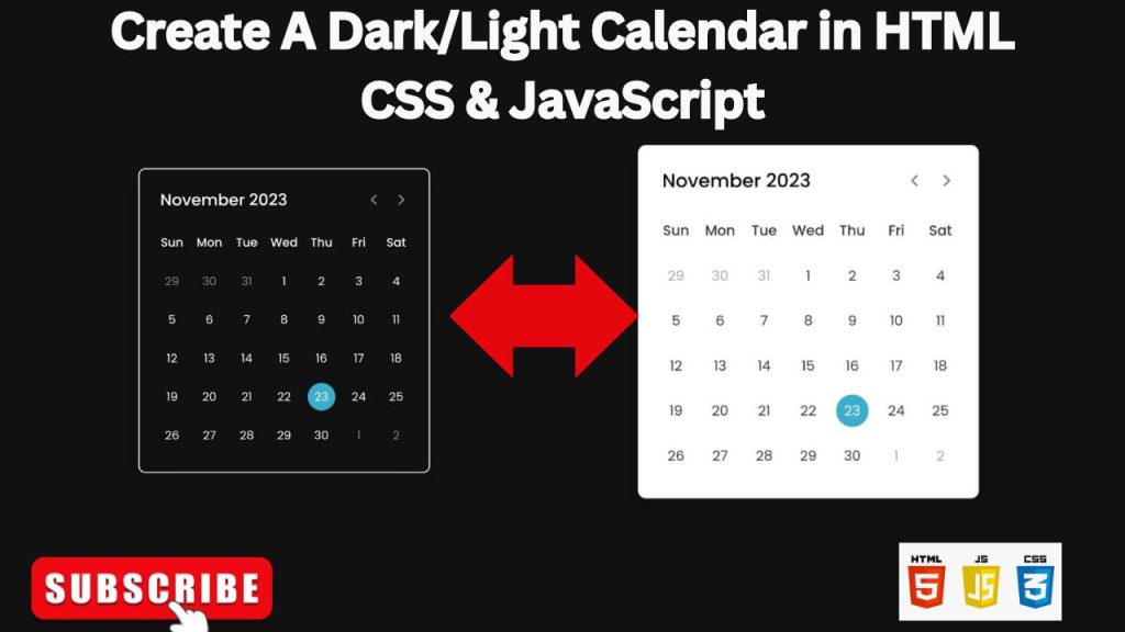
CSS Styling: Light and Dark Themes

Create a new CSS file (e.g., style.css) and add styles for both light and dark modes:

/* Import Google font - Poppins */
@import url("https://fonts.googleapis.com/css2?family=Poppins:wght@400;500;600&display=swap");

* {
  /* Reset margin and padding for all elements */
  margin: 0;
  padding: 0;
  
  /* Set box-sizing to include padding and border in element's total width and height */
  box-sizing: border-box;
  
  /* Set the font family to Poppins, with a fallback to sans-serif */
  font-family: "Poppins", sans-serif;
}

body {
  /* Center the content horizontally and vertically */
  display: flex;
  align-items: center;
  justify-content: center;
  
  /* Add padding on the left and right */
  padding: 0 10px;
  
  /* Set minimum height to fill the viewport */
  min-height: 100vh;
  
  /* Set the background color to dark (#111) */
  background: #111;
}

.wrapper {
  /* Set the width of the calendar container */
  width: 450px;
  
  /* Set the background color to white (for light theme) */
  background: #fff;
  
  /* The following lines are commented out and are used for dark theme */
  /* background: #222; */
  /* color: #fff; */
  /* border: 2px solid #fff; */
  
  /* Round the corners of the container */
  border-radius: 10px;
  
  /* Add a shadow to create depth */
  box-shadow: 0 15px 40px rgba(0, 0, 0, 0.12);
}

.wrapper header {
  /* Align items in the header horizontally */
  display: flex;
  align-items: center;
  
  /* Add padding to the header */
  padding: 25px 30px 10px;
  
  /* Space out the items in the header */
  justify-content: space-between;
}

header .icons {
  /* Display the navigation icons (previous/next) in a row */
  display: flex;
}

header .icons span {
  /* Set the size of the icons */
  height: 38px;
  width: 38px;
  
  /* Add a small margin between icons */
  margin: 0 1px;
  
  /* Change the cursor to a pointer when hovering over the icons */
  cursor: pointer;
  
  /* Set the color of the icons */
  color: #878787;
  
  /* Center the text/icon within the span */
  text-align: center;
  line-height: 38px;
  
  /* Set the font size of the icons */
  font-size: 1.9rem;
  
  /* Prevent text selection */
  user-select: none;
  
  /* Make the icons circular */
  border-radius: 50%;
}

.icons span:last-child {
  /* Remove extra margin on the right side of the last icon */
  margin-right: -10px;
}

header .icons span:hover {
  /* Change the background color when hovering over an icon */
  background: #f2f2f2;
}

header .current-date {
  /* Set the font size and weight for the current date text */
  font-size: 1.45rem;
  font-weight: 500;
}

.calendar {
  /* Add padding around the calendar grid */
  padding: 20px;
}

.calendar ul {
  /* Arrange the list items (weekdays and dates) in a row, allowing wrapping */
  display: flex;
  flex-wrap: wrap;
  
  /* Remove the default list styling */
  list-style: none;
  
  /* Center the text within each list item */
  text-align: center;
}

.calendar .days {
  /* Add margin to the bottom of the days list */
  margin-bottom: 20px;
}

.calendar li {
  /* Set the text color for the list items (weekdays and dates) */
  color: #333;
  
  /* The following line is commented out and is used for dark theme */
  /* color: #fff; */
  
  /* Set the width of each day to be one-seventh of the total width */
  width: calc(100% / 7);
  
  /* Set the font size for the list items */
  font-size: 1.07rem;
}

.calendar .weeks li {
  /* Make the weekday labels bold */
  font-weight: 500;
  
  /* Disable the pointer cursor for weekdays (no click action) */
  cursor: default;
}

.calendar .days li {
  /* Set the position for potential hover effects */
  position: relative;
  
  /* Add a margin to the top for spacing */
  margin-top: 30px;
  
  /* Enable pointer cursor for clickable days */
  cursor: pointer;
  
  /* Bring clickable days to the front */
  z-index: 1;
}

.days li.inactive {
  /* Dim the color for inactive days (e.g., days from previous/next month) */
  color: #aaa;
}

.days li.active {
  /* Highlight the active day (current day) with white text */
  color: #fff;
}

.days li::before {
  /* Position an element before the content (used for highlighting) */
  position: absolute;
  content: "";
  
  /* Center the element */
  left: 50%;
  top: 50%;
  
  /* Set the size of the highlighting circle */
  height: 40px;
  width: 40px;
  
  /* Send the highlighting element behind the text */
  z-index: -1;
  
  /* Make the element circular */
  border-radius: 50%;
  
  /* Adjust the position using a transform */
  transform: translate(-50%, -50%);
}

.days li.active::before {
  /* Set the background color for the active day's highlight */
  background: #3cafcf;
}

.days li:not(.active):hover::before {
  /* Set the background color for non-active days when hovered */
  background: #f2f2f2;
  
  /* The following line is commented out and is used for dark theme */
  /* background: #333; */
}

JAVASCRIPT :

// Selecting the HTML elements needed for the calendar functionality
const daysTag = document.querySelector(".days"), // The <ul> element where the days of the month will be displayed
      currentDate = document.querySelector(".current-date"), // The <p> element that will show the current month and year
      prevNextIcon = document.querySelectorAll(".icons span"); // The <span> elements for navigating to the previous and next months

// Getting the current date, year, and month
let date = new Date(), // Creating a new Date object to get the current date
    currYear = date.getFullYear(), // Extracting the current year
    currMonth = date.getMonth(); // Extracting the current month (0-11, where 0 is January and 11 is December)

// Storing the full names of all the months in an array
const months = ["January", "February", "March", "April", "May", "June", "July",
              "August", "September", "October", "November", "December"];

const renderCalendar = () => {
    // Getting the first day of the current month (0-6, where 0 is Sunday)
    let firstDayofMonth = new Date(currYear, currMonth, 1).getDay(), 
        // Getting the last date of the current month (e.g., 31 for January)
        lastDateofMonth = new Date(currYear, currMonth + 1, 0).getDate(), 
        // Getting the day of the week for the last date of the current month
        lastDayofMonth = new Date(currYear, currMonth, lastDateofMonth).getDay(), 
        // Getting the last date of the previous month
        lastDateofLastMonth = new Date(currYear, currMonth, 0).getDate(); 
    
    let liTag = ""; // Initializing an empty string to store the HTML for the days

    // Creating <li> elements for the last days of the previous month that are shown in the current month's calendar view
    for (let i = firstDayofMonth; i > 0; i--) { 
        liTag += `<li class="inactive">${lastDateofLastMonth - i + 1}</li>`;
    }

    // Creating <li> elements for each day of the current month
    for (let i = 1; i <= lastDateofMonth; i++) { 
        // Adding an "active" class to the <li> if the current day, month, and year match today's date
        let isToday = i === date.getDate() && currMonth === new Date().getMonth() 
                     && currYear === new Date().getFullYear() ? "active" : "";
        liTag += `<li class="${isToday}">${i}</li>`;
    }

    // Creating <li> elements for the first days of the next month that are shown in the current month's calendar view
    for (let i = lastDayofMonth; i < 6; i++) { 
        liTag += `<li class="inactive">${i - lastDayofMonth + 1}</li>`;
    }

    // Updating the current date text (month and year) in the calendar header
    currentDate.innerText = `${months[currMonth]} ${currYear}`; 
    
    // Injecting the generated <li> elements into the <ul> with the class "days"
    daysTag.innerHTML = liTag;
}

// Calling the renderCalendar function to initially render the calendar
renderCalendar();

prevNextIcon.forEach(icon => { // Iterating over both the previous and next month icons
    icon.addEventListener("click", () => { // Adding a click event listener to each icon
        // Checking if the clicked icon is the previous or next month icon
        currMonth = icon.id === "prev" ? currMonth - 1 : currMonth + 1;

        // Handling the case where the month goes beyond January or December
        if(currMonth < 0 || currMonth > 11) { 
            // Creating a new date object based on the new month and current date
            date = new Date(currYear, currMonth, new Date().getDate());
            // Updating the current year and month to reflect the new date
            currYear = date.getFullYear();
            currMonth = date.getMonth();
        } else {
            // If the month is within the valid range (0-11), keep the current date
            date = new Date(); 
        }
        // Re-rendering the calendar with the updated month and year
        renderCalendar(); 
    });
});

Conclusion

You’ve now created a dynamic dark/light mode calendar using HTML, CSS, and JavaScript. You can customize the styling, add features like event highlighting, and integrate it with your website or application.

Step-by-Step Guide to Building a Dark/Light Mode Calendar with HTML, CSS, and JavaScript

Leave a Reply

Your email address will not be published. Required fields are marked *

Scroll to top