For individuals who are just beginning their journey into web development, creating a simple yet responsive website presents an exciting and highly educational challenge. This project provides a fantastic opportunity to delve into the core principles of HTML and CSS, allowing beginners to master essential web development concepts. As you work on designing and building your website, you’ll gain valuable hands-on experience that will enhance your understanding of both structure and styling. This practical approach not only helps solidify your foundational knowledge but also equips you with the skills needed to craft visually appealing and functional websites.
To build our food ordering website, we will rely on fundamental HTML elements such as headers, navigation bars, lists, links, and buttons. These basic components will form the backbone of our site’s layout and functionality, allowing us to organize and present content in a clear and structured manner. By using these HTML elements effectively, we can create a coherent and user-friendly interface for our website.
In addition to HTML, we will apply CSS styles to enhance the visual appeal and overall aesthetics of the site. CSS will enable us to fine-tune the appearance of various elements, ensuring that the website is both attractive and functional. We will also implement responsive design techniques using CSS, which will allow the website to adapt seamlessly to different screen sizes, from large desktop monitors to small mobile devices. This ensures that users have a consistent and enjoyable experience regardless of the device they are using.
Even if you’re new to web development, this tutorial is crafted to be accessible and easy to follow. We will provide step-by-step instructions and clear explanations to help you understand each aspect of the code and design process. By working through this project, you’ll not only learn the basics of HTML and CSS but also gain valuable experience in creating a responsive website. This hands-on experience will lay a solid foundation for future web development projects, equipping you with the skills needed to build and style websites effectively.
To create our food ordering website, we will utilize fundamental HTML elements such as headers, navigation bars, lists, links, and buttons. These elements form the building blocks of our site’s structure, allowing us to organize and present content effectively. Alongside HTML, we will apply CSS styles to enhance the visual appeal of the website and ensure that it adjusts seamlessly to various screen sizes. CSS will help us create a responsive design, making sure the website looks great whether viewed on a desktop, tablet, or smartphone. This approach ensures that our website is not only functional but also visually engaging. Even if you’re just starting out in web development, this guide is designed to be beginner-friendly, providing clear explanations and easy-to-follow instructions to help you understand the code and concepts. By the end of this project, you’ll gain practical experience in both HTML and CSS, building a solid foundation for future web development endeavors.
Video Guide to Creating a Responsive Food Website with HTML & CSS
Guides to Create Responsive Food ordering Website HTML and CSS
To create a responsive food ordering website using HTML and CSS, follow these detailed steps:
- Create a Project Folder: Start by setting up a new folder on your computer. Name this folder something relevant to your project, such as “FoodOrderingWebsite”. This folder will serve as the central location for all the files and assets related to your website project.
- Set Up Your Files:
- Create an
index.htmlFile: Within your project folder, create a new file namedindex.html. This file will be the cornerstone of your website, providing the essential HTML structure that defines the layout and content of your web pages. - Create a
style.cssFile: Also in your project folder, create another file namedstyle.css. This stylesheet will contain all the CSS rules that determine how your HTML elements are styled, including colors, fonts, and layout adjustments.
- Add HTML Code:
- Open the
index.htmlfile in your text editor and insert the initial HTML code. This code will set up the foundational structure of your website using various HTML elements likeheader,nav,h2,a,ul,li,p, andbutton. These elements will help you build the different sections of your food ordering website, such as navigation menus, headings, lists of food items, and buttons for ordering. - If necessary, include a small JavaScript snippet to add interactive features to your site. For example, you might need JavaScript to handle mobile menu toggles, ensuring that the navigation remains functional on smaller screens.
HTML:
<!DOCTYPE html>
<html lang="en">
<head>
<!-- Metadata for character encoding and viewport settings -->
<meta charset="UTF-8" />
<meta name="viewport" content="width=device-width, initial-scale=1.0" />
<title>Food Ordering Website</title>
<!-- Linking to the external CSS stylesheet for styling -->
<link rel="stylesheet" href="style.css" />
<!-- Linking to Font Awesome for icons -->
<link rel="stylesheet" href="https://cdnjs.cloudflare.com/ajax/libs/font-awesome/4.7.0/css/font-awesome.min.css">
</head>
<body>
<!-- Header section containing the navigation bar -->
<header>
<nav>
<!-- Navigation logo and title -->
<div class="nav_logo">
<a href="#">
<img src="images/food-logo.png" alt="Food Logo" />
<h2>Fudi</h2>
</a>
</div>
<!-- Mobile menu toggle with checkbox and label -->
<input type="checkbox" id="click" />
<label for="click">
<i class="menu_btn fa fa-bars"></i>
<i class="close_btn fa fa-times"></i>
</label>
<!-- Navigation links -->
<ul>
<li><a href="#">Home</a></li>
<li><a href="#about">About</a></li>
<li><a href="#service">Services</a></li>
<li><a href="#why">Why Us</a></li>
<li><a href="#gallery">Gallery</a></li>
<li><a href="#contact">Contact</a></li>
</ul>
</nav>
</header>
<!-- Hero section with a call-to-action -->
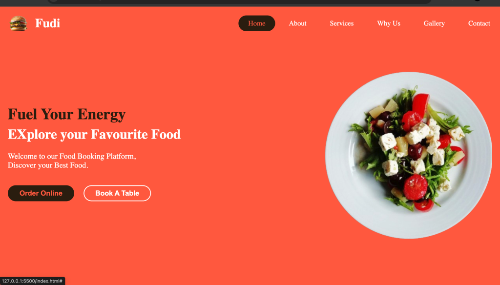
<section class="hero_section">
<div class="section_container">
<div class="hero_container">
<div class="text_section">
<h2>Fuel Your Energy</h2>
<h3>Explore Your Favourite Food</h3>
<p>
Welcome to our Food Booking Platform. Discover your favorite food with ease.
</p>
<div class="hero_section_button">
<button class="button">Order Online</button>
<button class="button">Book A Table</button>
</div>
</div>
<div class="image_section">
<img src="images/food-banner.png" alt="Food Banner" />
</div>
</div>
</div>
</section>
<!-- About Us section providing company details -->
<section class="about_us" id="about">
<div class="section_container">
<div class="about_container">
<div class="text_section">
<h2 class="section_title">About Us</h2>
<p>
Welcome to Fudi, your ultimate destination for effortless food booking and delivery.
We are committed to offering you a smooth dining experience, whether it's a cozy meal
at home or a grand celebration. Our platform connects you with a variety of foods
to meet every craving.
</p>
</div>
<div class="image_section">
<img src="images/aboutus-img.png" alt="About Us" />
</div>
</div>
</div>
</section>
<!-- Services section showcasing different offerings -->
<section class="services" id="service">
<h2 class="section_title">Our Services</h2>
<div class="section_container">
<div class="service_container">
<div class="services_items">
<img src="images/meat.png" alt="Delicious Meat" />
<div class="services_text">
<h3>Delicious Meat</h3>
<p>
A wide selection of delicious meats to keep you fresh and satisfied.
</p>
</div>
</div>
<div class="services_items">
<img src="images/beverages.png" alt="Beverages" />
<div class="services_text">
<h3>Beverages</h3>
<p>
Sweet and frothy cold coffee to refresh you from within.
</p>
</div>
</div>
<div class="services_items">
<img src="images/food1.png" alt="Food" />
<div class="services_text">
<h3>Food</h3>
<p>Delicious and nutritious food options.</p>
</div>
</div>
<div class="services_items">
<img src="images/combo-food.png" alt="Special Combos" />
<div class="services_text">
<h3>Special Combos</h3>
<p>
Easily select your favorite food and drink combinations.
</p>
</div>
</div>
<div class="services_items">
<img src="images/hottea.png" alt="Hot Tea" />
<div class="services_text">
<h3>Hot Tea</h3>
<p>The best healthy tea for a refreshing experience.</p>
</div>
</div>
<div class="services_items">
<img src="images/desserts.png" alt="Desserts" />
<div class="services_text">
<h3>Desserts</h3>
<p>
Indulge in delectable desserts that will surely satisfy your palate.
</p>
</div>
</div>
</div>
</div>
</section>
<!-- Why Us section highlighting unique selling points -->
<section class="why_us" id="why">
<h2 class="section_title">Why Us?</h2>
<div class="section_container">
<div class="why_container">
<div class="why_items">
<img src="images/delicious.png" alt="Delicious Food" />
<div class="why_us_text">
<h3>Delicious Food</h3>
<p>
With a luxurious range of mouth-watering dishes, we aim to delight your taste buds
and provide a memorable dining experience.
</p>
</div>
</div>
<div class="why_items">
<img src="images/pleasant.png" alt="Pleasant Ambience" />
<div class="why_us_text">
<h3>Pleasant Ambience</h3>
<p>
We strive to offer each guest an exceptional dining experience with the perfect
ambiance to enjoy special moments.
</p>
</div>
</div>
<div class="why_items">
<img src="images/hospitality.png" alt="Hospitality" />
<div class="why_us_text">
<h3>Hospitality</h3>
<p>
Our staff is always ready to assist. We go above and beyond to ensure your happiness.
</p>
</div>
</div>
</div>
</div>
</section>
<!-- Gallery section displaying images -->
<section class="gallery" id="gallery">
<h2 class="section_title">Gallery</h2>
<div class="section_container">
<div class="gallery_container">
<div class="gallery_items">
<img src="images/image1.jpg" alt="Gallery Image 1" />
</div>
<div class="gallery_items">
<img src="images/image2.jpg" alt="Gallery Image 2" />
</div>
<div class="gallery_items">
<img src="images/image3.jpg" alt="Gallery Image 3" />
</div>
<div class="gallery_items">
<img src="images/image4.jpg" alt="Gallery Image 4" />
</div>
<div class="gallery_items">
<img src="images/image5.jpg" alt="Gallery Image 5" />
</div>
<div class="gallery_items">
<img src="images/image6.jpg" alt="Gallery Image 6" />
</div>
</div>
</div>
</section>
<!-- Contact section with a form and contact details -->
<section class="contact" id="contact">
<h2 class="section_title">Contact Us</h2>
<div class="section_container">
<div class="contact_container">
<div class="contact_form">
<form action="#">
<div class="field">
<label for="Name">Full Name</label>
<input type="text" id="Name" placeholder="Your Name" required />
</div>
<div class="field">
<label for="email">Your Email</label>
<input type="text" id="email" placeholder="Your Email" required />
</div>
<div class="field">
<label for="number">Your Number</label>
<input type="number" id="number" placeholder="Your Contact Number" required />
</div>
<div class="field">
<label for="textarea">Message</label>
<textarea name="textarea" id="textarea" placeholder="Your Message"></textarea>
</div>
<button class="button" id="submit">Submit</button>
</form>
</div>
<div class="contact_text">
<div class="contact_items">
<i class="fa fa-map-marker"></i>
Next, enhance and personalize the look of your website by adding CSS code to your style.css file. This is your opportunity to explore various design elements such as colors, fonts, and backgrounds to tailor the website’s appearance to your taste. By experimenting with these CSS properties, you can create a distinctive and visually captivating design that reflects your personal style and makes your website stand out.
/* Resetting default browser styles */
* {
    margin: 0; /* Removes default margin from all elements */
    padding: 0; /* Removes default padding from all elements */
    box-sizing: border-box; /* Ensures padding and border are included in element's total width and height */
}

/* Defining Custom Variables */
:root {
    /* Color variables */
    --primary-color: tomato; /* Main color used for primary elements */
    --secondary-color: #30200c; /* Secondary color used for accents and backgrounds */
    --dark-color: #252525; /* Dark color for text or backgrounds */
    --white-color: #fff; /* White color used for text or backgrounds */
    --light-gray-color: #f2f2f2; /* Light gray color for backgrounds or borders */

    /* Maximum width for the site container */
    --site-max-width: 1300px; /* Sets a maximum width for responsive layout */
}

/* Smooth scrolling behavior for the entire page */
html {
    scroll-behavior: smooth; /* Enables smooth scrolling for anchor links */
}

/* Background color for the whole page */
body {
    background-color: var(--white-color); /* Sets background color to white */
}

/* General link styling */
a {
    text-decoration: none; /* Removes underline from links */
}

/* Removing default list styling */
ul {
    list-style: none; /* Removes default bullet points from lists */
}

/* Container styling for sections */
.section_container {
    margin: 0 auto; /* Centers the container horizontally */
    max-width: var(--site-max-width); /* Limits the maximum width of the container */
}

/* Styling for section titles */
.section_title {
    text-align: center; /* Centers the text horizontally */
    padding: 60px 0 100px; /* Adds vertical padding for spacing */
    font-size: 32px; /* Sets the font size */
    font-family: "Righteous", sans-serif; /* Uses a specific font for the title */
    text-transform: uppercase; /* Converts text to uppercase */
}

/* Adding a decorative line below the section title */
.section_title::after {
    content: ''; /* Creates a pseudo-element */
    width: 80px; /* Sets the width of the line */
    background: var(--secondary-color); /* Sets the background color of the line */
    height: 5px; /* Sets the height of the line */
    display: block; /* Makes the pseudo-element a block-level element */
    margin: 7px auto 0; /* Centers the line horizontally and adds top margin */
    border-radius: 8px; /* Rounds the corners of the line */
}

/* Header styling */
header {
    position: fixed; /* Fixes the header to the top of the viewport */
    top: 0; /* Aligns the header at the top */
    width: 100%; /* Makes the header full width */
    z-index: 1; /* Ensures the header appears above other elements */
    background: var(--primary-color); /* Sets the background color */
}

/* Navigation bar styling */
nav {
    display: flex; /* Uses flexbox for layout */
    padding: 15px 0 15px 20px; /* Adds padding around the nav items */
    justify-content: space-between; /* Distributes space between nav items */
    align-items: center; /* Centers nav items vertically */
    margin: 0 auto; /* Centers the navigation bar horizontally */
    max-width: var(--site-max-width); /* Limits the maximum width */
}

/* Logo and brand name styling */
nav .nav_logo a {
    display: flex; /* Uses flexbox to align logo and brand name */
    gap: 15px; /* Adds space between the logo and brand name */
    align-items: center; /* Centers items vertically */
}

nav .nav_logo a img {
    max-width: 55px; /* Sets the maximum width of the logo */
}

nav .nav_logo h2 {
    color: var(--white-color); /* Sets the text color */
    font-weight: 600; /* Makes the text bold */
    font-size: 32px; /* Sets the font size */
}

/* Navigation links styling */
nav ul {
    display: flex; /* Uses flexbox to lay out the links */
    gap: 10px; /* Adds space between the links */
}

nav ul li a {
    display: block; /* Makes the links block-level elements */
    padding: 10px 25px; /* Adds padding inside the links */
    font-size: 18px; /* Sets the font size */
    font-weight: 500; /* Makes the text semi-bold */
    color: var(--white-color); /* Sets the text color */
    border-radius: 30px; /* Rounds the corners of the links */
    transition: all 0.2s ease; /* Adds a transition effect for hover states */
}

nav ul li a:hover {
    color: var(--primary-color); /* Changes text color on hover */
    background-color: var(--secondary-color); /* Changes background color on hover */
}

/* Styling for the mobile menu toggle */
nav label {
    font-size: 32px; /* Sets the font size for the menu icon */
    color: var(--white-color); /* Sets the color */
    cursor: pointer; /* Shows a pointer cursor on hover */
}

label .menu_btn,
label .close_btn {
    display: none; /* Hides the menu and close icons by default */
}

#click {
    display: none; /* Hides the checkbox used for menu toggling */
}

/* stade 1 */

/* Hero Section */
.hero_section {
    min-height: 100vh; /* Sets the minimum height of the hero section to be the full viewport height */
    background: var(--primary-color); /* Sets the background color to the primary color variable */
}

.hero_container {
    display: flex; /* Uses flexbox for layout */
    gap: 20px; /* Adds space between the flex items */
    padding: 20px; /* Adds padding inside the container */
    align-items: center; /* Centers items vertically within the container */
    padding-top: 85px; /* Adds padding at the top to account for a fixed header */
    min-height: calc(100vh - 85px); /* Ensures the container takes up the full viewport height minus the header height */
    justify-content: space-between; /* Distributes space between the items */
}

.hero_container .text_section h2 {
    font-size: 40px; /* Sets the font size for the main heading */
    color: var(--secondary-color); /* Sets the text color to the secondary color variable */
}

.hero_container .text_section h3 {
    font-size: 35px; /* Sets the font size for the subheading */
    font-weight: 600; /* Makes the text semi-bold */
    color: var(--white-color); /* Sets the text color to white */
    margin-top: 8px; /* Adds top margin to separate from the heading */
}

.hero_container .text_section p {
    font-size: 20px; /* Sets the font size for the paragraph text */
    font-weight: 400; /* Sets the font weight to normal */
    color: var(--white-color); /* Sets the text color to white */
    margin: 24px 0 40px; /* Adds vertical margin for spacing above and below the paragraph */
    max-width: 70%; /* Limits the maximum width of the paragraph text */
}

.hero_container .hero_section_button {
    display: flex; /* Uses flexbox for layout of buttons */
    gap: 24px; /* Adds space between the buttons */
}

.hero_container .hero_section_button .button {
    padding: 8px 28px; /* Adds padding inside the button */
    border: 2px solid transparent; /* Sets a transparent border initially */
    outline: none; /* Removes the default focus outline */
    cursor: pointer; /* Changes the cursor to a pointer on hover */
    border-radius: 50px; /* Rounds the corners of the button */
    background: var(--secondary-color); /* Sets the background color to the secondary color */
    color: var(--primary-color); /* Sets the text color to the primary color */
    font-size: 18px; /* Sets the font size */
    font-weight: 600; /* Makes the text semi-bold */
    transition: all 0.4s ease; /* Adds a transition effect for hover states */
}

.hero_container .hero_section_button .button:last-child {
    color: var(--white-color); /* Sets the text color to white for the last button */
    border-color: var(--white-color); /* Sets the border color to white for the last button */
    background: none; /* Removes the background color */
}

.hero_container .hero_section_button .button:first-child:hover {
    color: var(--white-color); /* Changes text color to white on hover for the first button */
    background: transparent; /* Removes background color on hover */
    border-color: var(--white-color); /* Changes border color to white on hover */
}

.hero_container .hero_section_button .button:last-child:hover {
    color: var(--primary-color); /* Changes text color to the primary color on hover for the last button */
    background: var(--secondary-color); /* Changes background color to the secondary color on hover */
    border-color: var(--secondary-color); /* Changes border color to the secondary color on hover */
}

.hero_container .image_section {
    max-width: 45%; /* Limits the maximum width of the image section */
}

.hero_container .image_section img {
    width: 100%; /* Makes the image fill the width of its container */
}

/* stade 2 */

/* About Us Section */
.about_us {
    padding: 60px 20px 120px; /* Adds padding around the section */
    background: var(--light-gray-color); /* Sets the background color to a light gray */
}

.about_container {
    display: flex; /* Uses flexbox for layout */
    justify-content: space-between; /* Distributes space between items */
    gap: 20px; /* Adds space between the flex items */
    align-items: center; /* Centers items vertically */
}

.about_container .text_section {
    max-width: 50%; /* Limits the maximum width of the text section */
}

.about_container .text_section p {
    font-size: 18px; /* Sets the font size for paragraph text */
    font-weight: 500; /* Makes the text semi-bold */
    letter-spacing: 1px; /* Adds space between letters */
    line-height: 30px; /* Sets the line height for improved readability */
    text-align: center; /* Centers the text horizontally */
}

.about_container .image_section {
    max-width: 45%; /* Limits the maximum width of the image section */
}

.about_container .image_section img {
    width: 100%; /* Makes the image fill the width of its container */
}
/* stade 3 */

/* Services Section */
.services {
    background: var(--dark-color); /* Sets the background color to dark color variable */
    color: var(--white-color); /* Sets the text color to white */
    padding: 60px 20px 120px; /* Adds padding around the section */
}

.services .service_container {
    display: flex; /* Uses flexbox for layout */
    justify-content: space-between; /* Distributes space between items */
    gap: 120px; /* Adds significant space between items */
    align-items: center; /* Aligns items vertically in the center */
    flex-wrap: wrap; /* Allows items to wrap onto multiple lines if needed */
}

.section_container .services_items img {
    width: 100%; /* Makes images fill the width of their container */
    height: 250px; /* Sets a fixed height for images */
}

.section_container .services_items {
    width: calc(100% / 3 - 120px); /* Calculates the width of each item, adjusting for the gap */
}

.services_items .services_text {
    text-align: center; /* Centers the text horizontally */
}

.services_items .services_text h3 {
    margin: 12px 0; /* Adds vertical margin to separate from other elements */
    font-weight: 600; /* Makes the heading text semi-bold */
    font-size: 24px; /* Sets the font size for headings */
}

.services_items .services_text p {
    font-size: 17px; /* Sets the font size for paragraph text */
}

/* stade 4 */

/* Why Us Section */
.why_us {
    background: var(--light-gray-color); /* Sets the background color to light gray */
    padding: 60px 20px 120px; /* Adds padding around the section */
}

.why_us .why_container {
    display: flex; /* Uses flexbox for layout */
    justify-content: space-between; /* Distributes space between items */
    gap: 80px; /* Adds space between items */
    align-items: center; /* Aligns items vertically in the center */
    flex-wrap: wrap; /* Allows items to wrap onto multiple lines if needed */
}

.why_container .why_items img {
    width: 30%; /* Sets the width of images to 30% of the container width */
    margin-bottom: 10px; /* Adds space below the image */
}

.why_container .why_items {
    width: calc(100% / 3 - 80px); /* Calculates the width of each item, adjusting for the gap */
    padding: 12px; /* Adds padding inside each item */
    display: flex; /* Uses flexbox for layout inside the item */
    flex-direction: column; /* Arranges items in a column */
    align-items: center; /* Centers items horizontally */
    gap: 12px; /* Adds space between items */
}

.why_items .why_us_text {
    text-align: center; /* Centers text horizontally */
}

.why_items .why_us_text h3 {
    margin: 20px 0; /* Adds vertical margin to separate from other elements */
    font-size: 22px; /* Sets the font size for headings */
}

.why_items .why_us_text p {
    font-size: 17px; /* Sets the font size for paragraph text */
}

/* stade 5 */

/* Gallery Section */
.gallery {
    background: var(--white-color); /* Sets the background color to white */
    padding: 60px 20px 100px; /* Adds padding around the section */
}

.gallery .gallery_container {
    display: flex; /* Uses flexbox for layout */
    justify-content: space-between; /* Distributes space between items */
    gap: 32px; /* Adds space between items */
    align-items: center; /* Aligns items vertically in the center */
    flex-wrap: wrap; /* Allows items to wrap onto multiple lines if needed */
}

.gallery_container .gallery_items {
    width: calc(100% / 3 - 32px); /* Calculates the width of each item, adjusting for the gap */
    overflow: hidden; /* Hides any content that overflows the item */
    border-radius: 8px; /* Rounds the corners of the items */
}

.gallery .gallery_container img {
    width: 100%; /* Makes images fill the width of their container */
    border-radius: 8px; /* Rounds the corners of the images */
    transition: transform 0.4s ease; /* Adds a smooth transition effect for transformations */
}

.gallery_container .gallery_items:hover img {
    transform: scale(1.3); /* Scales the image to 130% on hover */
}

/* stade 6 */

/* Contact Section */
.contact {
    background: var(--light-gray-color); /* Sets the background color to light gray */
    padding: 60px 20px 100px; /* Adds padding around the section to create space */
}

.contact_container {
    display: flex; /* Uses flexbox for layout */
    gap: 50px; /* Adds space between items */
    align-items: center; /* Vertically aligns items in the center */
    justify-content: space-between; /* Distributes space between items */
}

.contact_container .contact_form {
    max-width: 65%; /* Sets the maximum width of the form to 65% of the container */
    width: 100%; /* Ensures the form takes up the full width of its container */
}

.contact_container .contact_form .field {
    margin: 20px 0; /* Adds vertical margin to space out form fields */
}

.contact_container .contact_form .field label {
    display: block; /* Makes the label a block-level element */
    font-size: 17px; /* Sets the font size for labels */
    font-weight: 500; /* Makes the label text semi-bold */
    margin-bottom: 8px; /* Adds space below the label */
}

.contact_container .contact_form .field input {
    width: 100%; /* Makes input fields fill the width of their container */
    height: 50px; /* Sets the height of input fields */
    padding: 0 12px; /* Adds horizontal padding inside the input fields */
    font-size: 16px; /* Sets the font size for input text */
    border-radius: 6px; /* Rounds the corners of the input fields */
    border: 1px solid #ccc; /* Adds a light gray border around the input fields */
}

.contact_container .contact_form textarea {
    width: 100%; /* Makes the textarea fill the width of its container */
    height: 200px; /* Sets a fixed height for the textarea */
    padding: 12px; /* Adds padding inside the textarea */
    font-size: 16px; /* Sets the font size for text in the textarea */
    border-radius: 8px; /* Rounds the corners of the textarea */
    border: 1px solid #ccc; /* Adds a light gray border around the textarea */
    resize: vertical; /* Allows vertical resizing of the textarea */
}

.contact_container .contact_form .button {
    padding: 8px 28px; /* Adds padding inside the button */
    border: 2px solid transparent; /* Sets a border that is initially transparent */
    outline: none; /* Removes the default outline of the button */
    cursor: pointer; /* Changes the cursor to a pointer on hover */
    border-radius: 50px; /* Rounds the corners of the button */
    background: var(--primary-color); /* Sets the background color to the primary color */
    color: var(--white-color); /* Sets the text color to white */
    font-size: 17px; /* Sets the font size for button text */
    font-weight: 600; /* Makes the button text semi-bold */
    transition: all 0.4s ease; /* Adds a smooth transition effect for all properties */
}

.contact_container .contact_form .button:hover {
    color: var(--primary-color); /* Changes the text color on hover to the primary color */
    background: transparent; /* Makes the background transparent on hover */
    border-color: var(--primary-color); /* Changes the border color to the primary color on hover */
}

.contact_text .contact_items {
    display: flex; /* Uses flexbox for layout */
    gap: 20px; /* Adds space between items */
    margin: 80px 0; /* Adds vertical margin to space out the contact items */
}

.contact_text .contact_items i {
    font-size: 32px; /* Sets the font size for icons */
    margin-top: 5px; /* Adds a small margin on top of the icons */
}

/* stade 7 */

/* Footer Section */
footer {
    background: #1b1b1b; /* Sets the background color of the footer to a dark shade */
    color: var(--white-color); /* Sets the text color in the footer to white */
    padding: 60px 20px; /* Adds padding around the footer content for spacing */
}

.footer_section {
    display: flex; /* Uses flexbox for layout */
    justify-content: space-between; /* Distributes space between footer sections */
}

.footer_section h3 {
    font-size: 22px; /* Sets the font size for section headings */
    margin-bottom: 16px; /* Adds space below the headings */
    font-weight: 600; /* Makes the headings semi-bold */
}

.footer_section .footer_logo a {
    display: flex; /* Uses flexbox for layout within the logo section */
    gap: 15px; /* Adds space between the logo image and text */
    align-items: center; /* Vertically centers items in the logo section */
    color: var(--white-color); /* Sets the color of the logo link text to white */
}

.footer_section .footer_logo a img {
    max-width: 55px; /* Limits the width of the logo image to 55 pixels */
}

.footer_section .footer_logo a h2 {
    font-weight: 600; /* Makes the logo text semi-bold */
}

.footer_section .useful_links ul li {
    margin: 20px 0; /* Adds vertical spacing between list items */
}

.footer_section .useful_links ul li a {
    color: var(--white-color); /* Sets the color of the links to white */
    font-size: 17px; /* Sets the font size for link text */
}

.footer_section .useful_links ul li a:hover {
    text-decoration: underline; /* Adds an underline to links on hover for better visibility */
}

.footer_section .contact_us ul li {
    margin: 20px 0; /* Adds vertical spacing between contact items */
    display: flex; /* Uses flexbox for layout within contact items */
    align-items: center; /* Vertically centers items within the contact list */
    gap: 20px; /* Adds space between icons and text in contact items */
}

.footer_section .contact_us ul li i {
    font-size: 25px; /* Sets the font size for icons in contact items */
}

.footer_section .contact_us ul li span {
    font-size: 17px; /* Sets the font size for text in contact items */
}

.footer_section .follow_us i {
    font-size: 26px; /* Sets the font size for social media icons */
    margin-right: 25px; /* Adds space to the right of each social media icon */
    cursor: pointer; /* Changes the cursor to a pointer on hover for social media icons */
    transition: all 0.3s ease; /* Adds a smooth transition effect for all properties */
}

.footer_section .follow_us i:hover {
    color: var(--secondary-color); /* Changes the color of social media icons on hover */
}

/* Responsive Media Query code for max-width: 1024px */
@media screen and (max-width: 1024px) {
    /* Adjusts padding for the navigation bar on smaller screens */
    nav {
        padding: 15px 20px; /* Adds padding to the top and bottom of the nav */
    }

    /* Shows the menu button for mobile navigation */
    label .menu_btn {
        display: block; /* Makes the menu button visible */
    }

    /* Styles the navigation menu for mobile view */
    nav ul {
        display: block; /* Changes the display to block to stack items vertically */
        background: var(--white-color); /* Sets the background color of the menu */
        position: absolute; /* Positions the menu absolutely */
        top: 75px; /* Positions the menu 75px from the top */
        left: -100%; /* Hides the menu off-screen to the left */
        overflow-y: auto; /* Adds vertical scroll if the content overflows */
        width: 100%; /* Sets the menu width to 100% of the viewport */
        height: 100vh; /* Sets the height of the menu to the full viewport height */
        text-align: center; /* Centers the text inside the menu */
        transition: all 0.15s ease; /* Adds a smooth transition effect for opening/closing */
    }

    /* Displays the menu when the checkbox is checked */
    #click:checked~ul {
        left: 0; /* Moves the menu into view */
    }

    /* Shows the close button when the checkbox is checked */
    #click:checked~label .close_btn {
        display: block; /* Makes the close button visible */
    }

    /* Hides the menu button when the checkbox is checked */
    #click:checked~label .menu_btn {
        display: none; /* Hides the menu button */
    }

    /* Styles the navigation menu items for mobile */
    nav ul li {
        display: block; /* Stacks menu items vertically */
        padding: 8px 12px; /* Adds padding around menu items */
        width: 48%; /* Sets the width of each menu item */
        margin: 24px auto; /* Centers the items with margin above and below */
    }

    /* Changes link color in the navigation menu */
    nav ul li a {
        color: var(--dark-color); /* Sets the link color to a dark shade */
    }

    /* Adjusts the hero container layout for smaller screens */
    .hero_container {
        flex-direction: column-reverse; /* Stacks content vertically with image at the bottom */
        align-items: center; /* Centers the content horizontally */
        padding-bottom: 32px; /* Adds padding to the bottom of the hero section */
    }

    /* Styles the image section in the hero container */
    .hero_container .image_section {
        max-width: 100%; /* Sets the maximum width of the image section to 100% */
        text-align: center; /* Centers the text inside the image section */
    }

    /* Styles the image inside the hero container */
    .hero_container .image_section img {
        max-width: 90%; /* Sets the maximum width of the image to 90% */
        align-items: center; /* Centers the image */
    }

    /* Styles the text section in the hero container */
    .hero_container .text_section {
        max-width: 100%; /* Sets the maximum width of the text section to 100% */
        text-align: center; /* Centers the text inside the text section */
        display: flex; /* Uses flexbox layout */
        flex-direction: column; /* Stacks text vertically */
        align-items: center; /* Centers the text horizontally */
    }

    /* Adjusts the paragraph inside the hero text section */
    .hero_container .text_section p {
        max-width: 100%; /* Sets the maximum width of the paragraph to 100% */
    }

    /* Adjusts the layout of the about container */
    .about_container {
        flex-direction: column; /* Stacks content vertically */
    }

    /* Sets the maximum width of the text section in the about container */
    .about_container .text_section {
        max-width: 100%; /* Sets the maximum width to 100% */
    }

    /* Adjusts the layout of the services container */
    .services .service_container {
        gap: 50px; /* Reduces the gap between service items */
    }

    /* Styles the service items in the services section */
    .section_container .services_items {
        width: calc(100% / 2 - 50px); /* Sets the width of service items to fit two items per row */
    }

    /* Adjusts the layout of the why container */
    .why_us .why_container {
        gap: 50px; /* Reduces the gap between why items */
    }

    /* Styles the why items in the why us section */
    .why_container .why_items {
        width: calc(100% / 2 - 50px); /* Sets the width of why items to fit two items per row */
    }

    /* Adjusts the gallery layout */
    .gallery .gallery_container {
        justify-content: center; /* Centers gallery items */
    }

    /* Styles the gallery items */
    .gallery_container .gallery_items {
        width: calc(100% / 2 - 50px); /* Sets the width of gallery items to fit two items per row */
    }

    /* Adjusts the contact container layout */
    .contact_container {
        flex-direction: column-reverse; /* Stacks contact form below contact text */
    }

    /* Styles the contact items */
    .contact_text .contact_items {
        margin: 25px 0; /* Adds vertical margin to contact items */
    }

    /* Sets the maximum width of the contact form */
    .contact_container .contact_form {
        max-width: 100%; /* Sets the maximum width of the contact form to 100% */
    }

    /* Adjusts the footer section layout */
    .footer_section {
        flex-direction: column; /* Stacks footer items vertically */
        gap: 24px; /* Adds space between footer items */
    }

    /* Styles the useful links in the footer */
    .footer_section .useful_links {
        text-align: start; /* Aligns text to the start (left) */
    }
}


/* Responsive Media Query code for max-width: 576px */
@media screen and (max-width: 576px) {
    /* Adjusts the padding for section titles on very small screens */
    .section_title {
        padding: 50px 0; /* Reduces padding to fit smaller screens */
    }

    /* Adjusts the size of logos in navigation and footer for smaller screens */
    nav .nav_logo a img,
    .footer_section .footer_logo a img {
        max-width: 45px; /* Reduces the maximum width of logo images */
    }

    /* Adjusts the font size of navigation logo text */
    nav .nav_logo h2 {
        font-size: 30px; /* Reduces the font size for better fit on smaller screens */
    }

    /* Adjusts the layout and spacing in the hero container for smaller screens */
    .hero_container {
        justify-content: space-evenly; /* Distributes items evenly in the container */
    }

    /* Adjusts the font size of the heading in the hero section */
    .hero_container .text_section h2 {
        font-size: 30px; /* Reduces the font size for smaller screens */
    }

    /* Adjusts the font size of the subheading in the hero section */
    .hero_container .text_section h3 {
        font-size: 26px; /* Reduces the font size for smaller screens */
    }

    /* Adjusts the maximum width of the image in the hero section */
    .hero_container .image_section img {
        max-width: 80%; /* Reduces the maximum width of images */
    }

    /* Adjusts the font size of the paragraph in the hero section */
    .hero_container .text_section p {
        font-size: 17px; /* Reduces the font size for better readability on small screens */
    }

    /* Adjusts the maximum width of the image in the about section */
    .about_container .image_section {
        max-width: 70%; /* Reduces the maximum width of images */
    }

    /* Adjusts the padding and font size of buttons for smaller screens */
    .button {
        padding: 10px 20px !important; /* Reduces padding for a better fit */
        font-size: 15px !important; /* Reduces font size for better readability */
    }

    /* Adjusts the width and alignment of service and why items for smaller screens */
    .section_container .services_items,
    .why_container .why_items {
        width: 100%; /* Makes items take up the full width of the container */
        text-align: center; /* Centers text inside items */
    }

    /* Adjusts the layout of gallery items for smaller screens */
    .gallery_container .gallery_items {
        flex-direction: column; /* Stacks gallery items vertically */
        width: 100%; /* Makes gallery items take up the full width of the container */
    }

    /* Adjusts the gap between items in services and why sections */
    .services .service_container,
    .why_us .why_container {
        gap: 70px; /* Reduces the gap between items */
    }

    /* Adjusts the maximum width of images in services section */
    .section_container .services_items img {
        max-width: 80%; /* Reduces the maximum width of images */
    }
}
Conclusion:
To sum up, embarking on the journey of designing a responsive website is an incredibly valuable and rewarding experience for those new to the field of web development. By carefully following the detailed guidelines and code examples provided in this post, you should now have a fully functional and responsive coffee website that showcases your newly acquired skills in HTML and CSS. This achievement not only highlights your progress but also sets a solid foundation for further growth in web development.
To further develop and refine your HTML and CSS skills in web development, I highly recommend undertaking the challenge of recreating a range of visually appealing website designs available on this site. Engaging in this practice will not only help you gain a more comprehensive understanding of HTML and CSS but will also significantly enhance your ability to construct entire websites or individual website components with greater confidence and proficiency. By working through these design exercises, you’ll build a stronger foundation and better prepare yourself for future web development projects.
Frequently Asked Question
How to create food website using HTML and CSS?
Using the above steps, you can draft an appealing website
How to make website responsive with CSS and HTML?
Making a website responsive with CSS and HTML involves using techniques that ensure your site looks good and functions well across various devices and screen sizes. Here’s a step-by-step guide to achieve a responsive design:
1. Use a Responsive Meta Tag
Add the following meta tag in the <head> section of your HTML to ensure proper scaling on mobile devices:
<meta name="viewport" content="width=device-width, initial-scale=1.0">2. Flexible Grid Layouts
Use a flexible grid layout with percentages or relative units (like em or rem) instead of fixed pixel values. Here’s an example of a flexible grid layout using CSS:
   .container {
       width: 100%;
       padding: 0 15px;
       box-sizing: border-box;
   }

   .row {
       display: flex;
       flex-wrap: wrap;
       margin: -15px;
   }

   .col {
       flex: 1;
       padding: 15px;
   }

   @media (min-width: 576px) {
       .col-sm-6 {
           flex: 0 0 50%;
       }
   }

   @media (min-width: 768px) {
       .col-md-4 {
           flex: 0 0 33.333%;
       }
   }

   @media (min-width: 992px) {
       .col-lg-3 {
           flex: 0 0 25%;
       }
   }
3. Media Queries
Use media queries to apply different styles based on the screen size or device characteristics:
   @media (max-width: 767px) {
       header {
           text-align: center;
       }

       nav ul {
           display: block;
           padding: 0;
       }

       nav ul li {
           display: block;
           margin-bottom: 10px;
       }
   }

   @media (min-width: 768px) {
       nav ul {
           display: flex;
           justify-content: center;
       }

       nav ul li {
           margin: 0 15px;
       }
   }
4. Fluid Images and Media
Make sure images and other media elements are responsive by setting their maximum width to 100%:
   img {
       max-width: 100%;
       height: auto;
   }
5. Flexible Typography
Use relative units like em or rem for font sizes to ensure text scales appropriately:
   body {
       font-size: 16px; /* Base font size */
   }

   h1 {
       font-size: 2rem; /* 2 times the base font size */
   }

   p {
       font-size: 1rem; /* 1 times the base font size */
   }
6. Responsive Navigation
Implement a responsive navigation menu that adapts to different screen sizes. For example, a hamburger menu for smaller screens:
   <nav>
       <button class="menu-toggle">Menu</button>
       <ul class="nav-menu">
           <li><a href="#">Home</a></li>
           <li><a href="#">About</a></li>
           <li><a href="#">Services</a></li>
           <li><a href="#">Contact</a></li>
       </ul>
   </nav>
CSS:
   .nav-menu {
       display: flex;
       list-style: none;
   }

   .menu-toggle {
       display: none;
   }

   @media (max-width: 767px) {
       .nav-menu {
           display: none;
           flex-direction: column;
       }

       .menu-toggle {
           display: block;
       }

       .nav-menu.active {
           display: flex;
       }
} document.querySelector('.menu-toggle').addEventListener('click', function() {
document.querySelector('.nav-menu').classList.toggle('active');
});7. Test Responsiveness
- Browser Resizing: Manually resize your browser window to see how your site adapts.
- Dev Tools: Use browser developer tools to simulate different devices and screen sizes.
8. Optimize for Touchscreens
Ensure that interactive elements are easily tappable on touchscreens. Use sufficient spacing and consider touch-friendly design practices.
By applying these techniques, you can create a responsive website that provides an optimal viewing experience on a wide range of devices, from desktops to smartphones.
How to create responsive services box with HTML and CSS?
Develop an HTML layout that includes a dedicated section for services, complete with a prominent title and a container designed to showcase multiple service cards. Utilize CSS to create a visually appealing design that features a background image, personalized font styles, and ensures the layout is responsive across various devices. Design the service cards within a flex container to maintain an organized and adaptable arrangement. Apply distinctive styles to each card, and include hover transition effects to enhance user interaction and engagement.
How to create a responsive landing page using HTML and CSS?
Creating a Responsive Landing Page with HTML and CSS:
- Outline Your Layout: Begin by planning the overall layout of your landing page.
- Establish Your HTML Framework: Set up the basic HTML structure for your page.
- Develop the Header: Create and style the header section of your landing page.
- Design the Hero Section: Focus on crafting an engaging hero section that captures attention.
- Incorporate Content Sections: Add and style the various content sections to provide valuable information.
- Add Social Proof: Include elements such as testimonials or reviews to build credibility.
- Create the Footer: Design the footer to include essential links and information.
- Test Your Page: Conduct thorough testing to ensure your landing page functions well across different devices and screen sizes.