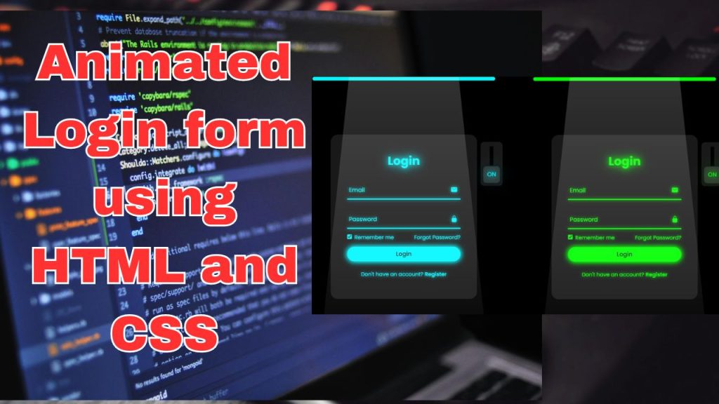
This article would provide a detailed, step-by-step tutorial on how to create a modern glassmorphism login form using HTML and CSS. It would cover the necessary HTML structure and CSS styling to achieve the glassmorphism effect, including blur and transparency effects.
STEP:1
Create a folder. You can give this folder any name you like. but i advice to use name related to what you want to create (e.g login or sign up)
STEP:2
Create a new HTML file, such as index.html (you can use any name but make sure it has .html extension) and add the basic framework. The comments added in the HTML explain the purpose of each element and attribute within the HTML code. Below is the HTML code for the login form.
<!DOCTYPE html> <!-- Declares the document type and version of HTML used -->
<!-- Code From Coding Classic - www.codingClassic.com --> <!-- Indicates the source of the code -->
<html> <!-- The root element of the HTML document -->
<head> <!-- Contains metadata and links to external resources -->
<meta charset="UTF-8"> <!-- Declares the character encoding of the document -->
<meta name="viewport" content="width=device-width, initial-scale=1.0"> <!-- Configures the viewport for responsive design -->
<title>Login Form</title> <!-- Sets the title of the document -->
<link rel="stylesheet" href="index.css"> <!-- Links an external CSS stylesheet -->
</head>
<body> <!-- Contains the content of the HTML document -->
<div class="container"> <!-- Container for the login form -->
<form action="#"> <!-- Form element with placeholder action attribute -->
<h2>Login</h2> <!-- Heading for the login section -->
<div class="input-space"> <!-- Container for input field and label -->
<input type="text" required> <!-- Text input for email -->
<label>Enter your email</label> <!-- Label for the email input -->
</div>
<div class="input-space"> <!-- Container for input field and label -->
<input type="password" required> <!-- Password input -->
<label>Enter your password</label> <!-- Label for the password input -->
</div>
<div class="remember-forget"> <!-- Container for "Remember me" and "Forgot password" -->
<label for="rememberme"> <!-- Label for the checkbox -->
<input type="checkbox" id="rememberme"> <!-- Checkbox for remembering login -->
<p>Remember me</p> <!-- Text for the remember me option -->
</label>
<a href="#">Forgot password?</a> <!-- Link to reset password -->
</div>
<button type="submit">Log In</button> <!-- Button to submit the form -->
<div class="register"> <!-- Container for registration link -->
<p>Don't have an account? <a href="#">Register</a></p> <!-- Text with link to registration -->
</div>
</form>
</div>
</body>
</html>
STEP: 3
Create a new CSS file (e.g., styles.css or index.css -> you can use any name but make sure it contain .css extension ) and link it to your HTML file. Below is the CSS code for the login form.
/* Importing Google Fonts */
/*
This line imports the Open Sans font family from Google Fonts.
The requested font weights are 200, 300, 400, 500, 600, and 700.
The 'display=swap' parameter ensures text is displayed immediately with fallback fonts while the Open Sans font is loading.
*/
@import url("https://fonts.googleapis.com/css2?family=Open+Sans:wght@200;300;400;500;600;700&display=swap");
/* Global reset and font family */
/*
This section resets the margin, padding, and box-sizing for all elements, and sets the default font family to Open Sans.
*/
* {
margin: 0;
padding: 0;
box-sizing: border-box;
font-family: "Open Sans", sans-serif;
}
/* Body styling */
/*
This section styles the body element, centering its contents both horizontally and vertically.
It sets a minimum height of 100% of the viewport height and adds horizontal padding of 10 pixels.
*/
body {
display: flex;
align-items: center;
justify-content: center;
min-height: 100vh;
width: 100%;
padding: 0 10px;
}
/* Background overlay */
/*
This section adds a background overlay to the body using a pseudo-element (::before).
The overlay consists of a background image and a fallback color of black.
*/
body::before {
content: "";
position: absolute;
width: 100%;
height: 100%;
background: url("./background.jpg"), #000;
background-position: center;
background-size: cover;
}
/* Container styling */
/*
This section styles the container element, setting its width, border radius, padding, and text alignment.
It also applies a border with transparency, and adds a backdrop filter for blur effects.
*/
.container {
width: 415px;
border-radius: 9px;
padding: 32px;
text-align: center;
border: 2px solid rgba(255, 253, 253, 0.5);
backdrop-filter: blur(8px);
-webkit-backdrop-filter: blur(9px); /* For Safari */
}
/* Form styling */
/*
This section styles the form element, setting its display to flex and its direction to column.
*/
form {
display: flex;
flex-direction: column;
}
/* Title styling */
/*
This section styles the h2 element, setting its font size, margin bottom, and color.
*/
h2 {
font-size: 2rem;
margin-bottom: 19px;
color: white;
}
/* Input space styling */
/*
This section styles the input-space class, which contains input fields and their labels.
It sets the position of the labels, border for the input fields, and styles for focus and valid states.
*/
.input-space {
position: relative;
border-bottom: 3px solid white;
margin: 14px 0;
}
/* Input styling */
/*
This section styles the input elements within the input-space class, setting their width, height, background, border, and color.
*/
.input-space input {
width: 100%;
height: 41px;
background: transparent;
border: none;
outline: none;
font-size: 16px;
color: white;
}
/* Label styling */
/*
This section styles the labels within the input-space class, setting their position, color, font size, and transition.
*/
.input-space label {
position: absolute;
top: 50%;
left: 0;
transform: translateY(-50%);
color: white;
font-size: 16px;
pointer-events: none;
transition: 0.15s ease;
}
/* Label transition on focus or valid input */
/*
This section styles the labels within the input-space class when the input is focused or has valid input.
It adjusts the font size, position, and transition for smoother animation.
*/
.input-space input:focus ~ label,
.input-space input:valid ~ label {
font-size: 0.9rem;
top: 10px;
transform: translateY(-120%);
}
/* "Remember me" and "Forgot password" styling */
/*
This section styles the remember-forget class, which contains elements related to remembering login and forgetting password.
It adjusts their alignment, margin, and color.
*/
.remember-forget {
display: flex;
align-items: center;
justify-content: space-between;
margin: 26px 0 36px 0;
color: white;
}
/* Checkbox styling */
/*
This section styles the checkbox element for remembering login.
*/
#rememberme {
accent-color: white;
}
/* Styling for text next to checkbox */
/*
This section styles the text next to the checkbox for remembering login.
*/
.remember-forget label p {
margin-left: 7px;
}
/* Styling for links */
/*
This section styles the links within the container class, setting their color and text decoration.
*/
.container a {
color: white;
text-decoration: none;
}
/* Hover effect for links */
/*
This section styles the hover effect for links within the container class, adding underline on hover.
*/
.container a:hover {
text-decoration: underline;
}
/* Button styling */
/*
This section styles the button element, setting its background color, text color, font weight, border, padding, cursor, border radius, font size, and transition.
*/
button {
background: #100000;
color: #ffffff;
font-weight: 600;
border: none;
padding: 11px 19px;
cursor: pointer;
border-radius: 3px;
font-size: 16px;
border: 2px solid transparent;
transition: 0.3s ease;
}
/* Button hover effect */
/*
This section styles the hover effect for buttons, changing the text color, border color, and background color on hover.
*/
button:hover {
color: #fff;
border-color: #fff;
background: rgba(53, 31, 31, 0.15);
}
/* Styling for registration link */
/*
This section styles the registration link within the container class, setting its text alignment, margin top, and color.
*/
.register {
text-align: center;
margin-top: 29px;
color: #fff;
}
These comments detail each component of the CSS code, making it easier to grasp its purpose and functionality. Creating a Glassmorphism login form involves a combination of HTML for the structure and CSS for the styling.