Coding classic

html, css, javascript, react, python

Build a Playable Piano from Scratch: A Guide Using HTML CSS and JavaScript

How to make Playable PIANO using HTML CSS & JavaScript

How to make Playable PIANO using HTML CSS & JavaScript

Introduction

This guide will walk you through creating a playable piano from scratch using HTML, CSS, and JavaScript. We’ll build a simple piano keyboard with keys that respond to clicks and play corresponding notes. This project combines the power of HTML for structure, CSS for styling, and JavaScript for interactivity to bring a musical instrument to life on the web.

1. HTML Structure (index.html):

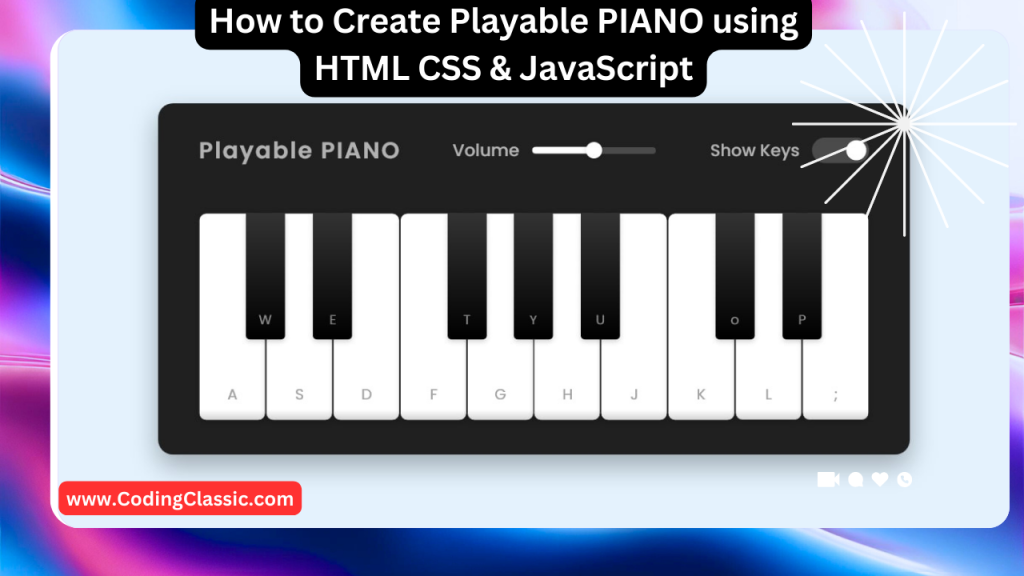
This HTML code sets up the framework for a playable piano interface. It creates a main container with a header and a section for the piano keys. The header displays the title “Playable PIANO” and provides controls for adjusting volume and showing/hiding the keys.

The piano keys are organized within an unordered list, each key represented as a list item. Each key is visually categorized as either white or black, and linked to a specific keyboard key for triggering sound. The key letter is displayed within each key for visual reference. The styling and functionality are handled by separate CSS (style.css) and JavaScript (script.js) files, respectively.

<!DOCTYPE html>
<html lang="en" dir="ltr">
  <head>
    <!-- Specifies the character encoding for the document -->
    <meta charset="utf-8">
    
    <!-- Sets the title of the webpage, visible in the browser tab -->
    <title>Playable Piano JavaScript By CodingClassic</title>
    
    <!-- Links to the external CSS file for styling the piano and other elements -->
    <link rel="stylesheet" href="style.css">
    
    <!-- Ensures the page is responsive and scales correctly on different devices -->
    <meta name="viewport" content="width=device-width, initial-scale=1.0">
    
    <!-- Links to the external JavaScript file for adding interactive behavior, 'defer' ensures it's loaded after HTML parsing -->
    <script src="script.js" defer></script>
  </head>
  <body>
    <!-- Container for the entire piano application -->
    <div class="wrapper">
    
      <!-- Header section containing controls for volume and key visibility -->
      <header>
        <!-- Title of the piano application -->
        <h2>Playable PIANO</h2>
        
        <!-- Volume control slider -->
        <div class="column volume-slider">
          <span>Volume</span>
          <input type="range" min="0" max="1" value="0.5" step="any">
        </div>
        
        <!-- Checkbox to toggle the visibility of piano keys -->
        <div class="column keys-checkbox">
          <span>Show Keys</span>
          <input type="checkbox" checked>
        </div>
      </header>
      
      <!-- List of piano keys -->
      <ul class="piano-keys">
        <!-- Each <li> represents a key on the piano -->
        <!-- 'data-key' attribute is used to map the key to a specific key on the keyboard -->
        <li class="key white" data-key="a"><span>a</span></li>
        <li class="key black" data-key="w"><span>w</span></li>
        <li class="key white" data-key="s"><span>s</span></li>
        <li class="key black" data-key="e"><span>e</span></li>
        <li class="key white" data-key="d"><span>d</span></li>
        <li class="key white" data-key="f"><span>f</span></li>
        <li class="key black" data-key="t"><span>t</span></li>
        <li class="key white" data-key="g"><span>g</span></li>
        <li class="key black" data-key="y"><span>y</span></li>
        <li class="key white" data-key="h"><span>h</span></li>
        <li class="key black" data-key="u"><span>u</span></li>
        <li class="key white" data-key="j"><span>j</span></li>
        <li class="key white" data-key="k"><span>k</span></li>
        <li class="key black" data-key="o"><span>o</span></li>
        <li class="key white" data-key="l"><span>l</span></li>
        <li class="key black" data-key="p"><span>p</span></li>
        <li class="key white" data-key=";"><span>;</span></li>
      </ul>
      
    </div>
  </body>
</html>

2. CSS Styling (style.css):

This CSS code defines the visual appearance of a piano interface on a webpage. It incorporates the “Poppins” font from Google Fonts for a clean and modern look. The page layout is centered, with a background color, and the main piano interface container is styled with padding and a dark background.

The header is designed using flexbox to arrange the title and controls neatly. The volume slider and keys checkbox are styled for a visually appealing and user-friendly experience. The piano keys themselves are styled with different sizes and colors to distinguish between white and black keys.

The code includes media queries to adapt the layout for smaller screens, ensuring a responsive design by hiding certain keys and adjusting sizes for optimal viewing on various devices.

/* Import Google font - Poppins */
@import url('https://fonts.googleapis.com/css2?family=Poppins:wght@400;500;600&display=swap');

/* Apply styles to all elements */
* {
  margin: 0; /* Remove default margin */
  padding: 0; /* Remove default padding */
  box-sizing: border-box; /* Include padding and border in element's total width and height */
  font-family: 'Poppins', sans-serif; /* Apply Poppins font from Google Fonts */
}

/* Style the body of the document */
body {
  display: flex; /* Use flexbox for layout */
  align-items: center; /* Vertically center items */
  justify-content: center; /* Horizontally center items */
  min-height: 100vh; /* Ensure body takes at least full viewport height */
  background: #E3F2FD; /* Light blue background color */
}

/* Style the main container */
.wrapper {
  padding: 35px 40px; /* Add padding around the container */
  border-radius: 20px; /* Round the corners */
  background: #141414; /* Dark background color */
}

/* Style the header section within the wrapper */
.wrapper header {
  display: flex; /* Use flexbox for layout */
  color: #B2B2B2; /* Light gray text color */
  align-items: center; /* Vertically align items */
  justify-content: space-between; /* Space out header elements */
}

/* Style the header title */
header h2 {
  font-size: 1.6rem; /* Larger font size for the title */
}

/* Style columns in the header section */
header .column {
  display: flex; /* Use flexbox for layout */
  align-items: center; /* Vertically align items */
}

/* Style text inside header columns */
header span {
  font-weight: 500; /* Semi-bold font weight */
  margin-right: 15px; /* Space between the span and the input */
  font-size: 1.19rem; /* Slightly larger font size */
}

/* Style inputs in the header */
header input {
  outline: none; /* Remove default outline */
  border-radius: 30px; /* Round the corners of the input elements */
}

/* Style the volume slider input */
.volume-slider input {
  accent-color: #fff; /* Set the accent color of the slider to white */
}

/* Style the checkbox for showing/hiding keys */
.keys-checkbox input {
  height: 30px; /* Height of the checkbox */
  width: 60px; /* Width of the checkbox */
  cursor: pointer; /* Change cursor to pointer on hover */
  appearance: none; /* Remove default appearance */
  position: relative; /* Position relative for positioning ::before pseudo-element */
  background: #4B4B4B; /* Dark gray background color */
}

/* Style the pseudo-element for the checkbox slider */
.keys-checkbox input::before {
  content: ""; /* Empty content for the pseudo-element */
  position: absolute; /* Absolute positioning */
  top: 50%; /* Center vertically */
  left: 5px; /* Position from the left */
  width: 20px; /* Width of the pseudo-element */
  height: 20px; /* Height of the pseudo-element */
  border-radius: 50%; /* Round the corners to make it a circle */
  background: #8c8c8c; /* Light gray background color */
  transform: translateY(-50%); /* Center vertically */
  transition: all 0.3s ease; /* Smooth transition for changes */
}

/* Style the pseudo-element when the checkbox is checked */
.keys-checkbox input:checked::before {
  left: 35px; /* Move slider to the right */
  background: #fff; /* Change background color to white */
}

/* Style the piano keys container */
.piano-keys {
  display: flex; /* Use flexbox for layout */
  list-style: none; /* Remove default list styling */
  margin-top: 40px; /* Space above the keys */
}

/* Style individual keys */
.piano-keys .key {
  cursor: pointer; /* Change cursor to pointer on hover */
  user-select: none; /* Prevent text selection */
  position: relative; /* Position relative for positioning child elements */
  text-transform: uppercase; /* Transform text to uppercase */
}

/* Style black keys */
.piano-keys .black {
  z-index: 2; /* Ensure black keys appear above white keys */
  width: 44px; /* Width of the black key */
  height: 140px; /* Height of the black key */
  margin: 0 -22px; /* Negative margin to overlap with white keys */
  border-radius: 0 0 5px 5px; /* Round the bottom corners */
  background: linear-gradient(#333, #000); /* Dark gradient background */
}

/* Style black keys when active */
.piano-keys .black.active {
  box-shadow: inset -5px -10px 10px rgba(255,255,255,0.1); /* Inner shadow effect */
  background: linear-gradient(to bottom, #000, #434343); /* Darker gradient background */
}

/* Style white keys */
.piano-keys .white {
  height: 230px; /* Height of the white key */
  width: 70px; /* Width of the white key */
  border-radius: 8px; /* Round the corners */
  border: 1px solid #000; /* Black border around the key */
  background: linear-gradient(#fff 96%, #eee 4%); /* Light gradient background */
}

/* Style white keys when active */
.piano-keys .white.active {
  box-shadow: inset -5px 5px 20px rgba(0,0,0,0.2); /* Inner shadow effect */
  background: linear-gradient(to bottom, #fff 0%, #eee 100%); /* Lighter gradient background */
}

/* Style text inside the keys */
.piano-keys .key span {
  position: absolute; /* Absolute positioning */
  bottom: 20px; /* Position at the bottom */
  width: 100%; /* Full width of the key */
  color: #A2A2A2; /* Light gray text color */
  font-size: 1.13rem; /* Font size for the key labels */
  text-align: center; /* Center the text horizontally */
}

/* Hide the text in keys when the key is hidden */
.piano-keys .key.hide span {
  display: none; /* Hide the text */
}

/* Style text on black keys */
.piano-keys .black span {
  bottom: 13px; /* Position closer to the bottom */
  color: #888888; /* Gray text color */
}

/* Responsive design for screens with a maximum width of 815px */
@media screen and (max-width: 815px) {
  .wrapper {
    padding: 25px; /* Reduce padding */
  }
  header {
    flex-direction: column; /* Stack header elements vertically */
  }
  header :where(h2, .column) {
    margin-bottom: 13px; /* Space between header elements */
  }
  .volume-slider input {
    max-width: 100px; /* Limit the width of the volume slider */
  }
  .piano-keys {
    margin-top: 20px; /* Reduce space above the keys */
  }
  .piano-keys .key:where(:nth-child(9), :nth-child(10)) {
    display: none; /* Hide some keys on smaller screens */
  }
  .piano-keys .black {
    height: 100px; /* Reduce height of black keys */
    width: 40px; /* Reduce width of black keys */
    margin: 0 -20px; /* Adjust margin for reduced width */
  }
  .piano-keys .white {
    height: 180px; /* Reduce height of white keys */
    width: 60px; /* Reduce width of white keys */
  }
}

/* Responsive design for screens with a maximum width of 615px */
@media screen and (max-width: 615px) {
  .piano-keys .key:nth-child(13),
  .piano-keys .key:nth-child(14),
  .piano-keys .key:nth-child(15),
  .piano-keys .key:nth-child(16),
  .piano-keys .key :nth-child(17) {
    display: none; /* Hide more keys on very small screens */
  }
  .piano-keys .white {
    width: 50px; /* Further reduce width of white keys */
  }
}

3. JavaScript Logic (script.js):

This JavaScript code brings a basic piano interface to life within a web page. It sets up the foundation for user interaction by identifying the piano keys, volume slider, and key visibility checkbox.

The code initializes a list of all piano keys and sets up a default audio tune. It then defines functions to play tunes, adjust the volume, show or hide the keys, and respond to keyboard presses.

Event listeners are added to trigger these functions based on user actions, such as clicking a key, adjusting the volume slider, checking the visibility checkbox, or pressing a key on the keyboard. This code creates a simple piano application where users can play tunes, control the volume, and toggle the visibility of the keys.

// Select all piano key elements, volume slider, and keys checkbox
const pianoKeys = document.querySelectorAll(".piano-keys .key"),
      volumeSlider = document.querySelector(".volume-slider input"),
      keysCheckbox = document.querySelector(".keys-checkbox input");

// Initialize an empty array to store key data
let allKeys = [],
    audio = new Audio(`tunes/a.wav`); // Create an Audio object with a default source for the "a" tune

// Function to play a tune based on the key pressed
const playTune = (key) => {
    audio.src = `tunes/${key}.wav`; // Set the audio source based on the key pressed
    audio.play(); // Play the audio

    // Get the piano key element that corresponds to the key pressed
    const clickedKey = document.querySelector(`[data-key="${key}"]`);
    clickedKey.classList.add("active"); // Add the "active" class to show visual feedback

    // Remove the "active" class after 150 milliseconds to revert the visual feedback
    setTimeout(() => {
        clickedKey.classList.remove("active");
    }, 150);
}

// Iterate through each piano key element
pianoKeys.forEach(key => {
    // Add the data-key attribute value to the allKeys array
    allKeys.push(key.dataset.key);
    
    // Add a click event listener to each key that calls playTune with the key's data-key value
    key.addEventListener("click", () => playTune(key.dataset.key));
});

// Function to handle volume change based on the volume slider input
const handleVolume = (e) => {
    audio.volume = e.target.value; // Set the audio volume based on the slider value
}

// Function to show or hide piano keys based on the checkbox status
const showHideKeys = () => {
    // Toggle the "hide" class on each piano key element
    pianoKeys.forEach(key => key.classList.toggle("hide"));
}

// Function to handle key presses on the keyboard
const pressedKey = (e) => {
    // If the pressed key is in the allKeys array, call playTune with the key's value
    if(allKeys.includes(e.key)) playTune(e.key);
}

// Add event listeners
keysCheckbox.addEventListener("click", showHideKeys); // Toggle key visibility when checkbox is clicked
volumeSlider.addEventListener("input", handleVolume); // Adjust volume when slider input changes
document.addEventListener("keydown", pressedKey); // Play tune when a key is pressed on the keyboard

Conclusion:

This guide has provided a basic framework for building a playable piano from scratch. You can expand upon this foundation by adding features like:

  • Keyboard Input: Allow users to play the piano using their computer keyboard.
  • Visual Feedback: Display the note being played visually on the piano.
  • Sound Effects: Add sound effects for key presses and releases.
  • Multiple Instruments: Allow users to choose from different instruments.

With some creativity and coding skills, you can create a fun and interactive piano experience for users to enjoy.

Build a Playable Piano from Scratch: A Guide Using HTML CSS and JavaScript

Leave a Reply

Your email address will not be published. Required fields are marked *

Scroll to top