Coding classic

html, css, javascript, react, python

Create Stunning Team Profiles Rotation with HTML CSS & JavaScript: Step-by-Step Guide

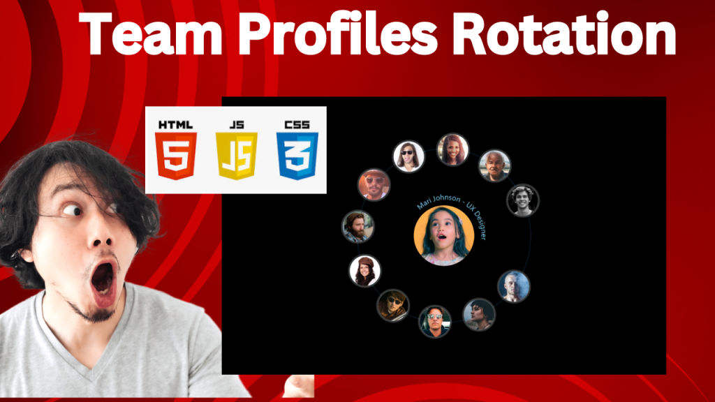
Team Profiles Rotation using HTML CSS and JavaScript

In today’s digital world, showcasing your team is essential. But static team profiles can feel stale. A dynamic, rotating display adds visual interest and keeps your website engaging. This article will guide you through creating a smooth team profile rotation using HTML CSS and JavaScript.

This HTML code sets up a visually appealing team profile display. It uses a circular arrangement, with each team member’s profile represented by a label containing their image and name/role. These labels are positioned around a central “The Team” element. The code cleverly utilizes SVG text paths to create circular text layouts for the profile descriptions. While the code doesn’t show the CSS, it’s designed to enhance the user experience by making the profiles interactive. When a user selects a profile (likely through hidden radio buttons), the image enlarges, and additional details are revealed.

Step 1: Set Up Your HTML Structure

First, you’ll need to set up the basic HTML structure for your team profiles.

<!DOCTYPE html>
<html lang="en"> 
<head>
    <!-- Specifies the document type and version of HTML -->
    <meta charset="UTF-8">
    <!-- Sets the character encoding for the document to UTF-8 -->
    <meta name="viewport" content="width=device-width, initial-scale=1.0">
    <!-- Ensures proper rendering and touch zooming on mobile devices -->
    <link rel="stylesheet" href="./style.css">
    <!-- Links the external CSS file for styling -->
    <title>Team Profiles rotation with pure CSS</title>
    <!-- Sets the title of the webpage, shown in the browser's title bar or tab -->
</head>
<body>

<div style="--total: 12;" class="circle-wrapper">
  <!-- The main container that wraps all team member profiles, with a CSS variable --total representing the number of profiles -->
  
  <div class="center-element">The Team</div>
  <!-- A central element in the circle, usually for a title or main focus, here labeled "The Team" -->

  <!-- Each team member is represented by an input radio button and a corresponding label -->
  <!-- The labels (avatars) are styled and positioned based on the CSS variable --i, which determines their position in the circle -->
  
  <input type="radio" name="radio-avatar" id="radio-avatar-1">
  <!-- A radio input for selecting the first team member -->

  <label id="avatar-1" for="radio-avatar-1" class="avatar" style="--i:1">
    <!-- The label that visually represents the first team member, linked to the corresponding radio input -->
    <img src="https://i.pravatar.cc/300?img=12" alt="Steven Robinson">
    <!-- An image representing the team member -->
    <svg viewBox="0 0 300 300">
      <!-- SVG container for displaying text along a circular path -->
      <text fill="currentColor">
        <textPath xlink:href="#circlePath">Steven Robinson - Web Developer</textPath>
        <!-- Text element with a path that follows a circular shape, displaying the name and role of the team member -->
      </text>
    </svg>
  </label>

  <!-- Repeat similar blocks for other team members -->
  <!-- Each team member has a unique id, image, and description -->

  <!-- Additional team members are defined similarly with unique IDs and details -->
  <!-- Example below: -->
  
  <input type="radio" name="radio-avatar" id="radio-avatar-2">
  <label id="avatar-2" for="radio-avatar-2" class="avatar" style="--i:2">
    <img src="https://i.pravatar.cc/300?img=37" alt="Mari Johnson">
    <svg viewBox="0 0 300 300">
      <text fill="currentColor">
        <textPath xlink:href="#circlePath">Mari Johnson - UX Designer</textPath>
      </text>
    </svg>
  </label>

  <!-- More team members continue in this pattern until all profiles are defined -->

</div>

<!-- SVG template for dynamic text -->
<svg version="1.1" xmlns="http://www.w3.org/2000/svg" xmlns:xlink="http://www.w3.org/1999/xlink" viewBox="0 0 300 300" width="0" height="0">
  <defs>
    <path id="circlePath" d="M 150, 150 m -100, 0 a 100,100 0 0,1 200,0 a 100,100 0 0,1 -200,0" />
    <!-- Defines a circular path used by all the text elements for each team member -->
  </defs>
</svg>

<!-- Links to the external JavaScript file for added interactivity -->
<script src="script.js"></script>
</body>
</html>

Breakdown of Key Sections:

  1. HTML Structure:
    • The entire document is wrapped within the standard HTML structure, beginning with the <!DOCTYPE html> declaration and ending with the </html> tag.
    • The <head> section contains metadata and links to external resources, including CSS and the page title.
    • The <body> contains the main content, including the team profiles, each represented by a combination of radio buttons, labels, images, and SVG text elements.
  2. Team Profiles:
    • Each team profile is represented by an input radio button and a label that contains the member’s image and an SVG displaying their name and role.
    • The profiles are arranged in a circular layout using CSS variables and the circle-wrapper class, which positions the labels based on their --i value, a custom property.
  3. SVG for Circular Text:
    • A reusable SVG path is defined within the <defs> tag, which each label uses to display text around the member’s profile picture in a circular format.

Step 2: Style Your Profiles with CSS

Now, let’s style the elements using CSS. We’ll create a grid layout for the team profiles, add transitions for smooth movement, and style the individual elements.

/* 
  This CSS code styles a circular layout of team profiles with interactive elements. 
  It uses radio buttons to control the selection of each profile, and the styles 
  transform the selected profile, making it larger and revealing more details. 
*/

/* 
  Resetting default styles for all elements, including pseudo-elements.
  This ensures consistent styling across the project.
*/
*,
::before,
::after {
  margin: 0;
  padding: 0;
  box-sizing: border-box;
}

/* 
  Styling the body of the page.
  - Sets a black background.
  - Ensures the page is at least as tall as the viewport.
  - Centers content using grid layout.
  - Sets the default font family.
*/
body {
  background-color: #000;
  min-height: 100vh;
  display: grid;
  place-content: center;
  font-family: system-ui, sans-serif;
}

/* 
  Hiding radio input elements from view.
  - Positions them absolutely, setting their size to 1px.
  - Removes padding, margin, and overflow.
  - Clips the content, making it invisible.
  - Prevents whitespace from being displayed.
  - Removes the default border.
*/
input[type="radio"] {
  position: absolute;
  width: 1px;
  height: 1px;
  padding: 0;
  margin: -1px;
  overflow: hidden;
  clip: rect(0, 0, 0, 0);
  white-space: nowrap;
  border-width: 0;
}

/* 
  Styling the paragraph element.
  - Positions it absolutely at the bottom right of the page.
  - Sets the text color to white.
  - Adjusts the font size.
*/
p {
  position: absolute;
  bottom: 2rem;
  right: 2rem;
  color: white;
  font-size: 0.8rem;
}

/* 
  Styling the wrapper for the circle elements.
  - Adds a border.
  - Sets the position to relative for absolute positioning of children.
  - Applies a full border-radius for a circular shape.
  - Uses grid layout for centering content.
  - Sets the width and height.
*/
.circle-wrapper {
  border: 1px solid #0f3e5d;
  position: relative;
  border-radius: 9999px; /* Fully rounded */
  display: grid;
  width: 450px;
  height: 450px;
  grid-template-areas: "stack";
  place-content: center;
}

/* 
  Styling the labels inside the circle wrapper.
  - Uses grid-area to fill the entire wrapper.
  - Sets the width, height, and border-radius for a circular shape.
  - Adds a border and background color.
  - Centers content using grid layout.
  - Sets the text color, font size, and cursor.
  - Adds transitions for smooth animations.
  - Adds a box shadow for visual emphasis.
*/
label {
  grid-area: stack;
  width: 5rem;
  height: 5rem;
  border-radius: 9999px; /* Fully rounded */
  border: 1px solid #738088;
  display: grid;
  place-content: center;
  background-color: rgba(255, 255, 255, 0.2);
  position: relative;
  color: #87ceeb;
  font-size: 1.25rem;
  transition-property: all;
  transition-duration: 0.5s;
  cursor: pointer;
  box-shadow: 0 0 0 4px rgba(255, 255, 255, 0.2); /* White with 20% opacity */
}

/* 
  Styling the images inside the labels.
  - Applies a full border-radius for a circular shape.
  - Sets the width and height to 100% of the label.
  - Uses object-fit to cover the entire label area.
  - Adds transitions for smooth animations.
*/
img {
  border-radius: 9999px;
  width: 100%;
  height: 100%;
  object-fit: cover;
  transition: all 1s ease-in-out;
}

/* 
  Styling the SVG elements.
  - Adds transitions for smooth animations.
  - Positions the SVG absolutely, centering it using inset and margin.
  - Sets the width and initial opacity.
  - Sets the z-index to ensure it's behind other elements.
*/
svg {
  transition: all 0.5s ease-in-out;
  position: absolute;
  inset: 0 0 0 -25%;
  margin: auto;
  width: 125px;
  opacity: 0;
  z-index: -10;
}

/* 
  Styling the centered element.
  - Positions it absolutely, centering it using margin.
  - Sets the width, height, background color, and border.
  - Applies a circular border-radius.
  - Centers content using grid layout.
  - Styles the text.
*/
.center-element {
  position: absolute;
  top: 0;
  right: 0;
  bottom: 0;
  left: 0;
  margin: auto;
  width: 8rem;
  height: 8rem;
  background-color: #1b2c36;
  border: 1px solid rgba(255, 255, 255, 0.4);
  border-radius: 50%; /* Circle */
  display: grid;
  place-content: center;
  text-transform: uppercase;
  font-weight: 100;
  letter-spacing: 0.05em;
  color: #cbd5e0;
  font-size: 1.125rem;
}

/* 
  Styling the before pseudo-element for the center-element.
  - Creates a background circle behind the center-element.
  - Positions it absolutely, ensuring it covers the entire element.
  - Sets the background color and border-radius.
  - Sets the z-index to ensure it's behind the center-element.
  - Adds transitions for smooth animations.
*/
.center-element::before {
  content: "";
  position: absolute;
  top: -1px;
  right: -1px;
  bottom: -1px;
  left: -1px;
  background-color: #0a4368;
  border-radius: 50%;
  z-index: -10;
  transition: all 1s;
}

/* 
  Styling the label when the corresponding radio button is checked.
  - Removes any transform applied to the label.
  - Sets the transition duration to 1 second.
*/
input:checked + label {
  transform: none !important;
  transition-duration: 1s;
}

/* 
  Styling the image inside the label when the corresponding radio button is checked.
  - Scales the image to twice its original size.
*/
input:checked + label > img {
  transform: scale(2);
}

/* 
  Styling the SVG element inside the label when the corresponding radio button is checked.
  - Sets the opacity to 1, making it visible.
  - Scales the SVG to 2.25 times its original size.
  - Rotates the SVG by 45 degrees.
  - Adds transition delays for a staggered animation effect.
*/
input:checked + label > svg {
  opacity: 1;
  transform: scale(2.25) rotate(45deg);
  transition-delay: 700ms, 500ms, 2000ms;
}

/* 
  Styling the avatar elements.
  - Uses custom properties to control the positioning and rotation.
  - Applies a transform to rotate and translate the avatar elements.
*/
.avatar {
  --radius: 14rem;
  --d: calc(var(--i) / var(--total));
  --r-offset: -0.15turn;
  --r-amount: 1turn;
  --r: calc((var(--r-amount) * var(--d)) + var(--r-offset));
  transform: rotate(var(--r)) translate(var(--radius)) rotate(calc(-1 * var(--r)));
}

Steps 3: JavaScript

This JavaScript code modifies the behavior of radio buttons on a webpage. It makes it so that clicking on a radio button, instead of just selecting it, will actually uncheck it.

Here’s a breakdown:

  1. Selection: The code finds all radio buttons on the page.
  2. Event Listener: It attaches a click event listener to each radio button.
  3. Default Prevention: When a radio button is clicked, the code prevents the default behavior, which is to select the radio button.
  4. Timeout: A short delay (timeout) is introduced before toggling the checked state of the radio button. This delay prevents the radio button from immediately being re-checked after being unchecked, providing a smoother user experience.

In essence, this code allows users to “toggle” radio buttons on and off by clicking them, instead of the traditional behavior of only selecting them.

// Uncheck radio buttons (unfortunately, this cannot be done with CSS alone)

// Select all radio input elements on the page
document.querySelectorAll('input[type="radio"]').forEach(radio => {
  
  // Add a click event listener to each radio button
  radio.addEventListener('click', (e) => {
    
      // Prevent the default behavior of the radio button when clicked
      // This prevents the radio button from staying checked
      e.preventDefault();

      // Use a setTimeout function with a delay of 0 milliseconds
      // This creates a small delay before executing the code inside
      setTimeout(() => {
        // Toggle the checked state of the radio button
        // If it was checked, uncheck it; if it was unchecked, check it
        radio.checked = !radio.checked;
      }, 0);
  });
});

Detailed Breakdown:

  1. Selecting Radio Buttons:
    • document.querySelectorAll('input[type="radio"]'): This selects all radio buttons on the page and returns a NodeList (similar to an array) of those elements.
  2. Adding Event Listeners:
    • .forEach(radio => { ... }): Iterates over each radio button in the NodeList.
    • radio.addEventListener('click', (e) => { ... }): Adds a click event listener to each radio button. This listener triggers a function whenever the radio button is clicked.
  3. Preventing Default Behavior:
    • e.preventDefault();: This prevents the default action of the click event, which would normally check the radio button. This is necessary because we want to control the checked state manually.
  4. Using setTimeout to Toggle the Checked State:
    • setTimeout(() => radio.checked = !radio.checked, 0);:
      • The setTimeout function introduces a slight delay (even with 0 milliseconds), allowing the browser to process the click event before changing the checked state.
      • The radio.checked = !radio.checked; line toggles the checked state of the radio button. If it was checked, it becomes unchecked, and vice versa.

CONCLUSION

In summary, building a Team Profiles Rotation effect with HTML and CSS has been both a fun and informative experience. By utilizing HTML for the layout and CSS for the styling and animations, we’ve created an interactive and visually appealing method to display team members on a webpage.

Create Stunning Team Profiles Rotation with HTML CSS & JavaScript: Step-by-Step Guide

Leave a Reply

Your email address will not be published. Required fields are marked *

Scroll to top