Coding classic

html, css, javascript, react, python

How to Create 3D Dot Preloader using HTML & CSS

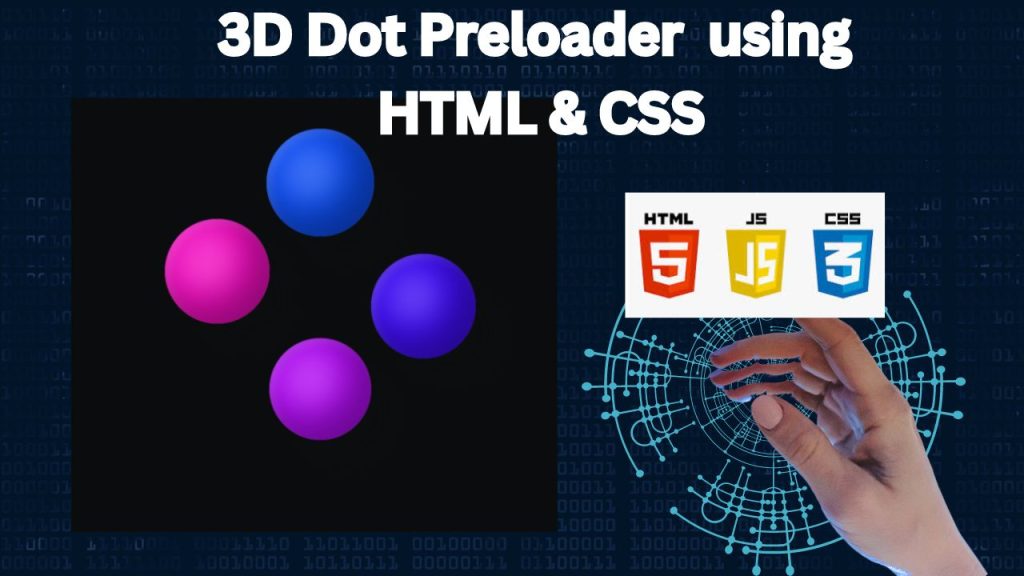
Let’s build a dynamic 3D dot loading animation using just HTML and CSS. We’ll create a visually captivating preloader by structuring it with HTML and bringing it to life with CSS animations. This project is perfect for honing your web design skills and adding a touch of flair to your website’s loading process. Let’s dive in and create an impressive loading experience!

HTML :

This HTML code establishes a simple webpage framework for a 3D dot preloader. It creates a basic structure using a div container and four inner div elements to represent the dots. The visual magic happens in the CSS file, where these elements will be styled and animated to form the 3D preloader effect.

<!DOCTYPE html>
<html lang="en">

<head>
  <!-- Specifies the character encoding for the HTML document -->
  <meta charset="UTF-8">
  <!-- Sets the title of the webpage, which appears on the browser tab -->
  <title>3D Dot Preloader (pure CSS)</title>
  <!-- Ensures the webpage is responsive and scales properly on different devices -->
  <meta name="viewport" content="width=device-width, initial-scale=1">
  <!-- Links to an external CSS file named "style.css" for styling the page -->
  <link rel="stylesheet" href="./style.css">
</head>

<body>
  <!-- Container for the preloader animation -->
  <div class="pl">
    <!-- Individual dots for the preloader animation, each with a unique class for styling and animation -->
    <div class="pl__dot pl__dot--a"></div>
    <div class="pl__dot pl__dot--b"></div>
    <div class="pl__dot pl__dot--c"></div>
    <div class="pl__dot pl__dot--d"></div>
  </div>

</body>
</html>

CSS :

This CSS code brings the 3D dot preloader to life. It starts by resetting browser defaults and establishing color and animation variables. The preloader container and individual dots are styled with precise dimensions, positioning, and 3D transformations. Keyframe animations are meticulously crafted to produce the mesmerizing 3D rotation and movement of the dots, creating a captivating loading effect.

/* Reset default margins, padding, and borders for all elements */
* {
  border: 0;
  box-sizing: border-box; /* Ensures padding and border are included in the element's width and height */
  margin: 0;
  padding: 0;
}

/* Define custom CSS variables for reuse throughout the stylesheet */
:root {
  --hue: 223; /* Base hue for the color scheme */
  --bg: hsl(var(--hue),10%,5%); /* Background color */
  --fg: hsl(var(--hue),10%,95%); /* Foreground (text) color */
  --dot-a: 313; /* Hue for dot A */
  --dot-b: 253; /* Hue for dot B */
  --dot-c: 223; /* Hue for dot C */
  --dot-d: 283; /* Hue for dot D */
  --trans-dur: 0.3s; /* Duration for transitions */
  
  /* Responsive font size based on the viewport width */
  font-size: calc(14px + (30 - 14) * (100vw - 280px) / (3840 - 280));
}

/* Basic styles for the body */
body {
  background-color: var(--bg); /* Use the background color from the custom variable */
  color: var(--fg); /* Use the foreground color from the custom variable */
  display: flex; /* Use flexbox for layout */
  font: 1em/1.5 sans-serif; /* Set the font size and line height */
  height: 100vh; /* Full viewport height */
  transition: background-color var(--trans-dur), color var(--trans-dur); /* Smooth transitions for color changes */
}

/* Styles for the preloader container */
.pl {
  margin: auto; /* Center the container */
  perspective: 18em; /* Create a 3D perspective */
  position: relative;
  width: 9em; /* Set the width */
  height: 9em; /* Set the height */
  transform-style: preserve-3d; /* Ensure child elements maintain 3D transformations */
}

/* Common styles for all dots in the preloader */
.pl__dot {
  animation-duration: 3s; /* Duration of the animation */
  animation-timing-function: cubic-bezier(0.37, 0, 0.63, 1); /* Custom easing for smooth animation */
  animation-iteration-count: infinite; /* Loop the animation indefinitely */
  border-radius: 50%; /* Make the dots circular */
  position: absolute;
  top: calc(50% - 1.5em); /* Position the dots in the center */
  left: calc(50% - 1.5em); /* Position the dots in the center */
  width: 3em; /* Width of the dots */
  height: 3em; /* Height of the dots */
}

/* Styles specific to dot A */
.pl__dot--a {
  animation-name: dot-a; /* Use the 'dot-a' keyframe animation */
  background-color: hsl(var(--dot-a), 90%, 60%); /* Color of dot A */
  
  /* Create a 3D effect with inset shadows */
  box-shadow: 
    -0.5em -0.5em 1em hsl(var(--dot-a), 90%, 30%) inset, 
    0.125em 0.125em 0.25em hsl(var(--dot-a), 90%, 60%) inset, 
    -0.25em -0.25em 0.75em 0.75em hsl(var(--dot-a), 90%, 50%) inset, 
    0.75em 0.75em 0.75em hsla(var(--hue), 10%, 5%, 0.7);
}

/* Styles specific to dot B (similar to dot A but with different color and animation) */
.pl__dot--b {
  animation-name: dot-b;
  background-color: hsl(var(--dot-b), 90%, 60%);
  
  /* 3D effect with shadows for dot B */
  box-shadow: 
    -0.5em -0.5em 1em hsl(var(--dot-b), 90%, 30%) inset, 
    0.125em 0.125em 0.25em hsl(var(--dot-b), 90%, 60%) inset, 
    -0.25em -0.25em 0.75em 0.75em hsl(var(--dot-b), 90%, 50%) inset, 
    0.75em 0.75em 0.75em hsla(var(--hue), 10%, 5%, 0.7);
}

/* Styles specific to dot C */
.pl__dot--c {
  animation-name: dot-c;
  background-color: hsl(var(--dot-c), 90%, 60%);
  
  /* 3D effect with shadows for dot C */
  box-shadow: 
    -0.5em -0.5em 1em hsl(var(--dot-c), 90%, 30%) inset, 
    0.125em 0.125em 0.25em hsl(var(--dot-c), 90%, 60%) inset, 
    -0.25em -0.25em 0.75em 0.75em hsl(var(--dot-c), 90%, 50%) inset, 
    0.75em 0.75em 0.75em hsla(var(--hue), 10%, 5%, 0.7);
}

/* Styles specific to dot D */
.pl__dot--d {
  animation-name: dot-d;
  background-color: hsl(var(--dot-d), 90%, 60%);
  
  /* 3D effect with shadows for dot D */
  box-shadow: 
    -0.5em -0.5em 1em hsl(var(--dot-d), 90%, 30%) inset, 
    0.125em 0.125em 0.25em hsl(var(--dot-d), 90%, 60%) inset, 
    -0.25em -0.25em 0.75em 0.75em hsl(var(--dot-d), 90%, 50%) inset, 
    0.75em 0.75em 0.75em hsla(var(--hue), 10%, 5%, 0.7);
}

/* Animation for dot A */
@keyframes dot-a {
  from {
    transform: rotateY(0) rotateZ(0) translateX(-100%) rotateY(0) rotateZ(0);
  }
  50% {
    transform: rotateY(1turn) rotateZ(0) translateX(-100%) rotateY(-1turn) rotateZ(0);
  }
  to {
    transform: rotateY(1turn) rotateZ(-1turn) translateX(-100%) rotateY(-1turn) rotateZ(1turn);
  }
}

/* Animation for dot B */
@keyframes dot-b {
  from {
    transform: rotateY(0) rotateZ(0) translateX(100%) rotateY(0) rotateZ(0);
  }
  50% {
    transform: rotateY(1turn) rotateZ(0) translateX(100%) rotateY(-1turn) rotateZ(0);
  }
  to {
    transform: rotateY(1turn) rotateZ(-1turn) translateX(100%) rotateY(-1turn) rotateZ(1turn);
  }
}

/* Animation for dot C */
@keyframes dot-c {
  from {
    transform: rotateZ(0) rotateX(0) translateY(-100%) rotateZ(0) rotateX(0);
  }
  50% {
    transform: rotateZ(-1turn) rotateX(0) translateY(-100%) rotateZ(1turn) rotateX(0);
  }
  to {
    transform: rotateZ(-1turn) rotateX(1turn) translateY(-100%) rotateZ(1turn) rotateX(-1turn);
  }
}

/* Animation for dot D */
@keyframes dot-d {
  from {
    transform: rotateZ(0) rotateX(0) translateY(100%) rotateZ(0) rotateX(0);
  }
  50% {
    transform: rotateZ(-1turn) rotateX(0) translateY(100%) rotateZ(1turn) rotateX(0);
  }
  to {
    transform: rotateZ(-1turn) rotateX(1turn) translateY(100%) rotateZ(1turn) rotateX(-1turn);
  }
}

Conclusion:

Creating a 3D dot preloader with HTML and CSS is a rewarding project. By combining these fundamental web technologies, we’ve produced an eye-catching loading animation that enhances user experience. This endeavor is a great way to learn and apply web development skills to create dynamic and visually appealing website elements.

How to Create 3D Dot Preloader using HTML & CSS

Leave a Reply

Your email address will not be published. Required fields are marked *

Scroll to top