Coding classic

html, css, javascript, react, python

How to Create a Personal Portfolio Website Using HTML CSS & JavaScript

As a web developer, creating a personal portfolio is a thrilling opportunity to highlight your expertise and showcase your best work. In this blog, we’ll dive into the process of crafting a remarkable personal portfolio using the fundamental building blocks of the web: HTML, CSS, and a dash of JavaScript.

Your personal portfolio is essentially your digital calling card, showcasing your skills, accomplishments, and projects to potential clients or employers. It’s a chance to make a lasting impression and stand out in a competitive field.

In this blog, we’ll take you on a step-by-step journey to create a stunning portfolio that not only looks great but also tells a compelling story about your unique strengths and personality. From designing a visually appealing layout to showcasing your best work, we’ll help you craft a professional portfolio that truly represents you and sets you up for success in the world of web development and design.

HTML:

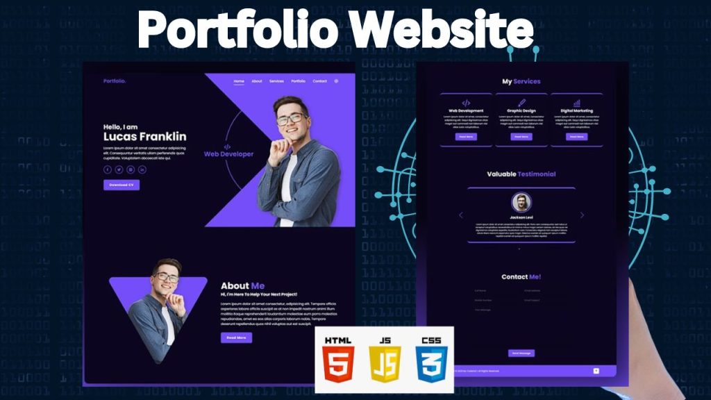
This code serves as the foundation for a portfolio website, outlining the structure and organization of the site. It includes various sections, such as home, about, services, portfolio, testimonials, and contact, each with its own unique content. The home section provides an introduction, the about section shares more information about the creator, the services section lists their offerings, the portfolio section showcases their projects, the testimonials section displays client feedback, and the contact section features a form for visitors to get in touch.

The header includes a menu and icons, as well as social media links and interactive buttons. The design is responsive, meaning it adapts to different screen sizes. Additionally, the code incorporates special effects, such as scrolling animations, to add visual interest to the site. Overall, this code provides a basic framework for creating a visually appealing and functional portfolio website.

<!DOCTYPE html>
<html lang="en">

<head>
    <!-- Metadata and external resources are declared in the <head> section. -->
    
    <!-- Specifies the HTML version (HTML5) -->
    <meta charset="UTF-8">
    <!-- Ensures compatibility with Internet Explorer -->
    <meta http-equiv="X-UA-Compatible" content="IE=edge">
    <!-- Controls the viewport settings for responsive design -->
    <meta name="viewport" content="width=device-width, initial-scale=1.0">
    <!-- The title of the webpage that appears in the browser tab -->
    <title>Cool Responsive Portfolio Website Design</title>

    <!-- External CSS for Swiper, a touch slider library -->
    <link rel="stylesheet" href="https://cdn.jsdelivr.net/npm/swiper@9/swiper-bundle.min.css" />

    <!-- External CSS for Boxicons, a library of icons -->
    <link href='https://unpkg.com/boxicons@2.1.4/css/boxicons.min.css' rel='stylesheet'>

    <!-- Link to the custom CSS stylesheet for additional styling -->
    <link rel="stylesheet" href="css/style.css">
</head>

<body>
    <!-- The content inside the <body> tag is what will be displayed on the webpage -->

    <!-- Header section containing the logo, navigation menu, and icons -->
    <header class="header">
        <!-- Logo for the portfolio, linked to the top of the page -->
        <a href="#" class="logo">Portfolio.</a>

        <!-- Navigation bar with links to different sections of the page -->
        <nav class="navbar">
            <a href="#home" class="active">Home</a>
            <a href="#about">About</a>
            <a href="#services">Services</a>
            <a href="#portfolio">Portfolio</a>
            <a href="#contact">Contact</a>
        </nav>

        <!-- Icon for toggling dark mode -->
        <div class="bx bx-moon" id="darkMode-icon"></div>

        <!-- Icon for toggling the mobile menu -->
        <div class="bx bx-menu" id="menu-icon"></div>
    </header>

    <!-- Home section of the portfolio -->
    <section class="home" id="home">
        <div class="home-content">
            <!-- Introduction text and profession description -->
            <h3>Hello, I am</h3>
            <h1>Cristian Chiriac</h1>
            <p>
                I'm a web developer who loves to create beautiful and functional websites
                for people who want to make a difference in the world.
            </p>
            <p>Currently I'm a student of The Jump Digital School, where I'm learning how to
            create beautiful and functional websites using HTML, CSS, JavaScript, and WordPress.</p>

            <!-- Social media icons linked to various platforms -->
            <div class="social-media">
                <a href="#"><i class='bx bxl-facebook'></i></a>
                <a href="#"><i class='bx bxl-twitter'></i></a>
                <a href="#"><i class='bx bxl-instagram-alt'></i></a>
                <a href="#"><i class='bx bxl-linkedin'></i></a>
            </div>

            <!-- Button to download the CV -->
            <a href="#" class="btn">Download CV</a>
        </div>

        <!-- Section showcasing different professions with animations -->
        <div class="profession-container">
            <div class="profession-box">
                <!-- Each profession is styled and positioned using custom CSS -->
                <div class="profession" style="--i:0;">
                    <i class='bx bx-code-alt'></i>
                    <h3>Web Developer</h3>
                </div>
                <div class="profession" style="--i:1;">
                    <i class='bx bx-camera'></i>
                    <h3>Photographer</h3>
                </div>
                <div class="profession" style="--i:2;">
                    <i class='bx bx-palette'></i>
                    <h3>Web Designer</h3>
                </div>
                <div class="profession" style="--i:3;">
                    <i class='bx bx-video-recording'></i>
                    <h3>Videographer</h3>
                </div>

                <!-- Decorative circle element -->
                <div class="circle"></div>
            </div>

            <!-- Overlay for the profession container -->
            <div class="overlay"></div>
        </div>

        <!-- Image representing the home section -->
        <div class="home-img">
            <img src="images/home.png" alt="">
        </div>
    </section>

    <!-- About section where the developer introduces themselves -->
    <section class="about" id="about">
        <div class="about-img">
            <!-- Image associated with the about section -->
            <img src="images/about.png" alt="">
        </div>

        <div class="about-content">
            <!-- Heading for the about section -->
            <h2 class="heading">About <span>Me</span></h2>
            <!-- Text content introducing the developer and their interests -->
            <h3>
                Hi there, welcome to my website! I'm Cristian,
                a passionate web developer who enjoys learning new technologies
                and solving problems with code!
            </h3>
            <p>
                This website is my personal blog where I write about web development
                topics that interest me and inspire me.
            </p>
            <p>
                Thank you for visiting my website and getting to know me better. I hope you
                enjoyed reading my blog posts and
                found
                them useful and informative. If you want to read more of my posts, subscribe
                to my newsletter where I send
                weekly
                updates on web development trends and tips. If you have any feedback or
                suggestions, please let me know. I'd love to hear from you.
            </p>
            <!-- Button to navigate to more detailed content -->
            <a href="#" class="btn">Read More</a>
        </div>
    </section>

    <!-- Services section highlighting the developer's offerings -->
    <section class="services" id="services">
        <h2 class="heading">My <span>Services</span></h2>

        <!-- Container holding different service offerings -->
        <div class="services-container">
            <div class="services-box">
                <!-- Icon and description for web development service -->
                <i class='bx bx-code-alt'></i>
                <h3>Web Development</h3>
                <p>Lorem ipsum dolor sit amet consectetur, adipisicing elit. Excepturi itaque similique, architecto
                    eaque ut quas delectus pariatur nesciunt in eligendi mollitia dicta.</p>
                <a href="#" class="btn">Read More</a>
            </div>
            <div class="services-box">
                <!-- Icon and description for graphic design service -->
                <i class='bx bxs-paint'></i>
                <h3>Graphic Design</h3>
                <p>Lorem ipsum dolor sit amet consectetur, adipisicing elit. Excepturi itaque similique, architecto
                    eaque ut quas delectus pariatur nesciunt in eligendi mollitia dicta.</p>
                <a href="#" class="btn">Read More</a>
            </div>
            <div class="services-box">
                <!-- Icon and description for digital marketing service -->
                <i class='bx bx-bar-chart-alt'></i>
                <h3>Digital Marketing</h3>
                <p>This text is a placeholder, used to demonstrate the layout and formatting of a paragraph. It is a Latin phrase that has been used for centuries in the printing and design industries to fill space and provide a sample text.</p>
                <a href="#" class="btn">Read More</a>
            </div>
        </div>
    </section>

    <!-- Portfolio section displaying recent projects -->
    <section class="portfolio" id="portfolio">
        <h2 class="heading">Latest <span>Project</span></h2>

        <!-- Container holding portfolio items -->
        <div class="portfolio-container">
            <!-- Each portfolio box represents a project -->
            <div class="portfolio-box">
                <img src="images/portfolio1.jpg" alt="">

                <!-- Overlay with project details and a link to view more -->
                <div class="portfolio-layer">
                    <h4>Web Design</h4>
                    <p>Lorem ipsum dolor sit amet consectetur adipisicing elit. Similique, ipsam est.</p>
                    <a href="#"><i class='bx bx-link-external'></i></a>
                </div>
            </div>
            <div class="portfolio-box">
                <img src="images/portfolio2.jpg" alt="">

                <div class="portfolio-layer">
                    <h4>Web Design</h4>
                    <p>Lorem ipsum dolor sit amet consectetur adipisicing elit. Similique, ipsam est.</p>
                    <a href="#"><i class='bx bx-link-external'></i></a>
                </div>
            </div>
            <div class="portfolio-box">
                <img src="images/portfolio3.jpg" alt="">

                <div class="portfolio-layer">
                    <h4>Web Design</h4>
                    <p>Lorem ipsum dolor sit amet consectetur adipisicing elit. Similique, ipsam est.</p>
                    <a href="#"><i class='bx bx-link-external'></i></a>
                </div>
            </div>
            <div class="portfolio-box">
                <img src="images/portfolio4.jpg" alt="">

                <div class="portfolio-layer">
                    <h4>Web Design</h4

CSS :

This CSS code enhances a webpage’s appearance. It incorporates a specific font, establishes a foundational style, and introduces customizable color themes, including a dark mode option. The code structures the page with a fixed header, sections, and interactive elements. It ensures the design adapts to different screen sizes and includes eye-catching animations. Finally, it tailors the look for specific content areas like testimonials, portfolios, and contact forms.

/* Importing the 'Poppins' font family from Google Fonts with various font weights */
@import url('https://fonts.googleapis.com/css2?family=Poppins:wght@300;400;500;600;700;800;900&display=swap');

/* Resetting default styles for all elements */
* {
    margin: 0; /* Removes default margin */
    padding: 0; /* Removes default padding */
    box-sizing: border-box; /* Includes padding and border in the element's total width and height */
    text-decoration: none; /* Removes underlines from links */
    border: none; /* Removes default borders */
    outline: none; /* Removes outline from focused elements */
    scroll-behavior: smooth; /* Enables smooth scrolling */
    font-family: 'Poppins', sans-serif; /* Applies the Poppins font to all elements */
}

/* Defining custom CSS variables (colors) for the entire document */
:root {
    --bg-color: #fdfdfd; /* Light background color */
    --text-color: #333; /* Dark text color */
    --main-color: #754ef9; /* Primary accent color (purple) */
    --white-color: #fdfdfd; /* White color */
    --shadow-color: rgba(0, 0, 0, .2); /* Light shadow color */
}

/* Styles for text selection */
*::selection {
    background: var(--main-color); /* Background color for selected text */
    color: var(--bg-color); /* Text color for selected text */
}

/* Dark mode styles, overriding default variables */
.dark-mode {
    --bg-color: #0b061f; /* Dark background color */
    --text-color: #fdfdfd; /* Light text color */
    --shadow-color: rgba(0, 0, 0, .7); /* Darker shadow color */
}

/* HTML element styles */
html {
    font-size: 62.5%; /* Setting the base font size to 10px (useful for rem units) */
    overflow-x: hidden; /* Prevents horizontal scroll */
}

/* Body element styles */
body {
    background: var(--bg-color); /* Sets background color */
    color: var(--text-color); /* Sets text color */
}

/* Header styles (navigation bar) */
.header {
    position: fixed; /* Fixes the header at the top of the page */
    top: 0; /* Aligns the header to the top */
    left: 0; /* Aligns the header to the left */
    width: 100%; /* Makes the header full width */
    padding: 2rem 7%; /* Adds padding inside the header */
    background: transparent; /* Makes the background transparent initially */
    display: flex; /* Enables flexbox layout */
    align-items: center; /* Aligns items vertically in the center */
    z-index: 100; /* Ensures the header is above other content */
    transition: .5s; /* Adds a smooth transition effect */
}

/* Styles for the header when it becomes sticky (after scrolling) */
.header.sticky {
    background: var(--bg-color); /* Changes background color when sticky */
    box-shadow: 0 .1rem 1rem var(--shadow-color); /* Adds a shadow effect */
}

/* Logo styles */
.logo {
    font-size: 2.5rem; /* Increases the font size */
    color: var(--main-color); /* Sets the logo color */
    font-weight: 600; /* Makes the font bold */
    margin-right: auto; /* Aligns the logo to the left */
}

/* Navbar link styles */
.navbar a {
    position: relative; /* Enables positioning relative to the navbar */
    font-size: 1.7rem; /* Sets the font size */
    color: var(--white-color); /* Sets the link color */
    font-weight: 500; /* Slightly bold font */
    margin-right: 3.5rem; /* Adds space between links */
}

/* Navbar link styles when the header is sticky */
.header.sticky .navbar a {
    color: var(--text-color); /* Changes link color when sticky */
}

/* Active link styles when the header is sticky */
.header.sticky .navbar a.active {
    color: var(--main-color); /* Highlights the active link */
}

/* Underline effect for active links */
.navbar a.active::before {
    content: ''; /* Creates a pseudo-element for the underline */
    position: absolute; /* Positions the underline */
    left: 0; /* Aligns the underline to the left */
    bottom: -6px; /* Positions the underline below the text */
    width: 100%; /* Makes the underline full width */
    height: .2rem; /* Sets the thickness of the underline */
    background: var(--white-color); /* Sets the underline color */
}

/* Underline effect for links when the header is sticky */
.header.sticky .navbar a::before {
    background: var(--main-color); /* Changes underline color when sticky */
    opacity: .7; /* Slightly transparent underline */
}

/* Dark mode icon styles */
#darkMode-icon {
    font-size: 2.4rem; /* Sets the icon size */
    color: var(--white-color); /* Sets the icon color */
    cursor: pointer; /* Changes the cursor to pointer */
}

/* Dark mode icon styles when the header is sticky */
.header.sticky #darkMode-icon {
    color: var(--text-color); /* Changes the icon color when sticky */
    opacity: .9; /* Slightly reduces the opacity */
}

/* Menu icon styles */
#menu-icon {
    font-size: 3.6rem; /* Sets the icon size */
    color: var(--text-color); /* Sets the icon color */
    display: none; /* Hides the icon initially */
}

/* Section styles */
section {
    min-height: 100vh; /* Ensures each section takes up the full viewport height */
    padding: 10rem 7% 2rem; /* Adds padding inside sections */
}

/* Home section styles */
.home {
    display: flex; /* Enables flexbox layout */
    align-items: center; /* Vertically centers content */
}

/* Home content styles */
.home .home-content {
    max-width: 44rem; /* Sets the maximum width for the content */
}

/* Heading styles inside the home content */
.home-content h3 {
    font-size: 3.2rem; /* Sets the font size */
    font-weight: 700; /* Makes the font bold */
    line-height: .3; /* Adjusts line height */
}

/* Main heading styles inside the home content */
.home-content h1 {
    font-size: 5.6rem; /* Sets the font size */
    font-weight: 700; /* Makes the font bold */
    margin-bottom: .3rem; /* Adds space below the heading */
}

/* Paragraph styles inside the home content */
.home-content p {
    font-size: 1.6rem; /* Sets the font size */
}

/* Social media link styles inside the home content */
.home-content .social-media a {
    display: inline-flex; /* Aligns icon and text side by side */
    justify-content: center; /* Centers content horizontally */
    align-items: center; /* Centers content vertically */
    width: 4rem; /* Sets the width of the social media icons */
    height: 4rem; /* Sets the height of the social media icons */
    background: transparent; /* Makes the background transparent */
    border: .2rem solid var(--main-color); /* Adds a border around the icons */
    border-radius: 50%; /* Makes the icons circular */
    box-shadow: 0 .2rem .5rem var(--shadow-color); /* Adds a shadow effect */
    font-size: 2rem; /* Sets the icon size */
    color: var(--main-color); /* Sets the icon color */
    margin: 2.5rem 1.5rem 3rem 0; /* Adds margin around the icons */
    transition: .5s ease; /* Adds a smooth transition effect */
}

/* Hover effect for social media links */
.home-content .social-media a:hover {
    background: var(--main-color); /* Changes the background color on hover */
    color: var(--white-color); /* Changes the icon color on hover */
}

/* Button styles */
.btn {
    display: inline-block; /* Makes the button inline-block */
    padding: 1.2rem 2.8rem; /* Adds padding inside the button */
    background: var(--main-color); /* Sets the background color */
    border-radius: .6rem; /* Rounds the corners */
    box-shadow: 0 .2rem .5rem var(--shadow-color); /* Adds a shadow effect */
    font-size: 1.6rem; /* Sets the font size */
    color: var(--white-color); /* Sets the text color */
    letter-spacing: .1rem; /* Adds letter spacing */
    font-weight: 600; /* Makes the font bold */
    border: .2rem solid transparent; /* Adds a border with transparent color */
    transition: .5s ease; /* Adds a smooth transition effect */
}

/* Hover effect for buttons */
.btn:hover {
    background: transparent; /* Makes the background transparent on hover */
    color: var(--main-color); /* Changes the text color on hover */
    border-color: var(--main-color); /* Changes the border color on hover */
}

/* Profession container styles inside the home section */
.home .profession-container {
    position: absolute; /* Positions the container absolutely */
    top: 50%; /* Aligns the container to the middle of the viewport */
    right: 0; /* Aligns the container

JavaScript:

This JavaScript code enhances a webpage’s interactivity and appearance. It controls the navigation menu, making it responsive to screen size and user actions. It also synchronizes the navigation links with the current page section, creating a smooth user experience. The code includes features like a content slider, a dark mode toggle, and animated elements, making the website more engaging and visually appealing.

/*========== menu icon navbar ==========*/
// Select the menu icon and the navbar elements
let menuIcon = document.querySelector('#menu-icon');
let navbar = document.querySelector('.navbar');

// Toggle the menu icon and navbar active classes when the menu icon is clicked
menuIcon.onclick = () => {
    menuIcon.classList.toggle('bx-x'); // Toggles the 'bx-x' class for the menu icon (changes the icon appearance)
    navbar.classList.toggle('active'); // Toggles the 'active' class for the navbar (shows or hides the navbar)
};

/*========== scroll sections active link ==========*/
// Select all sections and navbar links
let sections = document.querySelectorAll('section');
let navLinks = document.querySelectorAll('header nav a');

// Update the active link in the navbar based on the current scroll position
window.onscroll = () => {
    sections.forEach(sec => {
        let top = window.scrollY; // Get the current scroll position
        let offset = sec.offsetTop - 150; // Calculate the offset for the section (start point)
        let height = sec.offsetHeight; // Get the height of the section
        let id = sec.getAttribute('id'); // Get the section's id attribute

        // If the current scroll position is within the section, update the active link
        if(top >= offset && top < offset + height) {
            navLinks.forEach(links => {
                links.classList.remove('active'); // Remove the 'active' class from all links
                document.querySelector('header nav a[href*=' + id + ']').classList.add('active'); // Add the 'active' class to the current link
            });
        };
    });

/*========== sticky navbar ==========*/
// Select the header element
let header = document.querySelector('.header');

// Toggle the 'sticky' class on the header when the scroll position is greater than 100px
header.classList.toggle('sticky', window.scrollY > 100);

/*========== remove menu icon navbar when click navbar link (scroll) ==========*/
// Remove the 'bx-x' and 'active' classes from the menu icon and navbar when a link is clicked
menuIcon.classList.remove('bx-x');
navbar.classList.remove('active');

};

/*========== swiper ==========*/
// Initialize the Swiper slider with custom settings
var swiper = new Swiper(".mySwiper", {
    slidesPerView: 1, // Display one slide at a time
    spaceBetween: 50, // Space between slides
    loop: true, // Loop the slides
    grabCursor: true, // Change the cursor to a grabbing hand when hovering over the slider
    pagination: {
      el: ".swiper-pagination", // Enable pagination
      clickable: true, // Make pagination bullets clickable
    },
    navigation: {
      nextEl: ".swiper-button-next", // Element for the next button
      prevEl: ".swiper-button-prev", // Element for the previous button
    },
});

/*========== dark light mode ==========*/
// Select the dark mode icon element
let darkModeIcon = document.querySelector('#darkMode-icon');

// Toggle dark mode on and off when the dark mode icon is clicked
darkModeIcon.onclick = () => {
    darkModeIcon.classList.toggle('bx-sun'); // Toggle the 'bx-sun' class to change the icon
    document.body.classList.toggle('dark-mode'); // Toggle the 'dark-mode' class on the body element
};

/*========== scroll reveal ==========*/
// Initialize ScrollReveal with custom settings
ScrollReveal({
    // reset: true, // Uncomment this line if you want the animations to reset on every scroll
    distance: '80px', // Distance for the reveal animation
    duration: 2000, // Duration of the animation in milliseconds
    delay: 200 // Delay before the animation starts
});

// Define the elements and the origin of the animation for scroll reveal
ScrollReveal().reveal('.home-content, .heading', { origin: 'top' }); // Reveal from the top
ScrollReveal().reveal('.home-img img, .services-container, .portfolio-box, .testimonial-wrapper, .contact form', { origin: 'bottom' }); // Reveal from the bottom
ScrollReveal().reveal('.home-content h1, .about-img img', { origin: 'left' }); // Reveal from the left
ScrollReveal().reveal('.home-content h3, .home-content p, .about-content', { origin: 'right' }); // Reveal from the right

Conclusion:

Congratulations everyone! We’ve just completed our personal portfolio websites. This is a major accomplishment, no matter if you’re a seasoned coder or just starting your journey. Your portfolio is now your digital showcase, a place to proudly display your coding skills and creativity. Keep coding, keep learning, and enjoy the fruits of your hard work in this unique online space. You’ve done an amazing job!

How to Create a Personal Portfolio Website Using HTML CSS & JavaScript

Leave a Reply

Your email address will not be published. Required fields are marked *

Scroll to top