Coding classic

html, css, javascript, react, python

How to create Dropdown Menu Animation: A Guide with HTML, CSS, and JS

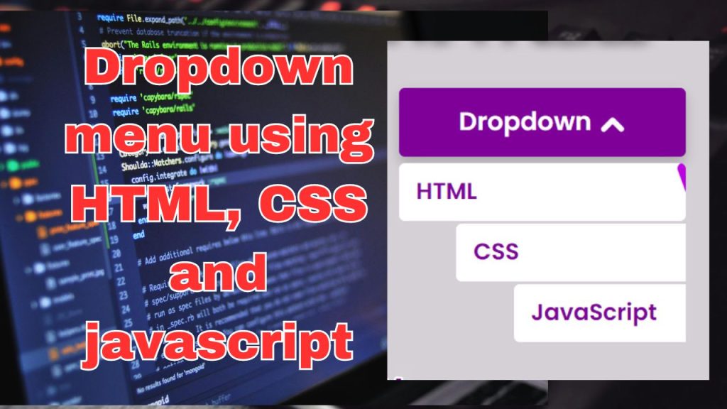
Greetings, everyone! Today, we delve into the art of crafting a captivating dropdown menu animation using HTML, CSS, and JavaScript. As we journey through the vast landscape of web development, we encounter the harmonious blend of functionality and visual allure. Among the many elements that grace this digital stage, the dropdown menu animation emerges as a star performer. Join us as we unravel the secrets behind its creation, exploring its importance, application, and the enchanting synergy that arises when HTML, CSS, and JavaScript unite.

HTML code (index.html)

<!DOCTYPE html>
<html lang="en">

<head>
    <!-- Defining document metadata -->
    <meta charset="UTF-8">
    <meta http-equiv="X-UA-Compatible" content="IE=edge">
    <meta name="viewport" content="width=device-width, initial-scale=1.0">
    <!-- Setting document title -->
    <title>Dropdown Animation | Codehal</title>
    <!-- Linking external stylesheet -->
    <link rel="stylesheet" href="style.css">
</head>

<body>

    <!-- Creating a container box -->
    <div class="box">
        <!-- Creating a dropdown menu -->
        <div class="dropdown">
            Dropdown
            <!-- Adding left and right arrow icons -->
            <span class="left-icon"></span>
            <span class="right-icon"></span>
            <!-- Creating dropdown items container -->
            <div class="items">
                <!-- Dropdown item 1: HTML -->
                <a href="#" style="--i:1;"><span></span>HTML</a>
                <!-- Dropdown item 2: CSS -->
                <a href="#" style="--i:2;"><span></span>CSS</a>
                <!-- Dropdown item 3: JavaScript -->
                <a href="#" style="--i:3;"><span></span>JavaScript</a>
            </div>
        </div>
    </div>

    <!-- Linking external JavaScript file -->
    <script src="script.js"></script>
</body>

</html>

CSS code (style.css)

/* Importing the Poppins font with a weight of 600 */
@import url('https://fonts.googleapis.com/css2?family=Poppins:wght@600&display=swap');

/* Resetting default styles and applying global styles */
* {
    margin: 0;
    padding: 0;
    box-sizing: border-box;
    font-family: 'Poppins', sans-serif; /* Setting font family for all elements */
}

/* Styling for the body */
body {
    /* Centering content vertically and horizontally */
    display: flex;
    justify-content: center;
    align-items: center;
    min-height: 100vh; /* Setting minimum height to full viewport height */
    background: #d5d0d6; /* Setting background color */
}

/* Styling for the container box */
.box {
    /* Setting relative positioning and dimensions */
    position: relative;
    width: 250px;
    height: 250px;
}

/* Styling for the dropdown menu */
.dropdown {
    /* Setting relative positioning, dimensions, background color, and text color */
    position: relative;
    width: 100%;
    height: 60px;
    background: #7f0099;
    color: #fff;
    font-size: 22px;
    /* Centering content vertically and horizontally */
    display: flex;
    justify-content: center;
    align-items: center;
    /* Adding border radius and box shadow for styling */
    border-radius: 5px;
    cursor: pointer; /* Changing cursor to pointer on hover */
    box-shadow: 0 5px 10px rgba(0, 0, 0, .2); /* Adding box shadow */
}

/* Styling for the left and right arrow icons */
.dropdown .left-icon,
.dropdown .right-icon {
    /* Setting relative positioning, dimensions, background color, and border radius */
    position: relative;
    top: 2px;
    display: inline-block;
    width: 15px;
    height: 5px;
    background: #fff;
    border-radius: 40px;
    /* Adding transition effect */
    transition: .5s;
}

/* Styling for the left arrow icon */
.dropdown .left-icon {
    left: 7px;
    transform: rotate(45deg); /* Rotating the left arrow */
}

/* Styling for the left arrow icon when dropdown is active */
.dropdown.active .left-icon {
    transform: rotate(135deg); /* Rotating the left arrow further when active */
}

/* Styling for the right arrow icon */
.dropdown .right-icon {
    transform: rotate(-45deg); /* Rotating the right arrow */
}

/* Styling for the right arrow icon when dropdown is active */
.dropdown.active .right-icon {
    transform: rotate(-135deg); /* Rotating the right arrow further when active */
}

/* Styling for the dropdown menu items container */
.dropdown .items {
    /* Setting absolute positioning, dimensions, and position */
    position: absolute;
    top: 0;
    left: 0;
    width: 100%;
    height: 160px;
    margin-top: 63px;
    /* Hiding overflow and visibility by default */
    overflow: hidden;
    visibility: hidden;
    /* Adding transition effect */
    transition: .5s;
}

/* Styling for the dropdown menu items container when dropdown is active */
.dropdown.active .items {
    visibility: visible; /* Making the items container visible */
}

/* Styling for the dropdown menu items */
.dropdown .items a {
    /* Setting relative positioning, initial left position, and flex display */
    position: relative;
    left: 100%;
    display: flex;
    /* Setting font size, background color, text color, and text decoration */
    font-size: 20px;
    background: #fff;
    color: #7f0099;
    text-decoration: none;
    /* Adding border radius, padding, margin, z-index, overflow, and transition effect */
    border-radius: 5px;
    padding: 10px 15px;
    margin-top: 2.5px;
    z-index: 1;
    overflow: hidden;
    transition: .5s;
    /* Adding delay based on index */
    transition-delay: calc(60ms * var(--i));
}

/* Styling for dropdown menu items when dropdown is active */
.dropdown.active .items a {
    left: 0; /* Bringing the items to the initial left position */
}

/* Styling for dropdown menu items on hover */
.dropdown .items a:hover {
    color: #fff; /* Changing text color on hover */
}

/* Styling for the background span of dropdown menu items */
.dropdown .items a span {
    /* Setting absolute positioning, dimensions, background color, z-index, border radius, and initial rotation */
    position: absolute;
    top: 0;
    left: 0;
    width: 100%;
    height: 100%;
    background: #bb00e0; /* Setting background color */
    z-index: -1; /* Moving behind the text */
    border-radius: inherit; /* Inheriting border radius from parent */
    transform: rotate(160deg); /* Initial rotation */
    transform-origin: right; /* Setting rotation origin */
    transition: .5s; /* Adding transition effect */
}

/* Styling for the background span of dropdown menu items on hover */
.dropdown .items a:hover span {
    transform: rotate(0deg); /* Rotating the background span to 0 degrees on hover */
}


These CSS rules control the appearance and behavior of the dropdown menu items when the dropdown is active and on hover. The dropdown.active .items a rule ensures that when the dropdown is active, the items are brought to their initial left position. The .dropdown .items a:hover rule changes the text color of the items when hovered over. The .dropdown .items a span rule styles the background span of the items, setting its initial position, dimensions, color, and rotation. The .dropdown .items a:hover span rule rotates the background span to 0 degrees when the item is hovered over, creating a smooth transition effect.

Adding Javascript

Enhance your website’s dropdown menu with dynamic versatility using JavaScript’s manipulation of active classes. Through effortless activation and deactivation of the active class, you attain meticulous management of menu visibility and functionality. This technique enriches user interaction, facilitating seamless transitions and interactive responsiveness. Unleash the full potential of your navigation system with this effective and user-centric method, infusing vitality into your website’s design.

// Selecting the dropdown element using its class name and storing it in the dropdown variable
const dropdown = document.querySelector('.dropdown');

// Adding a click event listener to the dropdown element
dropdown.addEventListener('click', () => {
    // Toggling the 'active' class on the dropdown element when clicked
    dropdown.classList.toggle('active');
});

This JavaScript code attaches an event listener to a dropdown element with the class name ‘dropdown’. When the dropdown element is clicked, the event listener toggles the presence of the ‘active’ class on the dropdown element. If the ‘active’ class is already present, it will be removed; otherwise, it will be added. This mechanism allows for toggling the visibility or behavior of the dropdown menu by adding or removing the ‘active’ class dynamically.

Conclusion

In summary, dropdown menu animations embody the perfect blend of style and utility within web development. With HTML, CSS, and JavaScript working in tandem, developers gain the ability to craft menus that elevate beyond the ordinary, delivering engaging and visually captivating user interactions. As you venture into your coding projects, may these animations serve as the graceful choreography that animates your website. This concludes the explanation on creating a dropdown menu animation using HTML, CSS, and JavaScript. Happy coding!

How to create Dropdown Menu Animation: A Guide with HTML, CSS, and JS

Leave a Reply

Your email address will not be published. Required fields are marked *

Scroll to top