In the expansive realm of the internet and applications, you’ve likely encountered those small popup elements, haven’t you? They resemble miniature windows that appear on your screen. These popups serve various purposes, such as conveying information, requesting input, or enhancing website engagement. In this blog post, we’ll dissect the concept of modal popups, exploring their functionality and significance in the digital landscape.
Mastering Modal Popups: A Practical Guide
If you’re considering implementing modal popups, it’s essential to do so effectively. Here’s how to utilize them like a seasoned pro:
- Relevance is Key: Deploy modal popups judiciously, ensuring they align with the user’s context. Ensure that the content or action prompted by the popup is directly related to the user’s current activity.
- Timing is Crucial: Avoid bombarding users with popups as soon as they land on your site. Exercise restraint and employ triggers that are contextually appropriate, such as displaying popups when users are about to exit the site or after they’ve spent some time exploring it.
- Clarity is Paramount: Clearly articulate the purpose of your popup and the desired action from the user. Keep the messaging straightforward, avoiding jargon or confusing language.
- Facilitate Easy Closure: Provide users with a hassle-free way to dismiss the popup. Include a prominent close button or allow users to click outside the popup area to close it seamlessly.
- Prioritize Accessibility: Ensure that your popups are accessible to all users, regardless of their abilities. Pay attention to factors such as screen reader compatibility and keyboard navigation to guarantee inclusivity.
The Impact of Modal Popups on Your Web Experience
Modal popups significantly influence your online interactions, and their effectiveness hinges on their appropriate usage. Here’s a breakdown of their role:
Attention Grabbers: Modal popups are crafted to capture your attention effectively. When employed correctly, they can convey crucial information or prompt essential actions.
Focused Engagement: By requiring your attention on the popup before resuming your previous task, modal popups ensure focused interaction. This feature is particularly beneficial for tasks that demand undivided attention.
Preventing Navigation Disruption: Modal popups prevent users from navigating to other pages or screens abruptly. This feature can enhance user experience by eliminating the need to reorient oneself.
Potential for Irritation: However, excessive or poorly timed usage of modal popups can become irritating. Users may feel inundated by frequent interruptions, disrupting their browsing flow and diminishing overall satisfaction.
Understanding the Mechanics of Modal Popups
Modal popups operate on a straightforward principle. Here’s a simplified breakdown of their functionality:
- User Initiation: Modal popups are typically triggered by user actions. When you interact with a specific element, such as clicking a button, the popup appears on the screen.
- Dimmed Background: To draw attention to the popup, the background content is often slightly darkened or blurred, creating a visual contrast.
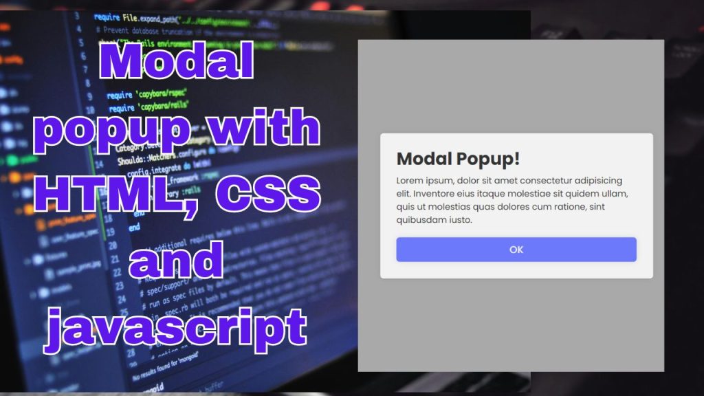
- Popup Presentation: The popup emerges prominently in the center or atop the main content of the webpage. Its appearance is tailored to convey a specific message or prompt a particular action.
- Modal Behavior: Modal popups earn their name from their mode of operation, which requires users to address them before returning to their previous tasks. Users are compelled to interact with the popup first.
- User Interaction: Within the popup, users can engage in various activities, such as entering information, reading messages, or making selections. Most popups offer options to confirm, deny, or dismiss.
- Exit Options: Exiting the popup is typically facilitated by clicking outside of it or pressing the “Escape” key. Alternatively, some popups feature a dedicated close button for convenience.
HTML Code (index.html)
CSS Code (style.css)
Brief Explanation of the css above
- The CSS file starts with an import statement to import the “Poppins” font family from Google Fonts.
- The
*selector resets default styles such as margin, padding, and box-sizing, and sets the font family to “Poppins”. - Styles for the body ensure that content is centered both vertically and horizontally on the page with a minimum height of 100 viewport height (vh) and a background color of #f2f2f2.
- The
.show-popupclass styles the button used to show the popup, setting padding, background color, border, border radius, box shadow, cursor, font size, font color, and font weight. - The
.popup-containerclass styles the container of the popup, positioning it absolutely to cover the entire viewport, setting its background color to a semi-transparent black (#000) with 30% opacity, and initially hiding it by setting opacity to 0 and pointer-events to none. - The
.popup-container.activeclass is used to make the popup container visible when it is active, setting its opacity to 1 and pointer-events to auto to allow interaction, with a transition effect applied for smooth visibility changes.
JavaScript Code (action.js)
Brief Explanation of the above javascript
- The
showPopupconstant is assigned the reference to the HTML element with the class ‘show-popup’. This element is typically a button or a link that triggers the display of the popup. - The
popupContainerconstant is assigned the reference to the HTML element with the class ‘popup-container’, which contains the popup content. - The
closeBtnconstant is assigned the reference to the HTML element with the class ‘close-btn’, which represents the close button inside the popup. - An onclick event handler is added to the
showPopupelement. When this element is clicked, the function inside the handler is executed. This function adds the ‘active’ class to thepopupContainer, making the popup visible by toggling its visibility based on the presence of the ‘active’ class. - Similarly, an onclick event handler is added to the
closeBtnelement. When this button is clicked, the function inside the handler is executed. This function removes the ‘active’ class from thepopupContainer, hiding the popup.
conclusion
In summary, modal popups serve as small windows that appear on websites, offering either significant assistance or becoming a source of irritation, depending on their implementation. When utilized effectively, they can enhance your browsing experience by providing necessary information or simplifying tasks. However, excessive use may lead to a feeling of intrusion. Therefore, it’s essential to employ them judiciously, ensuring they contribute positively to your website’s functionality and user experience.