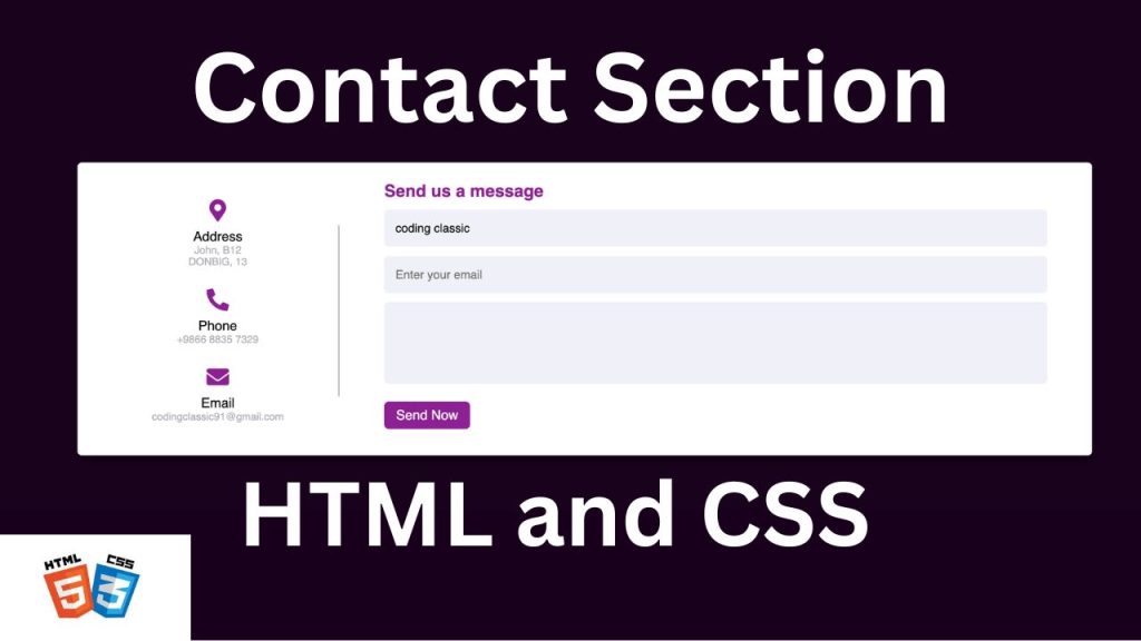
Have you ever visited a website on your phone, tried to fill out a contact form, and found yourself pinching and zooming just to hit the right fields? Frustrating, right? Well, today we’re going to put an end to that! Let’s dive into creating a responsive contact form that looks great on any device, using just HTML and CSS. No JavaScript required!
This contact form is fully responsive. To see a live demo of this contact page and view all the code used to create it, you can watch the complete video tutorial provided below.
WATCH VIDEO TUTORIA:
Setting Up the HTML Structure
First things first, let’s create the backbone of our form with HTML. We’ll keep it simple with fields for name, email and message.
<!DOCTYPE html>
<html lang="en">
<head>
<!-- Defines the document type and sets the language to English -->
<meta charset="UTF-8">
<!-- Sets the character encoding to UTF-8 -->
<meta name="viewport" content="width=device-width, initial-scale=1.0">
<!-- Ensures proper rendering and touch zooming on all devices -->
<title>Contact us Section</title>
<!-- Sets the title of the webpage -->
<link rel="stylesheet" href="style.css">
<!-- Links to an external CSS file for styling -->
<link rel="stylesheet" href="https://cdnjs.cloudflare.com/ajax/libs/font-awesome/5.15.2/css/all.min.css">
<!-- Links to Font Awesome for icons -->
</head>
<body>
<!-- Start of the body content -->
<div class="container">
<!-- Main container for the contact form and details -->
<div class="content">
<!-- Content wrapper -->
<div class="left-side">
<!-- Left side containing contact details -->
<div class="address details">
<!-- Address details section -->
<i class="fas fa-map-marker-alt"></i>
<!-- Address icon -->
<div class="topic">Address</div>
<!-- Address heading -->
<div class="text-one">John, B12</div>
<!-- First line of the address -->
<div class="text-two"><kbd>Dondib, 13</kbd></div>
<!-- Second line of the address -->
</div>
<div class="email details">
<!-- Email details section -->
<i class="fas fa-envelope"></i>
<!-- Email icon -->
<div class="topic">Email</div>
<!-- Email heading -->
<div class="text-one">Codingclassic91@gmail.com</div>
<!-- Email address -->
</div>
<div class="phone details">
<!-- Phone details section -->
<i class="fas fa-phone-alt"></i>
<!-- Phone icon -->
<div class="topic">Phone</div>
<!-- Phone heading -->
<div class="text-one">+6473 6764 99837</div>
<!-- Phone number -->
</div>
</div>
<div class="right-side">
<!-- Right side containing the contact form -->
<div class="topic-text">Send Us Message</div>
<!-- Form heading -->
<form action="#">
<!-- Form for sending messages -->
<div class="input-box">
<input type="text" placeholder="Enter Your name">
<!-- Input field for name -->
</div>
<div class="input-box">
<input type="text" placeholder="Enter Your Email">
<!-- Input field for email -->
</div>
<div class="input-box message-box">
<textarea name="text" id=""></textarea>
<!-- Textarea for message -->
</div>
<div class="button">
<input type="button" value="Send Now">
<!-- Button to submit the form -->
</div>
</form>
</div>
</div>
</div>
<!-- End of the main container -->
</body>
</html>
Styling with CSS
Now, let’s make our form look good! We’ll use CSS to give it a clean, modern look that adapts to different screen sizes.
/* Reset all elements' margin, padding, and set box-sizing to border-box */
* {
margin: 0;
padding: 0;
box-sizing: border-box;
}
/* Style the body to be a flex container, center its contents, and set background color */
body {
display: flex;
background: #17021b;
min-height: 100vh;
width: 100%;
align-items: center;
justify-content: center;
}
/* Style the main container for the form and contact details */
.container {
width: 85%;
padding: 20px 60px 30px 40px;
box-shadow: 0 5px 10px rgba(0,0,0, 0.2);
background: #fff;
border-radius: 6px;
}
/* Flex container for content inside the main container */
.container .content {
display: flex;
justify-content: space-between;
align-items: center;
}
/* Style for a pseudo-element on the left side content */
.content .left-side::before {
content: "";
position: absolute;
right: -15px;
top: 50%;
height: 70%;
width: 2px;
transform: translateY(-50%);
background: #afafb6;
}
/* Style for each detail item (address, email, phone) on the left side */
.content .left-side .details {
text-align: center;
margin: 14px;
}
/* Style for icons in the details section */
.content .left-side .details i {
color: #8d2093;
font-size: 30px;
margin-bottom: 10px;
}
/* Style for the topic text in the details section */
.content .left-side .details .topc {
font-weight: 500;
font-size: 18px;
}
/* Style for text lines in the details section */
.content .left-side .details .text-one,
.content .left-side .details .text-two {
color: #4d4d50;
font-size: 14px;
}
/* Style for the right side content */
.container .content .right-side {
margin-left: 75px;
width: 75%;
}
/* Style for the heading text on the right side */
.content .right-side .topic-text {
font-weight: 600;
font-size: 23px;
color: #8d2093;
}
/* Style for the input boxes on the right side */
.right-side .input-box {
width: 100%;
height: 50px;
margin: 12px 0;
}
/* Common style for input and textarea elements */
.right-side .input-box input,
.right-side .input-box textarea {
border: none;
outline: none;
height: 100%;
width: 100%;
border-radius: 6px;
padding: 0 15px;
font-size: 16px;
background: #f0f1f8;
resize: none; /* Disable resizing for textarea */
}
/* Style for the message box (textarea) */
.right-side .message-box {
min-height: 110px;
}
/* Additional padding for textarea */
.right-side .input-box textarea {
padding-top: 6px;
}
/* Style for the button container */
.right-side .button {
margin-top: 12px;
display: inline-block;
}
/* Style for the button element */
.right-side .button input[type="button"] {
color: #fff;
font-size: 18px;
padding: 8px 16px;
border-radius: 6px;
outline: none;
border: none;
background: #8d2093;
cursor: pointer;
transition: all 0.3s ease;
}
/* Hover effect for the button */
.button input[type="button"]:hover {
background: #b93ebd;
}
/* Media query for screens with max-width 950px */
@media (max-width: 950px) {
.container {
width: 90%;
padding: 30px 40px 40px 35px;
}
.container .content .right-side {
width: 75%;
margin-left: 35px;
}
}
/* Media query for screens with max-width 820px */
@media (max-width: 820px) {
.container {
height: 100%;
margin: 40px 0;
}
.container .content {
flex-direction: column-reverse;
}
.container .content .left-side {
margin-top: 40px;
width: 100%;
flex-direction: row;
justify-content: center;
flex-wrap: wrap;
}
.container .content .left-side::before {
display: none;
}
.container .content .right-side {
margin-left: 0;
width: 100%;
}
}
Summary of Key Points:
- Global Reset: The
*
selector resets margin and padding for all elements and setsbox-sizing
toborder-box
to include padding and border in the element’s total width and height. - Body Styling: Centers the content both vertically and horizontally with a dark background and full viewport height.
- Container: The main wrapper with padding, shadow, white background, and rounded corners.
- Content Layout: Uses flexbox to arrange the left and right sections side by side.
- Left Side: Contains contact details with icons and text, and a pseudo-element for a vertical line.
- Right Side: Contains the form fields with styled inputs, a message box, and a submit button.
- Responsive Design: Media queries adjust the layout and sizes for smaller screens, including stacking the sections vertically on very small screens.
CONCLUSION
Creating a responsive “Contact Us” form using HTML and CSS is a fundamental skill for web developers, ensuring seamless communication between users and website owners. By following the steps outlined in this guide, you can design a visually appealing and functional contact form that works well on all devices.
Key Takeaways:
- Responsive Design: Utilize CSS media queries to adapt the form layout to different screen sizes, ensuring a user-friendly experience on both desktops and mobile devices.
- HTML Structure: Organize the form elements logically using semantic HTML to enhance accessibility and improve search engine optimization (SEO).
- Styling with CSS: Apply CSS styles to enhance the appearance and usability of the form, including hover effects, padding, and font choices.
- Flexbox Layout: Use flexbox for a modern and flexible layout, making it easier to align and distribute form elements.
- User Experience: Incorporate intuitive input fields and clear labels to guide users, making it easy for them to submit their information.
By mastering these techniques, you can create a responsive “Contact Us” form that not only looks great but also provides a smooth and engaging user experience. Keep experimenting with different styles and layouts to find the best fit for your website, and remember that a well-designed contact form is a key component in building strong, trustful relationships with your users.