Coding classic

html, css, javascript, react, python

Increment and Decrement Button Using HTML CSS and JavaScript

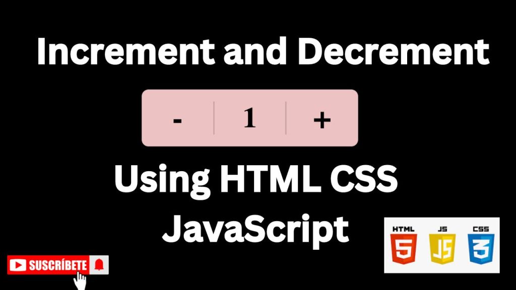
In web development, user interaction is key. One of the simplest yet effective ways to engage users is through interactive elements like increment and decrement buttons. These buttons allow users to easily adjust quantities, values, or settings, providing a smooth and intuitive experience. In this article, we’ll explore how to create these buttons using HTML, CSS, and JavaScript.

WATCH TUTORIAL:

HTML Structure: The Foundation

First, we need to set up the basic HTML structure for our increment and decrement buttons. We’ll use a div element to contain the buttons and a span element to display the current value.

<!DOCTYPE html>
<html lang="en">
<head>
    <!-- Specifies the document type and version of HTML being used (HTML5 in this case) -->
    <!DOCTYPE html>

    <!-- The root element of the HTML document -->
    <html lang="en">
    
    <!-- The head section contains meta-information about the document -->
    <head>
        <!-- Sets the character encoding for the document to UTF-8, which supports most characters from various languages -->
        <meta charset="UTF-8">
        
        <!-- Ensures the webpage is responsive by setting the viewport to the device's width and scaling the content accordingly -->
        <meta name="viewport" content="width=device-width, initial-scale=1.0">
        
        <!-- Specifies the title of the webpage, which appears in the browser tab -->
        <title>Increment and Decrement Button</title>
        
        <!-- Links to an external CSS file for styling the webpage -->
        <link rel="stylesheet" href="style.css">
    </head>
    
    <!-- The body section contains the content that is visible to the user -->
    <body>

        <!-- A container div that holds the increment, decrement buttons, and the numeric value -->
        <div class="container">
            <!-- A span element for the decrement button, represented by a minus sign -->
            <span class="minus">-</span>
            
            <!-- A span element displaying the initial numeric value (1) -->
            <span class="num">1</span>
            
            <!-- A span element for the increment button, represented by a plus sign -->
            <span class="plus">+</span>
        </div>

        <!-- Links to an external JavaScript file that adds interactivity to the buttons -->
        <script src="script.js"></script>
    </body>
</html>

CSS Styling: Enhancing the Look

Now, let’s style the elements with CSS to make them visually appealing. We’ll use basic styles for the buttons and the value display.

/* 
This rule applies to all elements (*) on the page.
It resets the default padding and margin of elements to 0,
and ensures that the box-sizing property is set to border-box. 
This means that padding and borders are included in the element's total width and height.
*/
* {
    padding: 0;
    margin: 0;
    box-sizing: border-box;
}

/* 
This rule applies to the body element, which is the main container of the page.
The display is set to flex, allowing the use of flexbox for alignment. 
align-items and justify-content center the content horizontally and vertically within the viewport.
height: 100vh sets the height of the body to the full height of the viewport.
width: 100% ensures the body takes up the full width of the viewport.
The background color is set to black.
*/
body {
    display: flex;
    align-items: center;
    justify-content: center;
    height: 100vh;
    width: 100%;
    background: black;
}

/* 
This rule styles the .container class, which is a flexbox container.
align-items and justify-content center the child elements (the span elements) within the container.
The height is set to 100px, and min-width ensures the container is at least 380px wide.
background: #edc2c2 sets a light red/pink background color.
border-radius: 12px gives the container rounded corners.
box-shadow adds a subtle shadow effect, giving a slight depth to the container.
*/
.container {
    display: flex;
    align-items: center;
    justify-content: center;
    height: 100px;
    min-width: 380px;
    background: #edc2c2;
    border-radius: 12px;
    box-shadow: 0 5px 10px rgba(0, 0, 0, 0.2);
}

/* 
This rule targets the span elements inside the .container.
text-align: center centers the text inside each span.
width: 100% ensures that each span takes up the full width of the container.
font-size: 55px makes the text large.
font-weight: 600 makes the text bold.
user-select: none prevents the text from being selected by the user.
cursor: pointer changes the cursor to a pointer when hovering over the span, indicating that it's clickable.
*/
.container span {
    text-align: center;
    width: 100%;
    font-size: 55px;
    font-weight: 600;
    user-select: none;
    cursor: pointer;
}

/* 
This rule targets the span element with the class .num inside the .container.
It adds a border between the number and the other span elements (minus and plus buttons).
border-radius: 2px solid rgba(0, 0, 0, 0.2); was intended to set a border with rounded corners, but it should be border: 2px solid rgba(0, 0, 0, 0.2); for it to work correctly.
pointer-events: none disables all pointer events (like clicking) on this span, making it non-interactive.
This is likely done because this span only displays the current number and isn't meant to be clicked.
*/
.container span.num {
    border-radius: 2px solid rgba(0, 0, 0, 0.2); /* This line has a typo and should be corrected */
    border-left: 2px solid rgba(0, 0, 0, 0.2);
    font-size: 50px;
    pointer-events: none;
}

Key Points:

  • Resetting Padding and Margin: By setting padding: 0 and margin: 0 on all elements, the code ensures consistency in spacing across different browsers.
  • Flexbox Layout: Flexbox is used extensively for centering elements both horizontally and vertically, making the layout responsive and easy to manage.
  • User Experience Enhancements: user-select: none and cursor: pointer are used to enhance the user experience by preventing unwanted text selection and indicating interactive elements.
  • Box Shadows and Borders: The box-shadow and border properties add visual depth and separation between elements, improving the overall design.

JavaScript Interaction: Bringing it to Life

Finally, we’ll use JavaScript to add the functionality of incrementing and decrementing the value. We’ll select the necessary elements and add event listeners to the buttons.

// Select the elements with the classes ".plus", ".minus", and ".num" from the DOM
// and store them in the variables plus, minus, and num respectively.
const plus = document.querySelector(".plus"),
    minus = document.querySelector(".minus"),
    num = document.querySelector(".num");

// Initialize a variable 'a' with a value of 1, which will represent the current number displayed.
let a = 1;

// Add a click event listener to the "plus" element.
// When the plus button is clicked, the following function will be executed.
plus.addEventListener("click", () => {
    // Increment the value of 'a' by 1.
    a++;
    
    // If 'a' is less than 10, keep 'a' as it is; otherwise, set 'a' to its current value.
    // This condition is somewhat redundant since it does not alter 'a' regardless of its value.
    a = (a < 10) ? a : a;
    
    // Update the text content of the 'num' element to display the current value of 'a'.
    num.innerText = a;
});

// Add a click event listener to the "minus" element.
// When the minus button is clicked, the following function will be executed.
minus.addEventListener("click", () => {
    // Check if the value of 'a' is greater than 1 to prevent the value from going below 1.
    if(a > 1) {
        // Decrement the value of 'a' by 1.
        a--;
        
        // Similar to the plus function, this condition keeps 'a' the same if it's less than 10.
        a = (a < 10) ? a : a;
        
        // Update the text content of the 'num' element to display the current value of 'a'.
        num.innerText = a;
    }
});

Key Points:

  • Element Selection: The document.querySelector method is used to select elements from the DOM. It grabs the first element that matches the specified CSS selector.
  • Event Listeners: The addEventListener method is used to attach click events to the plus and minus elements. This allows the code to respond when these buttons are clicked.
  • Increment and Decrement Logic: The variable a is used to store the current number. When the plus button is clicked, a is incremented by 1, and when the minus button is clicked, a is decremented by 1 (if it’s greater than 1). The updated value of a is then displayed in the num element.
  • Conditional Check: The condition a = (a < 10) ? a : a; is meant to limit the value of a, but in this context, it’s redundant because it doesn’t alter a based on any conditions. The code would work the same without this line.

Conclusion

By combining HTML, CSS, and JavaScript, we have successfully created a simple yet functional increment and decrement button system. This basic structure can be easily customized to fit different design requirements and functionalities. You can add features like limiting the value range, displaying error messages, or integrating it with other web elements. The possibilities are endless, allowing you to create interactive and engaging user experiences.

Increment and Decrement Button Using HTML CSS and JavaScript

Leave a Reply

Your email address will not be published. Required fields are marked *

Scroll to top