Coding classic

html, css, javascript, react, python

Navigation Menu Bar using HTML CSS and Javascript

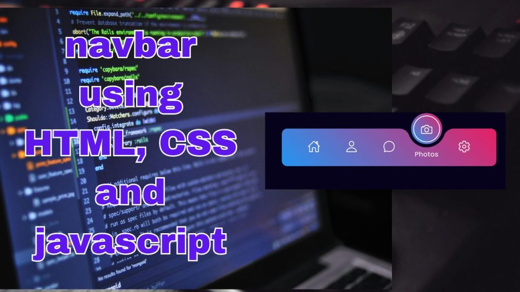
In the vast landscape of web development, one fundamental aspect reigns supreme: navigation. A seamless navigation experience can greatly enhance user interaction and accessibility on a website. Among the myriad of tools available to achieve this, the Navigation Menu Bar stands out as a cornerstone element. In this blog, we delve into the realm of web design, exploring how to create an elegant and functional Navigation Menu Bar using the trifecta of web technologies: HTML, CSS, and JavaScript. Join us on this journey as we unlock the secrets to crafting a captivating navigation experience that leaves users engaged and delighted.

So, let’s delve into the world of Magic Navigation Menu Indicators. Ever wondered what exactly constitutes a “magic navigation menu indicator”? Think of it as the dazzle in your web navigation. Essentially, it’s a dynamic, animated element of the menu that indicates your current position on a website. Its primary goal? To enhance the interactivity of the menu and showcase some impressive web enchantment.

The real magic happens when this indicator springs to life with animations. Instead of remaining static, when you click on a menu item, it undergoes a transformation – it might change colors, shift position, or add some captivating effects to signify that it’s the active selection. It’s these captivating animations that truly elevate the navigation experience on your website.

<!DOCTYPE html> <!-- This declaration specifies the document type and version of HTML being used, in this case, HTML5. -->

<html lang="en"> <!-- This tag marks the beginning of the HTML document and sets the language to English. -->

<head> <!-- This section contains meta-information about the HTML document and external resources like stylesheets or scripts. -->

    <meta charset="UTF-8"> <!-- This meta tag defines the character encoding for the document as UTF-8, which supports a wide range of characters. -->

    <meta http-equiv="X-UA-Compatible" content="IE=edge"> <!-- This meta tag sets the X-UA-Compatible header to ensure compatibility with Internet Explorer and Edge browsers. -->

    <meta name="viewport" content="width=device-width, initial-scale=1.0"> <!-- This meta tag sets the viewport properties for responsive design, ensuring proper rendering on various devices. -->

    <title>Magic Navigation Menu Indicator | Codehal</title> <!-- This tag defines the title of the HTML document, which appears in the browser tab or window title bar. -->

    <link rel="stylesheet" href="style.css"> <!-- This tag links an external CSS stylesheet named "style.css" to apply styles to the HTML document. -->

</head>
<body>
<!-- Start of navigation menu -->
<div class="navigation">
    <ul>
        <!-- List item for Home with 'active' class to indicate current page -->
        <li class="list active">
            <!-- Link to Home -->
            <a href="#">
                <!-- Icon for Home -->
                <span class="icon">
                    <ion-icon name="home-outline"></ion-icon>
                </span>
                <!-- Text label for Home -->
                <span class="text">Home</span>
                <!-- Indicator circle for Home -->
                <span class="circle"></span>
            </a>
        </li>
        <!-- List item for Profile -->
        <li class="list">
            <!-- Link to Profile -->
            <a href="#">
                <!-- Icon for Profile -->
                <span class="icon">
                    <ion-icon name="person-outline"></ion-icon>
                </span>
                <!-- Text label for Profile -->
                <span class="text">Profile</span>
                <!-- Indicator circle for Profile -->
                <span class="circle"></span>
            </a>
        </li>
        <!-- List item for Message -->
        <li class="list">
            <!-- Link to Message -->
            <a href="#">
                <!-- Icon for Message -->
                <span class="icon">
                    <ion-icon name="chatbubble-outline"></ion-icon>
                </span>
                <!-- Text label for Message -->
                <span class="text">Message</span>
                <!-- Indicator circle for Message -->
                <span class="circle"></span>
            </a>
        </li>
        <!-- Other list items for additional menu options can be added here -->
    </ul>
<!-- Start of navigation menu list items -->
<li class="list">
    <!-- Link to Photos -->
    <a href="#">
        <!-- Icon for Photos -->
        <span class="icon">
            <ion-icon name="camera-outline"></ion-icon>
        </span>
        <!-- Text label for Photos -->
        <span class="text">Photos</span>
        <!-- Indicator circle for Photos -->
        <span class="circle"></span>
    </a>
</li>
<li class="list">
    <!-- Link to Settings -->
    <a href="#">
        <!-- Icon for Settings -->
        <span class="icon">
            <ion-icon name="settings-outline"></ion-icon>
        </span>
        <!-- Text label for Settings -->
        <span class="text">Settings</span>
        <!-- Indicator circle for Settings -->
        <span class="circle"></span>
    </a>
</li>
<!-- End of navigation menu list items -->

<!-- Indicator for active menu item -->
<div class="indicator"></div>
</ul>
</div>

<!-- External script imports for Ionicons library -->
<script type="module" src="https://unpkg.com/ionicons@5.5.2/dist/ionicons/ionicons.esm.js"></script>
<script nomodule src="https://unpkg.com/ionicons@5.5.2/dist/ionicons/ionicons.js"></script>

<!-- External script import for custom JavaScript -->
<script src="script.js"></script>

</body>
</html>

/* Importing Google Fonts */
@import url('https://fonts.googleapis.com/css2?family=Poppins:wght@300;400;500;600;700;800;900&display=swap');

/* Resetting default margin, padding, and box-sizing */
* {
    margin: 0;
    padding: 0;
    box-sizing: border-box;
    font-family: 'Poppins', sans-serif; /* Setting default font */
}

/* Styling the body */
body {
    display: flex; /* Flex container */
    justify-content: center; /* Centering horizontally */
    align-items: center; /* Centering vertically */
    min-height: 100vh; /* Minimum height of the viewport */
    background: #06021b; /* Background color */
}

/* Styling the navigation bar */
.navigation {
    position: relative; /* Relative positioning */
    width: 400px; /* Width of the navigation bar */
    height: 70px; /* Height of the navigation bar */
    background: linear-gradient(45deg, #2196f3, #e91e63); /* Gradient background */
    display: flex; /* Flex container */
    justify-content: center; /* Centering horizontally */
    align-items: center; /* Centering vertically */
    border-radius: 10px; /* Border radius for rounded corners */
}

/* Styling the list items within the navigation */
.navigation ul {
    display: flex; /* Flex container */
    width: 350px; /* Width of the navigation list */
}

/* Styling each list item within the navigation */
.navigation ul li {
    position: relative; /* Relative positioning */
    width: 70px; /* Width of each list item */
    height: 70px; /* Height of each list item */
    list-style: none; /* Removing default list style */
    z-index: 1; /* Stacking order */
}

/* Styling the anchor tags within each list item */
.navigation ul li a {
    position: relative; /* Relative positioning */
    display: flex; /* Flex container */
    justify-content: center; /* Centering horizontally */
    align-items: center; /* Centering vertically */
    flex-direction: column; /* Setting flex direction */
    width: 100%; /* Full width */
    text-align: center; /* Centering text */
    font-weight: 500; /* Setting font weight */
}

/* Styling the icons within anchor tags */
.navigation ul li a .icon {
    position: relative; /* Relative positioning */
    display: block; /* Block element */
    line-height: 75px; /* Line height */
    font-size: 1.5em; /* Font size */
    text-align: center; /* Centering text */
    color: #fff; /* Text color */
    transition: .5s; /* Transition effect */
}

/* Styling the icons when their parent list item is active */
.navigation ul li.active a .icon {
    transform: translateY(-32px); /* Move the icon up */
}

/* Styling the text within anchor tags */
.navigation ul li a .text {
    position: absolute; /* Absolute positioning */
    color: #fff; /* Text color */
    font-weight: 400; /* Setting font weight */
    font-size: .75em; /* Font size */
    letter-spacing: .05em; /* Letter spacing */
    opacity: 0; /* Initially hidden */
    transform: translateY(20px); /* Move the text down */
    transition: .5s; /* Transition effect */
}

/* Styling the text when their parent list item is active */
.navigation ul li.active a .text {
    opacity: 1; /* Show the text */
    transform: translateY(10px); /* Move the text up */
}
/* Styling the circle element within anchor tags */
.navigation ul li a .circle {
    position: absolute; /* Absolute positioning */
    display: block; /* Block element */
    width: 50px; /* Width of the circle */
    height: 50px; /* Height of the circle */
    background: transparent; /* Transparent background */
    border-radius: 50%; /* Border radius to create a circle */
    border: 1.8px solid #fff; /* Border with white color */
    transform: translateY(-37px) scale(0); /* Initially hidden and scaled down */
}

/* Styling the circle when its parent list item is active */
.navigation ul li.active a .circle {
    transition: .5s; /* Transition effect */
    transition-delay: .5s; /* Delay before transitioning */
    transform: translateY(-37px) scale(1); /* Move up and scale to show */
}

/* Styling the indicator element */
.indicator {
    position: absolute; /* Absolute positioning */
    top: -50%; /* Positioning relative to its parent */
    width: 70px; /* Width of the indicator */
    height: 70px; /* Height of the indicator */
    background: linear-gradient(45deg, #2196f3, #e91e63); /* Gradient background */
    border: 6px solid #06021b; /* Border with dark color */
    border-radius: 50%; /* Border radius to create a circle */
    display: flex; /* Flex container */
    justify-content: center; /* Centering horizontally */
    align-items: center; /* Centering vertically */
    transition: .5s; /* Transition effect */
}

/* Styling the pseudo element before the indicator */
.indicator::before {
    content: ''; /* Empty content */
    position: absolute; /* Absolute positioning */
    top: 50%; /* Positioning relative to its parent */
    left: -22px; /* Positioning from the left */
    width: 20px; /* Width of the pseudo element */
    height: 20px; /* Height of the pseudo element */
    background: transparent; /* Transparent background */
    border-top-right-radius: 20px; /* Border radius to create a rounded corner */
    box-shadow: 1px -10px 0 #06021b; /* Shadow effect */
}

/* Styling the pseudo element after the indicator */
.indicator::after {
    content: ''; /* Empty content */
    position: absolute; /* Absolute positioning */
    top: 50%; /* Positioning relative to its parent */
    right: -22px; /* Positioning from the right */
    width: 20px; /* Width of the pseudo element */
    height: 20px; /* Height of the pseudo element */
    background: transparent; /* Transparent background */
    border-top-left-radius: 20px; /* Border radius to create a rounded corner */
    box-shadow: -1px -10px 0 #06021b; /* Shadow effect */
}
/* Styling the indicator element based on the active state of list items */

/* Styling the indicator when the first list item is active */
.navigation ul li:nth-child(1).active ~ .indicator {
    transform: translateX(calc(70px * 0)); /* Move the indicator horizontally */
}

/* Styling the indicator when the second list item is active */
.navigation ul li:nth-child(2).active ~ .indicator {
    transform: translateX(calc(70px * 1)); /* Move the indicator horizontally */
}

/* Styling the indicator when the third list item is active */
.navigation ul li:nth-child(3).active ~ .indicator {
    transform: translateX(calc(70px * 2)); /* Move the indicator horizontally */
}

/* Styling the indicator when the fourth list item is active */
.navigation ul li:nth-child(4).active ~ .indicator {
    transform: translateX(calc(70px * 3)); /* Move the indicator horizontally */
}

/* Styling the indicator when the fifth list item is active */
.navigation ul li:nth-child(5).active ~ .indicator {
    transform: translateX(calc(70px * 4)); /* Move the indicator horizontally */
}


// Select all elements with the class 'list'
const list = document.querySelectorAll('.list');

// Function to handle the click event on list items and toggle the 'active' class
function activeLink() {
    // Remove the 'active' class from all list items
    list.forEach((item) => item.classList.remove('active'));
    // Add the 'active' class to the clicked list item
    this.classList.add('active');
}

// Loop through each list item and add a click event listener
list.forEach((item) => item.addEventListener('click', activeLink));

This JavaScript code sets up event listeners on all elements with the class ‘list’. When a list item is clicked, it triggers the activeLink function, which removes the ‘active’ class from all list items and then adds the ‘active’ class to the clicked list item. This effectively toggles the ‘active’ class between list items when they are clicked.

In the realm of web design, dynamic navigation menu indicators with active tab animations are a game-changer for enhancing the online experience. They’re not just mere guides; they act as companions throughout your web journey. These interactive elements not only assist in navigation but also maintain your engagement and provide immediate feedback, instilling a sense of empowerment.

As the landscape of web design progresses, we anticipate witnessing even more innovative applications of these magical navigation menu indicators. They wield the power to transform websites into engaging, user-friendly platforms, adding an extra layer of excitement to your online ventures. So, stay vigilant for these enchanting elements as they continue to weave their magic across the digital realm, turning your browsing experiences into something truly captivating.

Navigation Menu Bar using HTML CSS and Javascript

Leave a Reply

Your email address will not be published. Required fields are marked *

Scroll to top